Quantcast
Channel: Divisare - Projects — Top Favorites of the Week
Viewing all 1949 articles
Browse latest View live

Fasano Boa Vista Hotel - Isay Weinfeld

$
0
0

Fazenda Boa Vista is a residential and hospitality complex located in a 750-hectare property in Porto Feliz, 100km away from the city of São Paulo, in Brazil. Besides the hotel, it comprises yet private villas, spa, kids club, equestrian center, sports center, petting zoo, two 18-hole golf courses, golf clubhouse, swimming pool and 242-hectare woods punctuated with inumerous lakes. 

Fasano_boa_vista_026_large

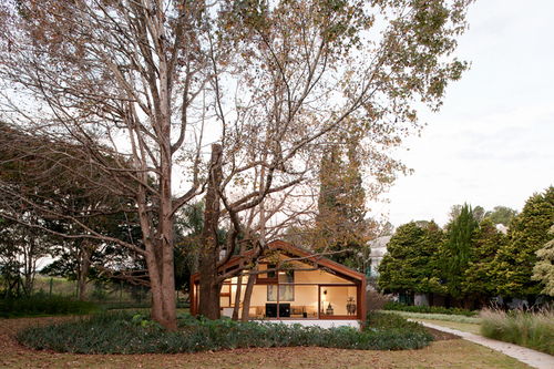
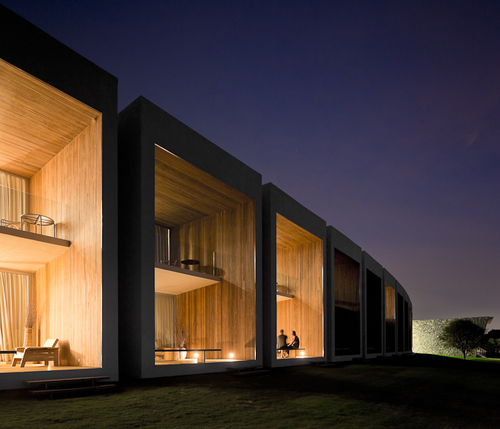
Placed on one of the highest spots of the property and overlooking one of the lakes and the sunset, the hotel building is defined by a large structure of pronounced horizontality, composed by two symmetric wings – they draw light curves, one slightly concave and the other slightly convex – flanking a core body housing the reception, entertaining, office and housekeeping facilities.

Fasano_boa_vista_003_large

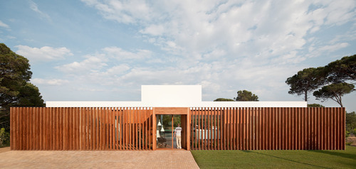
Right on the central transverse axis of the building, the entrance pathway leading to the reception hall is set under a wooden pergola and through a lush garden. From the reception forward, lobby and veranda develop in succession, integrated and gradually allowing for wider perspectives until, ultimately, unveiling the lake and the extensive green landscape.

Fasano_boa_vista_057_large

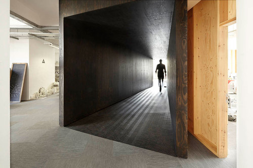
To the left and right wings of the reception, are all accommodations – 26 standard rooms to one side, and 11 duplex suites + 1 duplex two-bedroom suite and 1 room equipped for guests with disabilities to the other. Each of the wings is made up of a sequence of thirteen cubic modules housing all 39 guestrooms, clearly marked in the façade by the frames enclosing slabs and brickwork. The long hallways leading to the rooms are bathed in soft natural light, filtered by a sequence of pre-cast concrete slats standing all along the Northeast façade.

Fasano_boa_vista_090_large

On the underground level, the bar and restaurant extend outdoors onto a large deck projecting over the lake, which serves for contemplation as well as swimming. The ambience all over is that of low-key eloquence and coziness. The choice of materials – wood, stone, stucco, natural fibers and leather – as well as the furnishings, all contribute to this understated mood, at once elegant, plain and unpretentious, reminding of those resorts that existed in the 1950s and 1960s in the Sao Paulo countryside.

Fasano_boa_vista_120_large

Fasano_boa_vista_154_large

Fasano_boa_vista_165_large

Fasano_boa_vista_169_large

Fasano_boa_vista_200_large

Fasano_boa_vista_212_large

Fasano_boa_vista_214_large

Fasano_boa_vista_221_large

Fasano_boa_vista_240_large

Hotel-fasano-boa-vista_implanta‡Æo_large

Hotel-fasano-boa-vista_desenhos-1_large

Hotel-fasano-boa-vista_desenhos-2_large

Hotel-fasano-boa-vista_desenhos-3_large

Hotel-fasano-boa-vista_desenhos-4_large

Hotel-fasano-boa-vista_desenhos-5_large


Market Hall - Robbrecht En Daem Architecten, Marie-josé Van Hee

$
0
0

Exercise in Renaissance
Following two demolition campaigns for a world exhibition in 1913 and an administrative centre never built in the 60s, Ghent’s historic heart degenerated for decades into a desolate parking lot in between a suite of three adjoining Gothic towers. In two consecutive competi- tions between 1996 and 2005, Robbrecht en Daem architecten and MJosé Van Hee architects proposed their own programme, countering the initial competition requirement. Rather than just providing an open space for events, they sought, by meticulously positioning a market hall, to rectify this deficiency and reinstate the presence of old urban areas that had become unrecognisable.

Robbrechtendaem-vanhee-market-hall-gent-b-photographer-marc-de-blieck_large

The building positions itself between Poeljemarkt, Goudenleeuwplein, and a new lower ‘green’ connecting to the ‘brasserie’, bicycle park and public toilets below the hall. And although the building clearly occupies a position on the 24,000m2 site, it fits in well. Com – pared to St. Nicholas Church, Belfry and Cathedral, it assumes the heights of a lower group of buildings such as the adjacent town hall, from which it derives, mathematically, its profile. As an urban interior, the inside embraces the passer-by with a dual modulated wooden ceiling, whose small windows scatter light inwards. The exterior, the entire building in fact, seems to assume a respectful role relative to the nobler historic stone buildings, by using a wooden, almost humble, finish. A glass envelope protects the wood and provides a soft shine, with the sky reflected, integrated.

Robbrechtendaem-vanhee-market-hall-gent-a-photographer-marc-de-blieck_large

Large buffer basins to absorb rainwater, principles of low energy consumption for the bras- serie, use of truly natural materials, the contribution of public transport and a clear vision about giving new value to the historic centre with its old spatial structures, are just parts that broadly flesh out ‘sustainability’ for the future. The centre of Ghent will again become a social spot for people.

Robbrechtendaem-vanhee-market-hall-gent-situation-plan_large

Robbrechtendaem-vanhee-market-hall-gent-section-bb_large

Robbrechtendaem-vanhee-market-hall-gent-section-dd_large

Maracanã House - Terra e Tuma Arquitetos Associados

$
0
0

São Paulo. In this city, which contemporaneity is able to perform the most extraordinary urban contrasts for us, living can reveal an encouraging condition.

0070

In search of a place where this could be experienced, the idea of an elementary residence acquires the character of a ha- ppening. Thus, as this house decided to silently place itself at the westerly metropolitan meanders, is how it is presented at Maracanã Street.

0070

The plans which define the geometry – opaque in grayish materiality, clear in glass surfaces or vibrant on the access mural – shows its presence like a new event around the bucolic surroundings, where curious people wonder this new construction. Its discordant geometry in relation to the traditional houses of the neighborhood surprises upon the moment when it conce- als any territorial definition, admitting as an element and as a public event, takes possession of the street which allows to be perceived. Through its whole property’s occupation as it is available, it shares its limits as if internalizes the surrounding and though arises its unique place.

0070

More than a space, its levels gradually form a path through which outside and inside merge in a proper and continuous shape. The house discovers new possibilities to the limitations of the scanty plot, whose complexity exceeds horizontal and vertical routes which invariably leads to a new spacial experience, capable to elucidate singularities of the district’s geography.

0070

Being in the house of Maracanã Street is being in Lapa; is to live together with its peculiarities, stamped in the expectation to discover until where its spaces can conduct us and the possibility it offers the contemplation of neighbours reddish roof constructions and the church facade which crowns the district, while the sunset at São Paulo’s horizon gets unveiled. Entering the house doesn’t mean to set apart the city, which leads us to it or to close off a disconnected universe. Its access has to be discovered from behind the ceramics mural painted in black, white and red compositions. Entering the house means, simply to transpose a succession of spaces, now narrow, now lightened, now shady, which leads us always to new experiences.

0070

The house’s arrival happens from the emptiness, which is a viewpoint to the living space and also an identification area of its functional sections: social and services below, intimate above. Like the city streets, the lights between their spaces enlightens every directions, through big glass openings which sets against the solidity of the concrete materiality which it is built.

0070

Which way some arrives, which way some passes, which way some goes? Through the space, through the emptiness. Going around or staying, that’s how its extension is discovered. We can find ourselves immersed in its lower pavement, defined by concrete plans, by the gardens and by the backyard which shape the ambiance, or we can go through vertically until the gli- ding plan of the roof unveils the sky in a special instant leaving us as observers of the city whose point of view is this house’s roof top.

0070

The house is a living infrastructure. The pavements which configures a succession of perspectives is subtle protected by the presence of big glass frames. The handling of the technique and the use of minimum materials, as if it where stones over stones in its essence, confirm that Architecture can undress the present temporary superficialities and elevate only the spacial essence.

0070

The shelter, the protection to the fundamental, comprehend the nature into what the house is destinated and the sense it assumes, for those who are witnesses. Nothing more is needed for the contemporaneus city living. Here is the fundamental residence, unique and revealed.
Text by Daniel Corsi /Translation by Monika Sönksen

0070

0070

0070

0070

0070

0070

0070

03maracana-house_access-floor_large

04maracana-house_ground-floor_large

05maracana-house_first-floor_large

06maracana-house_roof-plan_large

07maracana-house_section-a_large

08maracana-house_section-b_large

09maracana-house_section-c_large

10maracana-house_section-d_large

11maracana-house_section-e_large

12maracana-house_north-view_large

13maracana-house_east-view_large

13maracana-house_south-view_large

14maracana-house_west-view_large

Sundial House - Hironaka Ogawa & Associates

$
0
0

This house stands in the middle of the fields in the country. The client does firming on the side. The site draws attention from the street; however it is not a place from which one can enjoy beautiful scenery in particular. Yet the client desired to live openly in this home. Modern housing lacks the feelings of seasonal and time changes by the artificial environment. My goal was to build a home where the client can feel the seasons’ change from winter, spring, summer and fall as a farmer. In order to accomplish this, I proposed this courtyard house with a two-storied unit in the middle of the site, surrounded by a one-storied unit. I purposefully placed the two-storied unit on the south part of the site to block the sun. As a result, the shadow of the tower moves slowly though out the day. In addition, the shadows of objects and places to stay within the home move accordingly. In the summer, there would be a summer shadow. In the winter, there would be a winter shadow. The house shows different appearances in each of the four seasons. There would be a rhythm in the home’s atmosphere created by the shadow of the tower, intentionally constructed on the south part of the site. Also, the client can feel the sense of privacy at the same time as the indication of the each room by placing a small courtyard in the one-storied unit to maintain the distances in the house. In conclusion, this house is like a sundial where one can feel the change of the seasons along with the surrounding fields.

Tkog_003_large

function : private house
location : Kagawa , Japan
structure : wood frame
site area : 727.69 sqm
architectural area : 132.21 sqm
total floor area : 147.51 sqm
completed date : 2009

Tkog_004_large

Tkog_010_large

Tkog_014_large

Tkog_016_large

Tkog_017_large

Tkog_021_large

Tkog_023_large

Tkog_026_large

Tkog_027_large

Tkog_032_large

Tkog_034_large

Tkog_038_large

Tkog_039_large

Tkog_040_large

Sundial-site_large

Plan_large

Sundial-elevation_large

Sundial--section_large

Toblerone House - studio mk27 - marcio kogan

$
0
0

CREDITS
architecture > studio mk27
architect> marcio kogan
co-architect > diana radomysler
interior design > diana radomysler
custom made furniture design > carolina castroviejo
team > eduardo chalabi . eduardo glycerio eduardo gurian . elisa friedmann . gabriel kogan lair reis . luciana antunes . marcio tanaka maria cristina motta . mariana simas renata furlanetto . samanta cafardo . suzana glogowski
project architects > oswaldo pessano . fernando falcon

Img_0442_large

Img_0378_large

Img_0438_large

Img_0455_57_large

Img_0509_large

Img_0544_large

Img_0576_large

Img_0587_88_large

Img_0592_large

Img_0602_large

Img_0670_large

Img_0769_large

Img_0784a_large

Img_0790_large

Img_0792_93_large

Mk27_toblerone_plans-1_large

Mk27_toblerone_plans-2_large

Mk27_toblerone_plans-3_large

Mk27_toblerone_plans-4_large

Mk27_toblerone_plans-5_large

Mk27_toblerone_plans-6_large

Mk27_toblerone_plans-7_large

Mk27_toblerone_plans-8_large

Mk27_toblerone_plans-9_large

Mk27_toblerone_plans-10_large

Mk27_toblerone_plans-11_large

Mk27_toblerone_plans-12_large

Mk27_toblerone_plans-13_large

Mk27_toblerone_plans-14_large

Mk27_toblerone_plans-15_large

Guest house - Doisamaisv arquitetos

$
0
0

The building was conceived as an addition to a pre-existing weekend house. The guest house was placed between a maple tree and a cypress, inserted perpendicularly to the main construction. It is situated in the outskirts of São Paulo, inside a residential condo.

01_doisamaisv_fran_parente_large

The largest tree marks the site´s center and the most vertical one its limit. Preserving the inner garden space, the view from the main house was kept unobstructed. Each program has its own façade and each façade its view. The bedrooms open up to the neighboring golf court, the office faces the lake, circulation leads to the garden, and the living room has the maple tree as backdrop. The surrounding vegetation plays an important role to the house. Because of it, the house cannot be seen from the street. It protects and shadows the glass pane. And from the inside, the window frames the giant tree.

02_doisamaisv_fran_parente_large

The central core, with four suites, has a concrete structure. Around it, an independent timber structure delimits gathering places and circulation. The roof trusses are only visible at the edges. Steel cables held by gusset plates attached to the peripheral pillars and over the frames are responsible for keeping them slim. House circulation is always through the porches and there is no distinction between front and back doors. Inside the building, one can feel the tranquil atmosphere of isolation, even being so close to the neighbors. It is just like being in a tree house without leaving the ground.

03_doisamaisv_fran_parente_large

04_doisamaisv_fran_parente_large

05_doisamaisv_fran_parente_large

06_doisamaisv_fran_parente_large

07_doisamaisv_fran_parente_large

08_doisamaisv_fran_parente_large

09_doisamaisv_fran_parente_large

010_doisamaisv_fran_parente_large

011_doisamaisv_fran_parente_large

012_doisamaisv_fran_parente_large

013_doisamaisv_fran_parente_large

014_doisamaisv_fran_parente_large

01_doisamaisv_guest-house_site-plan_large

02_doisamaisv_guest-house_plan_large

03_doisamaisv_guest-house_facade_large

04_doisamaisv_guest-house_section_large

Expansion Of The Saint Louis Art Museum - David Chipperfield Architects

$
0
0

The Saint Louis Art Museum is one of the leading art museums in the US, housing more than 30,000 works of art. Its collections include works of exceptional quality from virtually every culture and time period. Its Beaux-Arts-style historic home in Forest Park was designed for the 1904 World’s Fair by architect Cass Gilbert.
The expansion will increase the Museum’s galleries and public spaces, providing new exhibition space for the Museum’s comprehensive collection, and also for touring exhibitions.

6_large

The design creates an addition to the east and south of the original 1904 building with a dark, polished concrete façade made using Missouri river aggregate. New galleries and public spaces are top-lit and have a number of floor-to-ceiling windows, inviting and providing views from both inside and outside.
The design organically links the expansion to the current structure by connecting to existing primary circulation axes. It features a new central staircase to more clearly connect the main level to a new, lower level public concourse serving an expanded café and the existing museum shop and auditorium. A new restaurant will overlook Forest Park to the north. All existing Museum surface parking will be relocated to a 300-space, three-level, below-grade parking garage. The project also includes a new restaurant and a new fully accessible front entrance.

2_large

In total, the plan provides for 82,452 square feet of new galleries, public space and art support, and 128,979 square feet for below-grade parking. The Museum expects to break ground on the expansion project in late 2008, with completion anticipated in 2011. David Chipperfield said, “The Cass Gilbert building – the only remaining building from the 1904 World’s Fair – is integral to the Museum’s history and identity. We sought not only to maintain the building and its historic Sculpture Hall as the symbolic heart of the Museum, but also to create a strong relationship between landscape and architecture.”

1_large

“David Chipperfield’s design pays thoughtful and elegant homage to Cass Gilbert while creating modern spaces to house the Museum’s extraordinary holdings of post-war art,” said Art Museum Director Brent R. Benjamin. “The expansion will enable St. Louisans to enjoy even more of our wonderful collection in a building that takes full advantage of the Museum’s magnificent setting in Forest Park.”

3_large

4_large

5_large

7_large

8_large

1781844757_large

The design creates an addition to the east and south of the original 1904 building with a dark, polished concrete façade made using Missouri river aggregate. (East View) - Image: Atelier 2007 © All rights reserved.

593150886_large

The expansion will increase the Museum's galleries and public spaces, providing new exhibition space for the Museum’s comprehensive collection. (New Gallery Space) - Image: Atelier 2007 © All rights reserved.

62161184_large

The project also includes a new fully accessible front entrance (New North Entrance) - Image: Atelier 2007 © All rights reserved.

Garden Tree House - Hironaka Ogawa & Associates

$
0
0

This is an extension project on a thirty-five year-old house for a daughter and her husband. A Zelkova tree and a Camphor tree stood on the site since the time the main house was build thirty-five years ago. Removing these trees was one of the design requirements because the new additional building could not be built if these trees remained. When I received the offer for the project, I thought of various designs before I visited the site for the first time. However, all my thoughts were blown away as soon as I saw the site in person. The two trees stood there quite strongly. I listen to the stories in detail; the daughter has memories of climbing these trees when she was little. These trees looked over the family for thirty-five years. They colored the garden and grew up with the family. Therefore, utilizing these trees and creating a new place for the client became the main theme for the design. In detail, I cut the two trees with their branches intact. Then I reduced the water content by smoking and drying them for two weeks.

Umge_002_large

Thereafter, I placed the trees where they used to stand and used them as main structural columns in the center of the living room, dining room, and kitchen. In order to mimic the way the trees used to stand, I sunk the building addition 70 centimeters down in the ground. I kept the height of the addition lower than the main house while still maintaining 4 meter ceiling height. By the way, the smoking and drying process was done at a kiln within Kagawa prefecture. These two trees returned to the site without ever leaving the prefecture. The client asked a Shinto priest at the nearby shrine to remove evil when the trees were cut. Nobody would go that far without a love and attachment to these trees. When this house is demolished and another new building constructed by a descendant of the client hundreds of years from now, surely these two trees will be reused in some kind of form.

Umge_005_large

function : private house
location : Kagawa , Japan
structure : wood frame
site area : 699.54 sqm
architectural area : 50.90 sqm
total floor area : 50.90 sqm
completed date : 2010

Umge_006_large

Umge_014_large

Umge_016_large

Umge_017_large

Umge_019_large

Umge_022_large

Umge_026_large

Umge_027_large

Umge_028_large

Umge_033_large

Umge_036_large

Umge_040_large

Img_0758_large

Img_0813_large

Img_0824_large

P8190008_large

Isometric_large

Gth-elevation_large

Gth-site_large

Plan_large

Section_large


House in Sanbonmatsu - Hironaka Ogawa & Associates

$
0
0

This project is to design a private residence along drive way in Kagawa Prefecture in Sikoku. The site was plotted by the town redemarcation project and the construction site occupies twice the size of the surrounding ones. The neighboring houses are mostly two-story-high and standing on the small sites. Therefore, 1st and 2nd floor volume are the same and box-shaped design. In contrast, this house has achieved well-balanced exterior shape by introducing long hipped roof. The roof is partly cutout and it is used as a courtyard that lets the sunlight and wind into the house, and the rooms and corridors are placed around it. What is more, living room, dining room and kitchen are connected vertically and mildly by the voids. The garden surrounding the house was tilted toward to the house in order to provide better views to all the rooms. Despite the fact that the idea of cutting out a volume from hipped roof is quite simple, it gives various volume impressions in different angles and less oppressive feeling to the neighbors. What’s more, the change of the room volumes provides various views.

Ichb_001_large

function : private house
location : Kagawa , Japan
structure : wood frame
site area : 759.89sqm
architectural area : 281.60 sqm
total floor area : 253.03 sqm
completed date : 2011

Ichb_005_large

Ichb_009_large

Ichb_011_large

Ichb_016_large

Ichb_019_large

Ichb_022_large

Ichb_026_large

Ichb_027_large

Ichb_030_large

Ichb_036_large

Ichb_039_large

Ichb_044_large

Ichb_048_large

Ichb_051_large

Ichb_056_large

Ichb_058_large

Ichb_059_large

Ichb_064_large

Ichb_066_large

Ichb_067_large

Elevation_large

Site_large

1f-plan_large

2f-plan_large

His-section_large

Chiyodanomori Dental Clinic - Hironaka Ogawa & Associates

$
0
0

This is a dental clinic accompanied with a housing project. The conditions required were: to make the clinic and housing into one building, to create three individual treatment rooms and a couple of rooms that are able to alter into treatment rooms in the future for the clinic, and to provide the treatment area wide spread feelings while keeping its privacy. For the housing section, the client wanted to have a pleasant view of the sky. Other than these conditions, locating openings also needed particular attention in order to maintain enough natural lighting levels in the building; the site suffers from strong winter wind and is famous for the hottest temperature record in Japan during the summer. First of all, I made a rule to create a 2.7m x 2.7m cell that is needed for the individual treatment area. I placed the cells in grid inside of a walled box and located a couple of courtyards to get sunlight while considering their relations to each cell. By doing so, fifty-five cells were created on the plane. I let the building be seen as one volume by employing a hip roof and laid the second floor of the housing in the hipped or inclined section. The clinic and a part of the housing have different ceiling heights created by the slanted roof, and the courtyards’ varying depth creates natural light gradations. Therefore, there would be diversities in spaces. The plan is fairly ruled by a 2.7m grid. However, one can experience diverse feelings in each and every space because of the dissimilarities in each cell heights, natural lighting, and volume. While aiming for a functional and rational plan, I encountered ambiguous relationships between outside and inside conditions that generated a mysterious depth in the space. The diversity in light and space was created unintentionally by the fifty-five cells inside of the structure.

Cydc_005_large

function : dental clinic (+private house)
location : Gunma , Japan
structure : wood frame
site area : 804.26 sqm
architectural area : 306.18 sqm
total floor area : 383.31 sqm
completed date : 2011

Cydc_002_large

Cydc_008_large

Cydc_009_large

Cydc_010_large

Cydc_012_large

Cydc_017_large

Cydc_020_large

Cydc_023_large

Cydc_024_large

Cydc_027_large

Cydc_031_large

Cydc_036_large

Cydc_037_large

Cydc_039_large

Cydc_048_large

Cydc_049_large

Cydc_051_large

Cydc_053_large

Cydc_055_large

Cydc_057_large

Cydc_058_large

Isometric_large

1f-plan_large

2f-plan_large

Elevation_large

Section_large

Site_large

Nuevo cementerio de Añorbe - MRM Arquitectos s.l.p.

$
0
0

La ubicación aislada del cementerio y del propio municipio, encaramados sobre la ladera define unos criterios arquitectónicos de diseño a gran escala en base a las relaciones con el paisaje y por la ausencia de continuidad formal y funcional con la morfología urbana del pueblo. La formalización del programa pasa por el recintado del nuevo cementerio, en dos zonas, con muros reinterpretados a partir del existente: modeladores del propio paisaje, adaptándose a él, a su topografía, conteniéndolo, apenas delimitándolo, cóncavos y convexos, como ecos formales corbuserianos, incorporando sus vistas, el paisaje y el cielo genérico; integrándose así en él.

Cementerio_añorbe_02_large

Vista general interior del acceso

Los nuevos muros reordenan y reescriben, agregan nuevos significados y re-significan el conjunto partiendo de la preexistencia del muro del viejo cementerio. La transparencia parcial de los mismos como celosía, permite una mediación en la relación con el paisaje y evita su percepción masiva y cerrada.

Cementerio_añorbe_04_large

Vista detalle muro y paisaje

A pesar de la estaticidad intrínseca del programa, la obra adquiere un enorme dinamismo al ser recorrida, se activa de alguna manera en el desplazamiento descubriéndose las relaciones con el entorno, donde cualquier recorrido es una sucesión de secuencias cambiantes, dibujando distintas percepciones y permitiendo re-leer y re-comprender el mismo paisaje circundante.

Cementerio_añorbe_10_large

Vista interior detalle muros

La fábrica se construye desnuda, osamenta semienterrada, presencia de la ausencia que allí crece, que guarda y contiene el tiempo de todos, su propio tiempo representado en cada pieza de bloque colocada. El muro no solo está sino que su propio tiempo ocurre cada vez que se nos presenta.

Planta

Se plantea el proyecto desde la redefinición de un recinto interior tradicionalmente cerrado, desocupado del paisaje e infrautilizado para, a través del diseño de un límite discontinuo menos impermeable, mejorar la continuidad del paisaje, vientos, luz y naturaleza.

E0

Una arquitectura cargada de relaciones que deriva sus formas de las mismas. La oposición positivo-negativo, cóncavo-convexo, espacio-materia, permiten extraer de estas consideraciones el proyecto paisajístico.

Cementerio_añorbe_13_large

Cementerio_añorbe_14_large

Cementerio_añorbe_06_large

Cementerio_añorbe_01_large

Vista acceso principal

Cementerio_añorbe_16_large

Detalle muro con columbarios

The Palmiry Museum Place of Memory - WXCA

$
0
0

IDEA
The Palmiry Museum Place of Memory is a museum area complying with the pine-birch forest surrounding the cemetery. The museum building is a part of the Kampinos National Park, separated with glass and steel walls, covered with a green roof. The exhibition space lies among trees – witnesses of past tragedies. The ascetic form of the building and the severity of the used materials form a background for the exhibition inside.

Elevation2__large

LOCATION
The Museum borders on an ecumenical cemetery – a mausoleum of the victims of the Nazi regime in the years 1939-1941, founded in 1948 according to the project of Romuald Grutt and Ewa Śliwińska. The building is adjusted to numerous outer conditions. The building’s location responds to the layout of the cemetery, sustaining the legal requirements of the irregularly shaped lot. The aim was to blur the border between the forest and the museum area. The effect was achieved by leaving space for trees. The greenery of the Kampinos National Park fits the designed area development plan. The object is located between the pedestrian alley, and the guest parking area on the south end. The separation of the sacrum and the profanum was achieved by designing a passage along the eastern façade, from the parking lot to the cemetery, between the steel museum front and the concrete resistance wall, holding the slope.

Building_from_outside_large

FORM AND FUNCTION
The interior and the exterior of the building form a whole. The used materials are a background for the exhibition. The architecture is not supposed to interfere with the emotional message of the personal items belonging to the victims buried at the cemetery. A clear simple division of functions has been suggested inside the building. The entrance to the building is located at the ending of the main alley from the cemetery. The visitor enters the glazed space of teh hall, with a reception and a cloakroom on the right, closed within a steel panel booth, so as not to restrict the inside cubature and the view from the outside. The end of the hall holds an education room and a corridor to the café, the restrooms, and the office area with a backstage. The rectangular exposition space is separated with a reinforced concrete wall. In the direction of the cemetery the exhibition space opens with a wide glassing, directing the eye of the visitor to the three white crosses at the end. The glass patios include pines. The patios enlight the exhibition area, separating particular parts of the exposition, and organizing the direction of the visit.

Datail_of_elevation__large

MATERIALS, CONSTRUCTION
The applied materials match the importance of the place and its location. The severity of the materials such as concrete, glass, the corten steel, complies with the surroundings of the Kampinos National Park, and the concrete rough crosses of the cemetery-mausoleum. The building has been designed within a reinforced concrete-steel construct. The glass walls introduce the history of the place and nature, viewed from the outside they comply with the surroundings. The walls, fitted with the corten steel, change with time, the grey steel surface at the beginning covers with rust. The roof of the building is a green roof, constructed as a reversed terrace, covered with extensive, non-cultivation greenery. The greenery of the green roof has been discussed with the management of the National Park, not to disturb the local eco-system.

Elevation_large

CONDITIONS
Due to its location, the object was under numerous legal restrictions, it was necessary to get specific permits in the area of artefact protection, conservation, environment and fire protection. The distance from the outer walls to the forest line is smaller than 12 metres. It was necessary to ensure both fire protection for the users in case of a forest fire, and a secure exit in case of a fire inside the building. Such hazard was real with glass façades. A two-layer glass façade is used, with an inner fire-proof layer. It is an expensive solution. Outer glassing is also used for protection against vandalism. The security of the exhibits is ensured by various low-current systems. The entrance to the building holds a guard post, designed for access control.

Building_from_outside2__large

INSTALLATION SOLUTIONS
The museum facilities are suited for exhibits’ needs, the user of the Warsaw Museum of History has stated the requirements for the exposition hall. The micro-climate inside is determined by the necessity to ensure adequate conditions for the artefacts. It was the basis for designing a wide ventilation system, with perfect temperature and humidity parameters. In order to restrict the energy absorption of the object, a green roof is used, preventing excessive heating during summer months. The number of windows in the exposition area is minimized. During winter seasons, the mass of the reinforced concrete walls will accumulate the heat of sunrays, and return it to the interior. To provide appropriate acoustic conditions, as well as for environment protection reasons, all technical devices are hidden in the roof, covered with steel bars.

Exposition1_large

LOCATION: PALMIRY (Kampinos National Park)
MAIN ARCHITECT: Zbigniew Wroński
ARCHITECTS: Szczepan Wroński, Wojciech Conder
DESIGN DATE: 2009-2010
REALIZATION DATE: 2010-2011
INVESTOR:
Auxiliary Investor: Stołeczny Zarząd Rozbudowy Miasta User: Muzeum Historyczne m.st. Warszawy

TOTAL AREA: 1133 m2
DEVELOPMENT AREA: 1145m2
GROSS CUBIC CAPACITY: 4400m3
MAIN DEVELOPER: „Winnicki’

Exposition2_large

Exposition3_large

Path__large

Path2_large

Elevation_at_night_large

Axonometry_large

Key_areas_large

Elevations_large

Plan_large

Sections_large

Site_plan_large

Orientation_large

Under_construction_large

Casa Chalú - adamo-faiden

$
0
0

Las denominadas “Casas Chorizo” constituyeron una de las tipologías más sistematizadas en la ciudad de Buenos Aires a principios del siglo XX. Construidas en parcelas urbanas muy estrechas y profundas, se organizaban mediante un único corredor que comunicaba con todas las unidades que en aquel entonces arrendaban oleadas de inmigrantes europeos. Fue precisamente su estructuración longitudinal y repetitiva lo que dio origen a su nombre.

Casa_chal£_baja_04_large

La familia Chalú entendió que recuperar una de estas unidades les daría la oportunidad de vivir en una casa ubicada en el centro de la ciudad por menos de la mitad del valor que indica el mercado inmobiliario.

Casa_chal£_baja_02_large

De la construcción original fue posible reutilizar su organización en “L” adyacente al patio, sus fundaciones y con ellas los muros de cerramiento y carga que configuraban un espacio único de doble altura. El programa de necesidades exigió la construcción de un entrepiso únicamente interrumpido por la escalera que comunica las áreas comunes con las habitaciones de cada integrante de la familia.

Casa_chal£_baja_03_large

La voluntad de introducir luz indirecta en el patio sumado a un presupuesto ajustado trajo aparejado un segundo reciclaje asociado esta vez a una técnica de revestimiento local olvidada por décadas: el revoque de cuarzo. En su lugar se optó por triturar in situ botellas de vidrio transparente, fijarlas sobre una base de cemento blanco y pulir sus aristas. Obteniendo de esta forma un tratamiento superficial capaz de hacernos olvidar por un momento el reflejo plano asociado a la técnica de flotado del vidrio. Recuperando en este patio la dimensión orgánica del cristal en forma de destellos irregulares que aparecen y desaparecen siempre de manera distinta.

Casa_chal£_baja_05_large

Casa_chal£_baja_01_large

Casa_chal£_baja_07_large

02-chal£_plantas_large

03-chal£_cortes_large

THALIA THEATRE - Gonçalo Byrne, arquitectos Lda., Barbas Lopes Arquitectos

$
0
0

Two different generations of Portuguese architects reconverted together the ruins of a neoclassical theatre in Lisbon, next to the city zoo. The remains of the building were covered by a shell of concrete and extend onto a glass pavilion, forming a multipurpose space where events and performances can take place.

Thaliafinalhr_ext03_large

The Thalia Theatre inaugurated in 1843, as a private venue for the Count of Farrobo. It was located just outside of Lisbon, facing a palace and gardens also owned by this aristocrat. A lover of the arts, the Count of Farrobo used the Thalia Theatre to stage theatre and opera shows as well as extravagant parties for his own amusement. In 1862, a fire burned down the building with all its luxurious decoration of gilded wood, mirrors, and chandeliers. By then, the Count of Farrobo had lost his fortune and eventually died penniless.

Thaliafinalhr_ext02_large

For almost 150 years, the Thalia Theatre remained in ruins. While the outskirts of Lisbon sprawled round its whereabouts, the city zoo was located next to it providing an exotic background to the derelict structure. In 2008, the Portuguese Ministry of Education and Science commissioned a study to reconvert the Thalia Theatre into a multipurpose space. This public institution is presently located in the palace just in front. Gonçalo Byrne Arquitectos and Barbas Lopes Arquitectos, both Lisbon-based, made the project.

Thaliafinalhr_ext01_large

In order to retain the old walls of the Thalia Theatre, the exterior was entirely covered by a shell of terracotta concrete that forms a massive and monolithic body. It is composed of the original volumes of the audience and the stage, 23 meters high. Inside these two voided spaces, the ruins are left untouched in a spectacle of their own. Minimum technical fixtures create an arena that can be adjusted to several uses such as exhibitions, summits, concerts, parties or broadcasts. An adjacent single-story structure, entirely glazed, houses additional program such as a reception, services, and a cafeteria. The new wing embraces the Thalia Theatre and faces the busy street next to it with a continuous surface of glass panes that mirror the environs with gilded reflections. The entrance is made by the original foyer, reconstructed in a “neo- neoclassical” style including a fluted frieze on the inside built with styrofoam profiles. On the outside, the front portico and marble sphinxes were restored.

Thaliafinalhr_ext04_large

Bronze letters at the tympanum of the main façade spell out the motto of Thalia, the muse of comedy. The original Latin inscription, “Hic Mores Hominum Castigantur,” was placed once again. In other words, “Here the Deeds of Men Shall Be Punished.” The project for the reconversion of the Thalia Theatre in Lisbon combines the old and new parts of the building into an urban ensemble with views to the nearby zoo. It brings back the presence of the past as a place for fantasy, imagination, and civic life.

Thaliafinalhr_ext05_large

Date 2008-2012
Area 1.600 m2
Budget 2.700.000 €

Thaliafinalhr_ext06_large

Thaliafinalhr_ext07_large

Thaliafinalhr_ext08_large

Thaliafinalhr_ext09_large

Thaliafinalhr_ext10_large

Thaliafinalhr_ext11_large

Thaliafinalhr_int01_large

Thaliafinalhr_int02_large

Thaliafinalhr_int03_large

Thaliafinalhr_int04_large

Thaliafinalhr_int05_large

Thaliafinalhr_int07_large

Thaliafinalhr_int09_large

Thaliafinalhr_int10_large

Thaliafinalhr_int15_large

Thaliafinalhr_int17_large

Thaliafinalhr_int18_large

Thaliafinalhr_int19_large

Thaliaruinshr_01_large

Thaliaruinshr_04_large

Thaliaruinshr_05_large

Thaliadrawings01_siteplan_large

Thaliadrawings02_plan_large

Thaliadrawings03_sectionlong_large

Thaliadrawings04_facadeeast_large

Thaliadrawings05_facadewest_large

Thaliadrawings06_sectioncrossi_large

Thaliadrawings07_facadesouth_large

Thaliadrawings08_sectioncrossii_large

Thaliadrawings09_detail_large

Thaliadrawings10_sectiondetail_large

Thaliasitedrawing_1904_1911__large

Boaçava House - Una Arquitetos

$
0
0

The slope where this site is located, beside the six meters difference between back neighbor and the house, provide a large distant view from the street level. The continuity is established therefore through the neighborhood treetops and the skyline on the banks of Pinheiros River.

19905pr111212_119d_large

The suspended concrete volume protects living areas on the ground level, with spatial variations from the design of the pavement with various heights. This wood pavement connects the entry to the pool, unfolding inside the room.

19905pr111212_108d_large

The concrete wall supports construction and divides longitudinally the site giving independence to the facilities areas. This colored block was pigmented with iron oxide. The presence of this molded wall is extended from the reflections of light and follows a transition from external to internal areas. Two concrete columns complete the supports of this level allowing apparent asymmetry in the regular structure.

19905pr111212_098d_large

Thinking of structural sense as a folding, the volume of the superior level behaves differently. There is no continuity of the pillars, are the concrete walls that support the cover slab. 
The contrast with first level, where the bedrooms are, appears in the opacity of the volume.

19905pr111212_085d_large

It indicates some intimacy; views from these rooms are mediated by reentrant balconies. These extractions ensure diagonal views, multiple light and ventilation accesses emphasizing the sun’s path.
The rising way is completed by a solarium on the roof.

19905pr111212_068d_large

19905pr111212_064d_large

19905pr111212_062d_large

19905pr111212_059d_large

19905pr111212_052p_large

19905pr111207_020d_large

01_1-100_terreo_large

02_1-100_superior_large

03_1-100_cobertura_large

04_1-100_corte-longitudinal_large

04_1-100_corte-transversal_large

05_1-100_corte-transversal_large


Pista Deportiva Elevada en Colegio Lasalle Franciscanas de Zaragoza - Guzmán de Yarza Blache

$
0
0

El encargo surge de la necesidad del colegio de aumentar la superficie útil del patio de recreo, que debido al gran número de alumnos y (de padres) que coinciden en diferentes momentos del día impiden el correcto desarrollo de las actividades deportivas y de esparcimiento.

Screen-shot-2013-03-05-at-11

Dicho patio tiene unas dimensiones de 33×35 metros conformadas por el Colegio existente en forma de U, con un ala realizada en los años 50 y otra fase en los 70, con su lado abierto hacia una orientación SE.

Screen-shot-2013-03-05-at-11

El hecho de tratarse de un colegio y de tener que acometer las obras exclusivamente durante los meses de verano hizo apostar, desde un principio, por una estructura de hormigón prefabricado que pudiese ser construida en pocos días, además de ser capaz de salvar las grandes luces diáfanas de 13 metros que el proyecto exigía para el aprovechamiento óptimo del espacio resultante bajo la pista elevada.

Screen-shot-2013-03-05-at-11

La necesaria eliminación de dos árboles existentes en el patio también proporcionó otra de las claves del proyecto como lo ha sido la voluntad de incluir vegetación en la actuación. De ese modo se ha proyectado el cerramiento del nivel superior como una burbuja metálica en cuya base discurre una jardinera de 70 metros lineales desde la que nace una especie trepadora, la hiedra, que en pocos años habrá recubierto la totalidad de la burbuja. El cerramiento metálico de mallazo galvanizado se ha colocado a doble cara, de modo que hacia el exterior permite en crecimiento de la hiedra y hacia el interior protege la planta de los balonazos propios de la práctica deportiva adolescente.

Screen-shot-2013-03-05-at-11

En el nivel de calle también se ha incluido un banco-jardinera de forma orgánica que incluye diferentes especies vegetales y permite que los padres y los alumnos se sienten.

Screen-shot-2013-03-05-at-11

De igual modo hubo que solucionar la conexión del nuevo volumen con el colegio y el patio; una suave rampa de 45 metros lineales conecta la cota 0 con el nivel de la pista deportiva y con un nivel intermedio de salida de los edificios existentes. Otra rampa comunica tres nuevas aulas de infantil con su zona de recreo exterior, a cota cero y parcialmente bajo la nueva pista deportiva.

Screen-shot-2013-03-05-at-11

Las posteriores visitas al Colegio han revelado el éxito de la actuación y la rápida asimilación icónica que los alumnos han hecho del proyecto, al que han apodado cariñosamente, “La Ballena”.

Screen-shot-2013-03-05-at-11

Screen-shot-2013-03-05-at-11

Screen-shot-2013-03-05-at-11

Ultima_large

00_planta_baja_large

01_planta_baja_large

02_planta_primera_large

03_planta_cubierta_large

04_alzado_ppal_y_seccion_longitudinal_large

05_alzado_patio_y_alzado_lateral_1_large

06_seccion_transversal_y_alzado_lateral_2_large

07_axono_final_01b_large

Garden in Comporta - Topiaris, Gonçalo Salazar de Sousa

$
0
0

The garden is located on the southwest coast of Portugal, in Herdade da Comporta, Alentejo, which is an outstanding and diverse landscape mosaic with high ecological and cultural value. It is worth mentioning the dune system with psammophilous pioneer vegetation, as well as maritime and umbrella pine woods. This mosaic is complemented by agricultural areas in the lower alluvial soils with large ranges of rice fields. The plot area is 3000m2, and the morphology of the land is very smooth and low sloped.

Jm_topiaris_comporta_002_large

The key concept is to regenerate the terrain – severely damaged by the construction works of the house, following a specific design – inspired on the natural patterns of the surrounding landscape. The plantation of native species was carried out through clusters with small elevations, which are expected to gradually expand to lower adjacent areas fostering an evolutionary dynamics. This ecological evolution has a positive impact in terms of landscape aesthetics, translated into changeable and transitory scenarios, which at some point will merge with the surrounding woodland.

Jm_topiaris_comporta_009_large

The Client asked for mainly three things – visual privacy, a small tank of water and cool shades for the summer – all present into the design proposed. The house is rather unpretentious in its architecture, guiding the orthogonal lines of the paths, which assure the liaisons, safeguarding the soil and clusters. Under the main porch there’s a small scented garden, with aromatic species structured by a wooden grid. From here, a path leads towards the chill – out. In the northwest and southwest limits wooded beams panels were built to create privacy in the initial period – while vegetation is still growing, having an important role on this garden’s identity.

Jm_topiaris_comporta_011_large

The garden maintenance was intended – and by now confirmed – to be low, including few cuts spaced in time to ensure its natural regeneration. The strategy pointed that the drip irrigation system will be gradually shut down, becoming only available for regeneration purposes.

Jm_topiaris_comporta_013_large

The project was only the beginning of a story that continues through time, in its own dynamics, giving us the opportunity to follow it, taking conclusions on the ecological and sustainable principals underlying our strategy.

Jm_topiaris_comporta_025_large

Jm_topiaris_comporta_035_large

Jm_topiaris_comporta_072_large

Jm_topiaris_comporta_078_large

Jm_topiaris_comporta_083_large

Jm_topiaris_comporta_093_large

Jm_topiaris_comporta_144_large

Jm_topiaris_comporta_148_large

Jm_topiaris_comporta_162_large

Jm_topiaris_comporta_167_large

_masterplan_large

_section_large

_concept_large

18 Feet and Rising, advertising agency - studio octopi

$
0
0

After designing 18 Feet & Rising’s work desks, Studio Octopi were commissioned to work on the fit-out of their new 5,300sqft offices in central London. Appointment to completion of the fit-out was only a period of two months which was quicker than the time it took to design and build the 18 Feet & Rising work desks. To achieve this timeframe the client transferred full creative control to Studio Octopi. Only a brief four words were issued by the client; emergence, vortex, action and illusion. CEO, Jonathan Trimble stated “all final approval decisions were granted to Studio Octopi. 18 Feet would collaborate as equal creative partner but not as client.’ It was agreed that the project would emerge on site.

_mg_6496x_large

We identified three principle zones within the agency: work, socialise and pitch. Each zone was then supported by a secondary tier of: read, make and plan. The zones were defined by black stained plywood walls and woven vinyl flooring. These act as theatrical devices in function and appearance. As with theatre the design enhances the presence and immediacy of the experience. The work desks were arranged within a cog form. On entering the agency, the end of the cog disappears out of view. It is difficult to perceive the space denoted as a work zone, there is an illusionary aspect to the design. Power and data was taken off the existing overhead supply and distributed to the desks throughout the low plywood walls. Break out spaces are scattered to the perimeter provide views across neighbouring buildings. To the inside of the cog, the kitchen opens onto a central café seating area. There is no reception; the café area fulfils this role.

_mg_6530x_large

Joining the two units is a small opening. Views through the opening reveal the tunnel, the entrance to the boardroom. Approaching the entrance to the tunnel reveals more theatrics. The tunnel walls and sloping soffit are lined in ply however the supporting timber structure is visible on the other side. The tunnel reduces in height and width over its 7m length. The strong light at the end of the tunnel picks out the plywood grain and woven vinyl flooring. Within the boardroom the plywood stained walls form a backdrop for the imposing views of the Post Office Tower. The client embraced the temporary appearance of utilitarian construction materials. As London’s fastest growing independent ad agency, it’s likely the design will be replaced within a few years. On this basis the fit-out is surprising, a little unnerving, and in places whimsical. “It’s just incredible what happens when people are set free. They did things we never could have imagined and probably would have never approved.” Jonathan Trimble.

_mg_6645x_large

Bolon makes London more creative
Bolon has now established a strong foothold in London with its unique, woven floor coverings. The popularity of this international design brand is particularly high among the media, advertising and other creative industries. Its floors are appreciated as a modern, innovative alternative, especially to textile floorings which are traditionally used in public spaces in the UK. Bolon’s weaving technology brings a dynamic look and textile feel to its floors. They have excellent wear resistance and user-friendliness and offer architects tremendous creative scope to produce vibrant and innovative interiors. Studio Octopi, which is currently one of the top names among London’s architecture firms, sees major potential in Bolon’s collections. Its most recent project with Bolon is the office for advertising agency, 18 Feet and Rising, which is a spectacular setting with its ingenious simplicity.

_mg_6666x_large

“We are always on the look-out for original flooring for our projects. Textile, linoleum, rubber floors – most floors, in fact – are not architecturally expressive enough. They are too flat, too institutional, offer too few opportunities. Bolon, on the other hand, feels like tailor-made clothing. We have recommended Bolon to five advertising agencies so far and all of them have chosen Bolon – one strong reason being its proactive approach to customer-tailored solutions,” explains Chris Romer-Lee, who is co-founder of Studio Octopi.

_mg_6696x_large

18 Feet and Rising is one of London’s fastest growing and most talked-about advertising agencies. The company moved to new, larger office premises in 2011. Bolon was used as a central feature in the design of this space. Chris Romer-Lee says, “They needed a look that matched their creative business and enhanced the agency’s unique position and portfolio”.

_mg_6709x_large

The office on Clipstone Street is striking because of its original simplicity. Studio Octopi subdivided the agency using black stained spruce plywood. They created a variety of spaces within the open plan office, culminating in a striking tunnel leading to the meeting room. Specially-designed tile configuration from the Bolon Artisan collection highlight various areas in the agency. A parquet-style, diagonal motif contrasts with rotated full tiles. The Bolon Limited collection was used in the tunnel and meeting room. Chris Romer-Lee goes on to say, “When the light fell on the tiles, the effect was far more dramatic and vibrant than we could have hoped. We wanted to create a more direct response in the tunnel and meeting room and the elegant dark-brown Bolon harmonised fantastically with the stained plywood”. This project would not have been possible without the close collaboration between Bolon and Studio Octopi. “Bolon and its partner in the UK, Flooring Concept, have given us support and guidance all the way, from the first samples to the final product and installation. They opened our eyes to the possibilities afforded by simple, low-key colours and shades,” says Chris Romer-Lee in conclusion.

Octopi-3336x_large

Project: The advertising agency, 18 Feet and Rising
Collection: Bolon Artisan (Slate), Bolon Limited (Brown)
Area: 500 m2
Year: 2012

Octopi-3419x_large

Octopi-3246x_large

Octopi-3306x_large

12_18-feet-_-rising_large

Northern Nautilus - Takato Tamagami Architectural Design

$
0
0

This house for a young couple stands on a lot in a readjusted land on a hill. The site faces a street on the north, and is surrounded by neighboring houses on the other three sides. It seemed like a rather commonplace urban condition at first, but we were excited to discover a good view of a park below, located across the street towards northeast direction. We imagined that if we make the house high enough, they will have a nice view towards the park and the panorama of the town on the hill, and enjoy seasonal changes of trees from there. So our design started from providing a large window towards the park view on top floor.

01_北東ファサード_large

The building consists of interlocking volumes of cuboid located parallel to the site and cube rotated by 30 degrees to face the park. Plan of the cuboid is based on golden proportion and spatial division is determined by logarithmic spiral. By giving order to spatial proportion and composition, one can provide a sense of stability and comfort in living environment. This is a classical design method that had been adapted by many architects in the past. We added a new step to this method that is extracting the square and rotating it. As a result we created a dynamic spiral flow of circulation and form. Light and view transform in multiple ways as you move up and down the space. Each volume has floor on different level and each floor is allocated for specific use, and the floors step up continually and extend outwards. The gap between mezzanine ceiling and top floor is used as storage space.

02_北西ファサード_large

Garage is placed in a part of rotated cube and the ceiling is made high enough to accommodate a canoe, as the client loves outdoor sports. And we made storage space above the garage so that they can load and unload outdoor sport goods directly from the car. Each space has different ceiling height. Entrance hall has a 6.6 meter-high void space and as you go up ceiling height of each living space gets lower. Living room on the mezzanine level is 3.9 meters high and dining room on the second floor is compressed to 2.2 meters high. Here the sense of horizontality is emphasized to enhance visual experience. As you approach the full-width window a bright panoramic view of trees and surrounding townscape opens up dramatically.

03_北東夕景_large

Study/book storage is located in that middle on the mezzanine level, which is used as private room of the client’s wife. It is visually inaccessible from the rest of the house, except that it is visually connected to the double-height bedroom so the couple can feel each other’s presence while maintaining some privacy. She can go down there from the second floor using stairs located behind the kitchen, so it is easy take a break from housekeeping and enjoy her free time. By splitting floor levels we were able to separate living spaces while maintaining a sense of togetherness at the same time. The couple stands by the dining room window and sees neighborhood children playing cheerfully in the park. When they have a child on their own he/she will eventually join there. From this window they will keep an eye on growth of all children and their hometown.

06_ガレージと小屋裏収納_large

Structural Design Company / Engineer:  S.FORM / Akira Ouchi
Construction:  MORINAGA Co.,Ltd.
Photographer:  Masaya Yoshimura
Scope of work:  new construction
Structure:  wooden structure

Principal use:  Residence
Total floor area:  131.02m2
Finish material:
Exterior wall:  lysine roller finish paint
Roof:  galvanized color steel sheet standing seam roofing
Interior floor:  polyvinyl-chloride roll flooring
Interior Wall : vinyl sheet, lysin roller finish paint
Interior Ceiling: vinyl sheet
Construction Period:  2012.6.6 – 2012. 10.19

07_外から見える螺旋階段_large

08_1階廊下より玄関、階段見る_large

09_1階玄関から廊下、個室1_large

10_玄関吹抜見上_large

11_個室1から庭を見る_large

12_リビングからダイニングを見る_large

15_鉄砲と階段螺旋_large

16_リビングから_個室へ抜ける開口_large

17__個室3_large

18_ダイニングキッチン_large

19_ダイニング正面に公園が見える_large

22_ダイニングからリビング見下ろし_large

23_書庫と個室3が腰壁越しに繋がる_large

24_書庫内の書斎スペース_large

Diagram_large

Plan_en_large

Section_en_large

Casa Sifera - josepcamps | olgafelip

$
0
0

SIFERA se basa en el concepto de pre-diseño donde el proyecto se trabaja conjuntamente, ya en fases iniciales, con los industriales. Éstos desarrollan un sistema de soluciones constructivas para SIFERA basado en la pre-industrialización, el pre-montaje y el uso de materiales fácilmente reciclables. Todas las partes de la vivienda sobre rasante deben estar construidas y equipadas en menos de dos meses.

Pg363_02_large

La estructura es a base de paneles de gran formato de madera laminada con sello FSC. Los elementos de cerramientos y revestimiento interior, como zócalos, retornos de aire, esquinas, armarios, etc., se han pre-montado en taller para luego ensamblarse en obra en un máximo de quince días por sistema.

Pg363_04_large

Las fachadas y las cubiertas son ventiladas y conectadas entre sí para mejorar las prestaciones térmicas de la casa en su conjunto. Los sistemas de cerramientos constructivamente no dependen unos de otros. Por ejemplo, los vidrios, de baja emisividad, se colocan indistintamente a las aperturas de madera maciza, de manera que se mejora la flexibilidad de puesta en obra.

Pg363_18_large

Xerojardineria, iluminación y grifería de bajo consumo, recuperación de aguas para el riego, placas solares, sistema automático de regulación de la calefacción, electrodomésticos eficientes, uso de aislantes naturales de celulosa,… facilitan un buen control energético de la vivienda y complementan sistemas pasivos como la ubicación de patios a norte, ventilación cruzada, porches y buena orientación.

Pg363_29_large

Pg363_54_large

Viewing all 1949 articles
Browse latest View live


Latest Images