Quantcast
Channel: Divisare - Projects — Top Favorites of the Week
Viewing all 1949 articles
Browse latest View live

House on a Cliff - petra gipp arkitektur, Katarina Lundeberg

$
0
0

The clients wished for a living in interplay with the experience of this environment
The site is found in an area of temporary dwelling where small, elemental wooden houses from the mid 1900’s provide holiday housing. At the very tip of a cape, the house overlooks the bay from high up on a cliff. The clients pictured dwelling here as an interplay with the experience of this environment, with the possibility both of privacy and transparency. The house turns away from the settlement, towards the water.

petra gipp arkitektur, Katarina Lundeberg — House on a Cliff

Two distinct volumes take hold of each other to create the conditions for the life that is led here. One of the volumes contains elemental cells for sleeping, which have a direct connection to the outside via a separate entrance. There is also a large bedroom with an adjacent terrace, and a bathroom, which is open to the sky. The other one of the two volumes houses a generous living room and a kitchen, where the public aspects of dwelling take place. The kitchen presents a degree of simplicity and abstraction, which aesthetically as well as functionally brings it into the same realm as the living room. As a release between the two volumes, an internal light well forms itself where light cuts down through a large lantern. The idea is to allow this release to define a conceptual cut between the two parts of the house; the closed space that turns inwards, and the generously outward looking, open volume.

petra gipp arkitektur, Katarina Lundeberg — House on a Cliff

The spacious living room blurs the boundary between inside and outside. Part of the volume forms an outside space with nothing but a roof as protection from the elements, this part transitions into the large terraces. The clients envisioned terraces to bring the house and the cliff together into a whole. Thus, in order to retain a concentrated totality of form, the generous terraces formally belong to the main structure while they connect it to the ground. On the outside, steps are carved out of the volume to connect the bedroom terrace to the roof.

petra gipp arkitektur, Katarina Lundeberg — House on a Cliff

Materials and details are chosen with care to emphasize an architectonic whole. Elemental panelling consisting of boards of varying dimensions has a coat of iron sulphate and mitred corners; it follows the fluctuating profile of the form, internally as well as externally. Throughout the building, the floors are covered with soaped spruce, and in order to accentuate a unity within the form, so are a few of the vertical surfaces. Concrete cast on site and details out of sheet zinc are other materials used.

petra gipp arkitektur, Katarina Lundeberg — House on a Cliff

Our intention has been to create something sustainable through the use of materials that age with dignity, to enhance the experience over time, both of the house and of the site. The open foundation rises above ground and leaves the site untouched. There is a strong desire to inflict as little damage on the site as possible, visually as well as conceptually.

petra gipp arkitektur, Katarina Lundeberg — House on a Cliff

Location: Stockholm archipelago, Sweden
Project year: 2008-2009
area: 150 sqm

petra gipp arkitektur, Katarina Lundeberg — House on a Cliff

petra gipp arkitektur, Katarina Lundeberg — House on a Cliff

petra gipp arkitektur, Katarina Lundeberg — House on a Cliff

petra gipp arkitektur, Katarina Lundeberg — House on a Cliff

petra gipp arkitektur, Katarina Lundeberg — House on a Cliff

petra gipp arkitektur, Katarina Lundeberg — House on a Cliff

petra gipp arkitektur, Katarina Lundeberg — House on a Cliff

petra gipp arkitektur, Katarina Lundeberg — House on a Cliff

petra gipp arkitektur, Katarina Lundeberg — House on a Cliff

petra gipp arkitektur, Katarina Lundeberg — House on a Cliff


Top of Tyrol - LAAC Architekten

$
0
0

During recent years a number of observation platforms have been created attempting by different means to confront the visitor with the beauties of nature. This panorama platform was commissioned by the management of one of the five glacier ski arenas in Austria. Like most of its competitors the management is intent upon retaining a high level attractiveness of its ski region. One hour’s drive from Innsbruck, the Stubai Glacier offers a large variety of mountain climbs and hikes. The aim of the newly erected platform is therefore mainly the revival of seasonal and summer tourism. During the winter season the platform can be accessed the weather conditions permitting. Like the structural engineer we were directly commissioned for the project. The client placed complete trust in our team and left the team with unlimited scope for implementing an innovative design.

LAAC Architekten — Top of Tyrol

The mountain station Schaufeljoch at 3180 metres above sea level is reached via the mountain station. The path to the mountain peak platform starts from the funicular. One climbs up a number of steps to the ridge leading to the Great Isidor. After another 70 meters walk through natural landscape one arrives at the platform.

LAAC Architekten — Top of Tyrol

The Great Isidor is centrally positioned in the Stubai Glacier and divides the Stubai Glacier into a western and an eastern half. Only by creating access has a panorama view become feasible enabling the onlooker to grasp the dimensions of the landscape. The unique position of the platform opens up an unobstructed view onto the permanent glacier as well as the 109 three thousand metre peaks of the Tyrolean Alps. The breath-taking 360 degree panorama stretches from the Zillertal and Stubai Alps to the Dolomites and Chalk Alps. The platform invites the visitor to take a rest and to enjoy the peace and beauty of the mountains.

LAAC Architekten — Top of Tyrol

“As clients we wanted to create a spiritual place in which even stressed mountaineers can find peace and recuperate while letting their thoughts wander and enjoying the seemingly endless expanses of the mountain world” says Reinhard Klier, Head of the Stubai Gletscher Bahn. The observation of the glacier during the summer months with a critical eye to climate change and the resulting melting of the glacier is a though-provoking interesting experience.

LAAC Architekten — Top of Tyrol

As unusual as the panorama from the platform might seem, so crucial is the question concerning the solution to the invasion of nature or natural space. The platform is intended to represent a reaction to, and also form part of this natural environment.

LAAC Architekten — Top of Tyrol

So the design goal was more the design of a situation in space rather than a building. By setting in scene and exaggerating the existing topography the landscape generates shaped architecture, in other words, artificial landscape. It expresses both a dynamic and static aspect and forms part of its transformation: an obstruction interacting with the landscape, each reflecting and influencing the other.

LAAC Architekten — Top of Tyrol

The panorama platform on Mount Isidor is a drawing in snow, architecture as a walk along and transformation of a ridge. Path and platform are found in the brittle rock; for six months the lamellas will disappear under the snow; only the swords extending beyond the northern cliff will remain visible all year round. As in a sketched drawing, wind and sun expose the lamellas like feint traces on the snow surface. Through the external influence of the glacier the structure of the steel design is transformed, providing a vantage point for shapes of ice and snow.

LAAC Architekten — Top of Tyrol

Due to its high iron content the rock has a red hue. It is clearly textured and serrated, which gives it a unique character. The choice of materials emphasises a contrast to the zinc covered steel structures of the surrounding ski region. The platform is a steel construction made from weather resistant steel. The construction principle of the girder grate is an unstructured grid. The twisted, excrescent swords of Corten sheet steel are box section beams with a triangular cross-section. The standing girders to the rear of the foundations are supported by reinforcement strips. Between the 50 cm tall supports there is the floor of grating. The arched railing is monolithic. The handrail and bench are made of larch wood and the filling consists of a stainless steel net. The load is transferred to the foundations and to the upslope rock anchors. The platform lies in the high alpine permafrost area. This requires the foundations to be braced by 15m long rock anchors in the load area and a steel-reinforced concrete foundations on which the structure rests. The sandblasted steel swords of weather-resistant steel extend 9m beyond the rock edge. All in all 19 tonnes of corten steel, 60 m2 of grate and 50 m wood banister larch with stainless steel net were worked. The structure was erected exclusively by helicopter. Therefore the adaptation of the elements of the structure to fit the load limits of the helicopter and the perfectioning of the mounting surfaces and accuracy of fit were essential aspects of design improvement. A high level and standard of pre-fabrication, simple mounting surfaces and accuracy of fit are essential criteria for erecting an edifice 3200 meters above sea level. As the erection of the building site, concrete works and the mounting of all the building components had to be achieved by helicopter, the weather conditions obviously had a considerable influence on planning and execution.

LAAC Architekten — Top of Tyrol

KRAMPON - Shogo ARATANI Architect & Associates

$
0
0

This is a residential area where the magnificent nature still remains. The site is situated on a sloped land among natural forest. Two large trees with beautifully shaped branches (one is a camphor tree and the other a cherry tree) stand on top of the site. These trees are integrated into the residential design.

Shogo ARATANI Architect & Associates — KRAMPON

The entire site is steeply sloped, and the gap between the top and the bottom is as large as approximately 11 meters. And the ground composed of a rock bed is extremely hard. Considering these landscape conditions, we decided to place volumes along the sloped ground to minimize excavation.

Shogo ARATANI Architect & Associates — KRAMPON

In order to provide the best view, the main spaces are located on the top floor and the other interior spaces are connected along the slope down to the street level. We designed the spatial sequence in relation to the landscape by placing three volumes along contour lines.

Shogo ARATANI Architect & Associates — KRAMPON

The upper volume is placed right underneath the two large trees. A skylight is provided in the living room to see the trees above. The volume on the north is allocated for bathroom. The volume on the lower level contains private rooms on the first floor and a wood-decked terrace on the roof, accessible from the living room. We place stairs with the same inclination as the ground at the intersection of the three volumes. The stair space is used as a library, while the stairs are designed to accommodate a large number of books.

Shogo ARATANI Architect & Associates — KRAMPON

By designing the three volumes along the landscape, diverse activities are generated and one can enjoy unique spatial sequences as they are.

Shogo ARATANI Architect & Associates — KRAMPON

A sizeable volume of rock was excavated upon construction of the garage, and it is reused as exterior finish on pavements and steps along the entryway.

Shogo ARATANI Architect & Associates — KRAMPON

Shogo ARATANI Architect & Associates — KRAMPON

Shogo ARATANI Architect & Associates — KRAMPON

Shogo ARATANI Architect & Associates — KRAMPON

Shogo ARATANI Architect & Associates — KRAMPON

Shogo ARATANI Architect & Associates — KRAMPON

Shogo ARATANI Architect & Associates — KRAMPON

Shogo ARATANI Architect & Associates — KRAMPON

Shogo ARATANI Architect & Associates — KRAMPON

Salão Brazil - Jorge Teixeira Dias

$
0
0

The repurposed building is located in the historic centre of the city of Coimbra. Its three facades define part of a city block inserted in a dense urban fabric, characterised by narrow cobbled streets and small town squares. The plan for the building was to convert it into a performance venue and a bar.

Jorge Teixeira Dias — Salão Brazil

The project was conceived to achieve the restoration of the building while keeping its original character, keeping to a minimum the introduction of new elements: the door at the bottom of the stairs, the ticket booth, the curtain separating the foyer and the main room, the bar counter and the stage curtain. The new performance area has been painted in black, in reference to the “black-box” performance spaces of the sixties and seventies. Unlike what is typical for this type of space, here the large windows to the outside are acknowledged, with plain views of the the two small squares adjacent to the building and the associated street lighting. In the adjacent spaces – the stairwell and the foyer – wood and the colour white set a contrasting tone.

Jorge Teixeira Dias — Salão Brazil

The various uses of the space (stage, performance space, bar) are characterised and defined by a new set of lighting fixtures that can be configured in a multitude of ways. The definition of the space is further reinforced by the furniture. All the floors have been kept in their original condition, bearing the mark of time.

Jorge Teixeira Dias — Salão Brazil

Jorge Teixeira Dias — Salão Brazil

Jorge Teixeira Dias — Salão Brazil

Jorge Teixeira Dias — Salão Brazil

Jorge Teixeira Dias — Salão Brazil

Jorge Teixeira Dias — Salão Brazil

Jorge Teixeira Dias — Salão Brazil

Jorge Teixeira Dias — Salão Brazil

Jorge Teixeira Dias — Salão Brazil

Jorge Teixeira Dias — Salão Brazil

Jorge Teixeira Dias — Salão Brazil

Jorge Teixeira Dias — Salão Brazil

Jorge Teixeira Dias — Salão Brazil

Jorge Teixeira Dias — Salão Brazil

Jorge Teixeira Dias — Salão Brazil

Jorge Teixeira Dias — Salão Brazil

Jorge Teixeira Dias — Salão Brazil

Jorge Teixeira Dias — Salão Brazil

Jorge Teixeira Dias — Salão Brazil

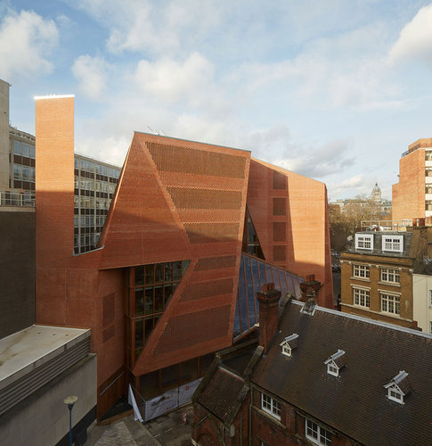
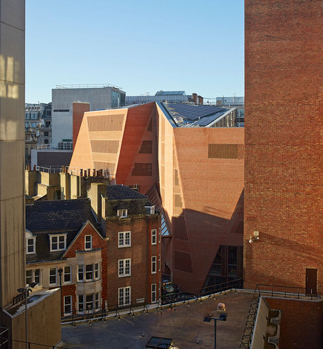
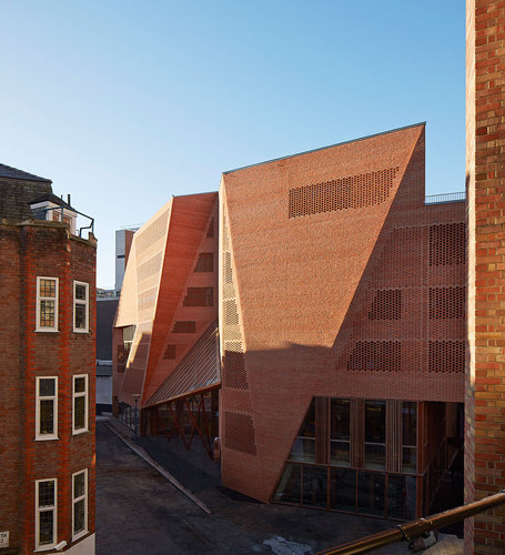
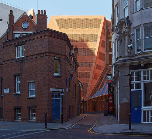
Saw Swee Hock Student Centre, London School of Economics - O’Donnell + Tuomey Architects

$
0
0

Client Brief
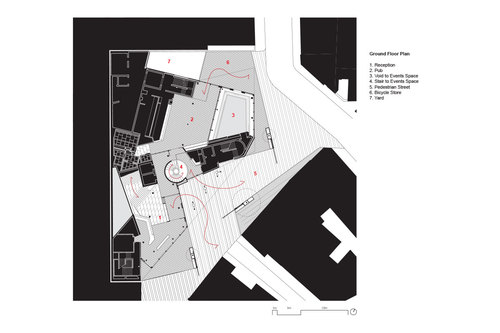
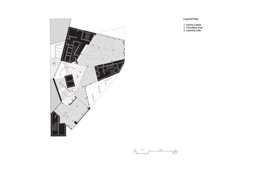
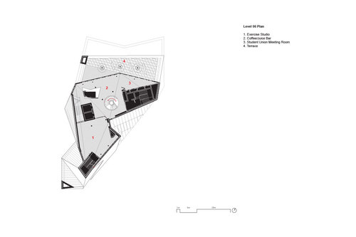
The brief was to bring student facilities together under one roof. The multi-functional building includes a venue, pub, learning café, media, prayer, offices, gym, careers, dance studio and social spaces. The brief asked for the “best student building in the UK” and had the aspiration for BREEAM Excellent rating. The design achieved BREEAM Outstanding.

O’Donnell + Tuomey Architects — Saw Swee Hock Student Centre, London School of Economics

Planning Constraints
The site lies within the Strand Conservation Area. The context was complex and the site was restricted by surrounding building lines. Specifications were closely monitored by Westminster planners, who supported the ambition for a contemporary design integrated with its setting. Throughout the building process, the planners maintained a commitment to the enduring quality of carefully crafted construction.

O’Donnell + Tuomey Architects — Saw Swee Hock Student Centre, London School of Economics

Street Life
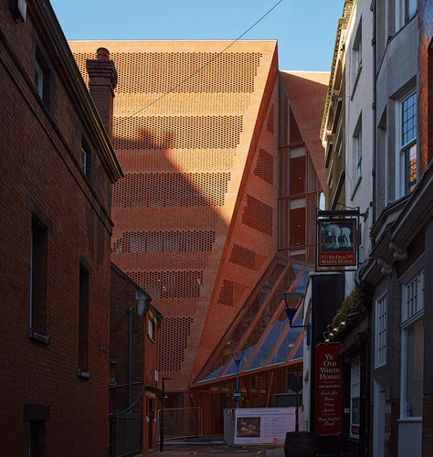
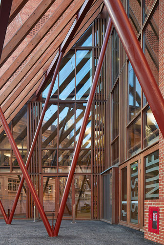
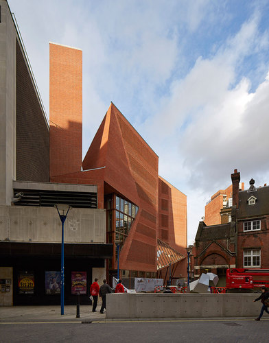
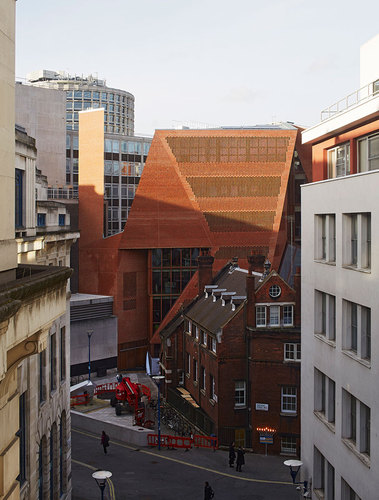
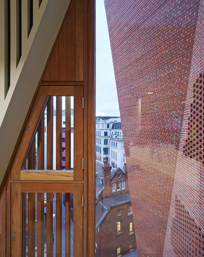
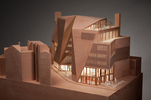
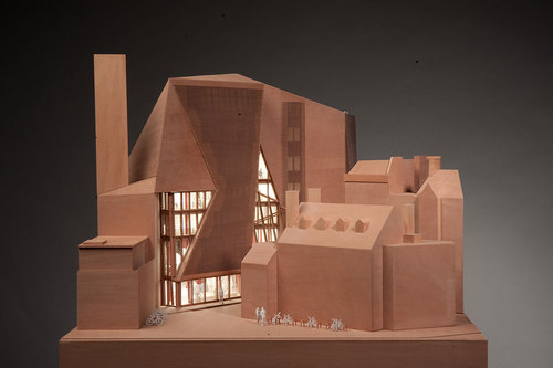
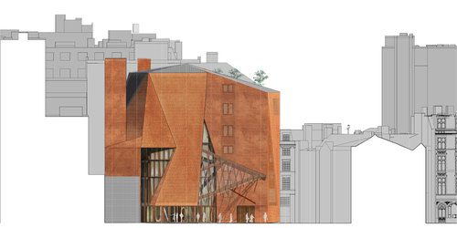
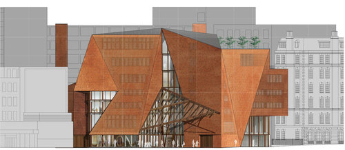
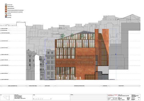
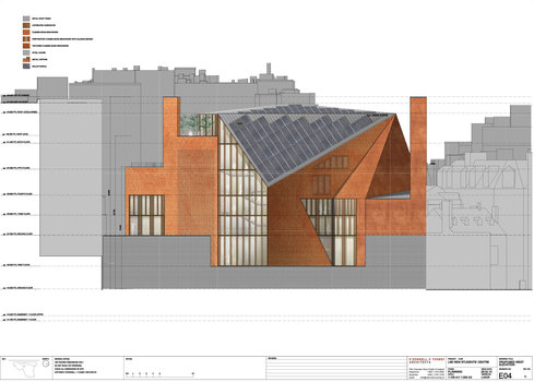
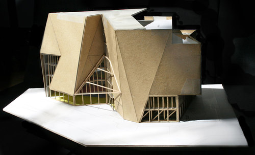
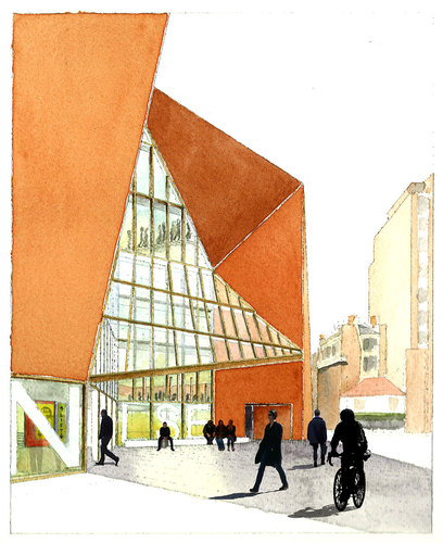
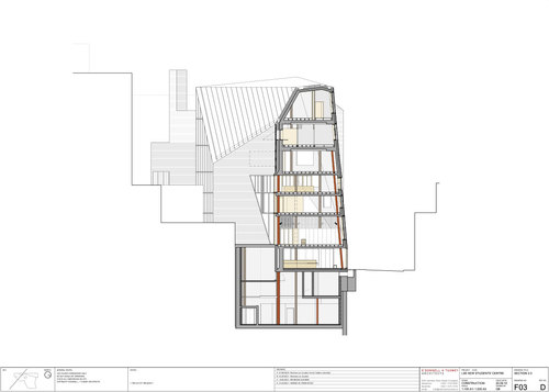
The site is located at the knuckle-point convergence of narrow streets that characterise the LSE city centre campus. The faceted façade operates with respect to the Rights of Light Envelope and is tailored to lines of sight, to be viewed from street corner perspectives and to make visual connections between internal and external circulation. The brick skin is cut along fold lines to form large areas of glazing, framing views. Analysis of the context has influenced the first principles of a site specific architectural design.

O’Donnell + Tuomey Architects — Saw Swee Hock Student Centre, London School of Economics

Embodiment
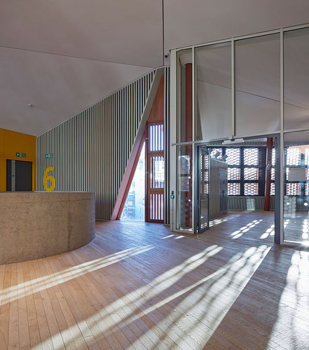
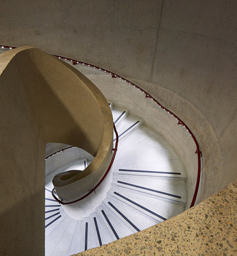
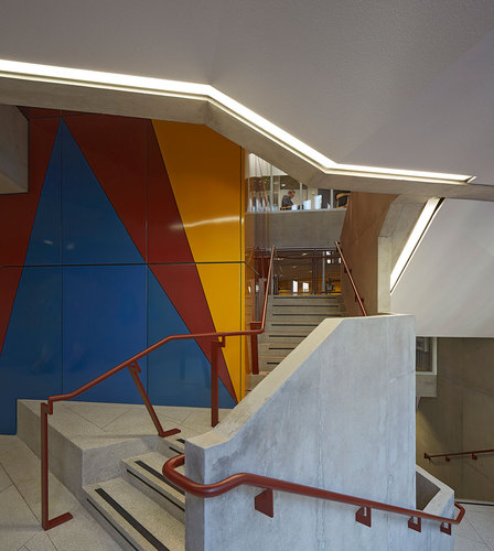
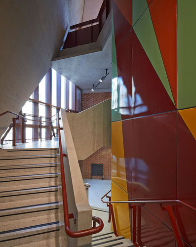
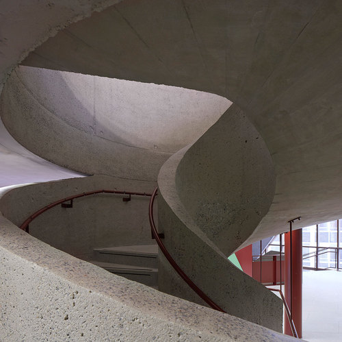
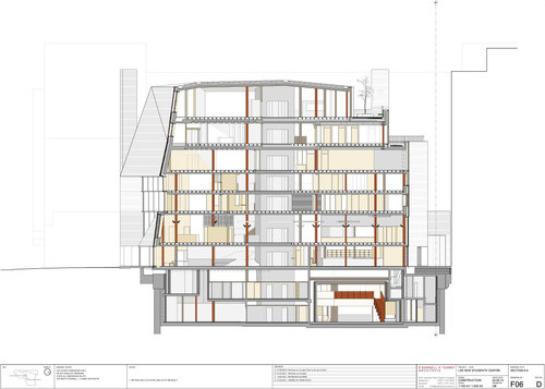
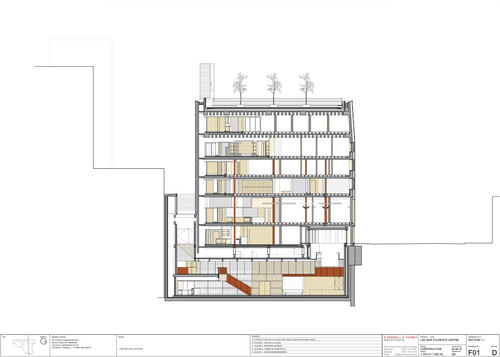
The building is designed to embody the dynamic character of a contemporary Student Centre. The complex geometries of the site provided a starting point for a lively arrangement of irregular floor plates, each particular to its function. Space flows freely in plan and section, with stairs turning to create meeting places at every level.

O’Donnell + Tuomey Architects — Saw Swee Hock Student Centre, London School of Economics

Construction, Colour and Atmosphere
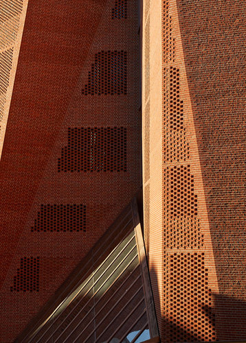
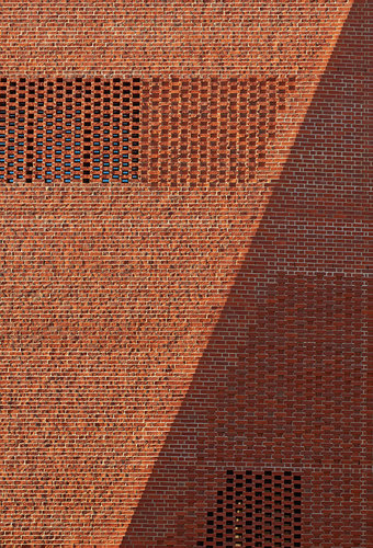
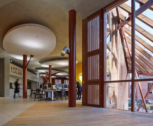
London is a city of bricks. The building is clad with bricks, with each brick offset from the next in an open work pattern, creating dappled daylight inside and glowing like a lattice lantern at night. The building has the robust adaptability of a lived-in warehouse, with solid wooden floors underfoot. The structure is a combination of reinforced concrete and steelwork. Steel trusses or ribbed concrete slabs span the big spaces. Circular steel columns prop office floors between the large span volumes and punctuate the open floor plan of the café. Concrete ceilings contribute thermal mass with acoustic clouds suspended to soften the sound. There are no closed-in corridors. Every hallway has daylight and views in at least one direction. Every office workspace has views to the outside world. The basement venue is daylit from clerestory windows.

O’Donnell + Tuomey Architects — Saw Swee Hock Student Centre, London School of Economics

Inclusive Design
The building is designed with accessibility and inclusive design as key considerations. Approaches are step free. Floor plates are flat without steps. Circulation routes are open and legible with clearly identifiable way-finding. Services are located at consistent locations. The central wide stair was carefully designed to comply with standards and details agreed with the approved inspector.

O’Donnell + Tuomey Architects — Saw Swee Hock Student Centre, London School of Economics

International Competition Winner June 2009
Completed December 2013
Works currently underway on pedestrian street landscape, due for completion June 2014 Area 6,100 sqm
Construction Budget £24,115.00

O’Donnell + Tuomey Architects — Saw Swee Hock Student Centre, London School of Economics

Consultants
Structural Engineer: Dewhurst Macfarlane and Partners / Horganlynch Consulting Engineers
Services + Environmental Engineer: BDSP
Security / Fire / Acoustics / Transport & Logistics / Venue: Arup
Catering:Tricon Foodservice Consultants
Access:David Bonnett Associates
Archaeology: Gifford
Project Manager: Turner & Townsend
Quantity Surveyor: Northcroft
Planning Consultant: Turley Associates
Party Wall Consultant: Anstey Horne
Building Control Consultant: Carillion
CDM Coordinator: Gardiner & Theobald

O’Donnell + Tuomey Architects — Saw Swee Hock Student Centre, London School of Economics

O’Donnell + Tuomey Architects — Saw Swee Hock Student Centre, London School of Economics

O’Donnell + Tuomey Architects — Saw Swee Hock Student Centre, London School of Economics

O’Donnell + Tuomey Architects — Saw Swee Hock Student Centre, London School of Economics

O’Donnell + Tuomey Architects — Saw Swee Hock Student Centre, London School of Economics

O’Donnell + Tuomey Architects — Saw Swee Hock Student Centre, London School of Economics

O’Donnell + Tuomey Architects — Saw Swee Hock Student Centre, London School of Economics

O’Donnell + Tuomey Architects — Saw Swee Hock Student Centre, London School of Economics

O’Donnell + Tuomey Architects — Saw Swee Hock Student Centre, London School of Economics

O’Donnell + Tuomey Architects — Saw Swee Hock Student Centre, London School of Economics

O’Donnell + Tuomey Architects — Saw Swee Hock Student Centre, London School of Economics

O’Donnell + Tuomey Architects — Saw Swee Hock Student Centre, London School of Economics

O’Donnell + Tuomey Architects — Saw Swee Hock Student Centre, London School of Economics

O’Donnell + Tuomey Architects — Saw Swee Hock Student Centre, London School of Economics

O’Donnell + Tuomey Architects — Saw Swee Hock Student Centre, London School of Economics

O’Donnell + Tuomey Architects — Saw Swee Hock Student Centre, London School of Economics

O’Donnell + Tuomey Architects — Saw Swee Hock Student Centre, London School of Economics

O’Donnell + Tuomey Architects — Saw Swee Hock Student Centre, London School of Economics

O’Donnell + Tuomey Architects — Saw Swee Hock Student Centre, London School of Economics

O’Donnell + Tuomey Architects — Saw Swee Hock Student Centre, London School of Economics

O’Donnell + Tuomey Architects — Saw Swee Hock Student Centre, London School of Economics

O’Donnell + Tuomey Architects — Saw Swee Hock Student Centre, London School of Economics

O’Donnell + Tuomey Architects — Saw Swee Hock Student Centre, London School of Economics

O’Donnell + Tuomey Architects — Saw Swee Hock Student Centre, London School of Economics

O’Donnell + Tuomey Architects — Saw Swee Hock Student Centre, London School of Economics

O’Donnell + Tuomey Architects — Saw Swee Hock Student Centre, London School of Economics

O’Donnell + Tuomey Architects — Saw Swee Hock Student Centre, London School of Economics

O’Donnell + Tuomey Architects — Saw Swee Hock Student Centre, London School of Economics

Ampliamento del cimitero di Gubbio - Andrea Dragoni, Francesco Pes

$
0
0

L’ampliamento del Cimitero di Gubbio indaga un nuovo modello di edificio civile. Da una parte articola l’ultima fase di crescita del cimitero monumentale di Gubbio, una delle città medioevali più importanti d’Italia, dall’altra cerca di ridefinirne il senso e la centralità all’interno della struttura della città.

Andrea Dragoni, Francesco Pes — Ampliamento del cimitero di Gubbio

L’impianto è in forma di struttura urbana con blocchi stereometrici lineari disposti a riprendere il sistema dei tracciati agrari che caratterizza il paesaggio e la città storica; questo principio insediativo è enfatizzato dall’intrusione di grandi recinti quadrati immaginati come piazze che misurano ritmicamente la struttura dell’impianto. Questi spazi sono pensati in analogia alle Skyspaces di James Turrell, e si propongono come spazi pubblici fruibili dall’esterno, indipendentemente dal cimitero, offrendo l’occasione per sostare e riflettere: “ Piazze del silenzio” in forma di volume cubo con un sfondamento del soffitto che evoca una finestra aperta verso l’alto. Il cielo così incorniciato apre un varco mentale verso i regni dell’invisibile, permettendo allo sguardo ed al pensiero di abbandonare la gravità della madre terra e conquistare una dimensione più aerea e spirituale

Andrea Dragoni, Francesco Pes — Ampliamento del cimitero di Gubbio

Questo rapporto con il cielo cerca di definire uno spazio, che è anche un tempo, nella quale ritrovare se stessi, uno spazio che spinge l’orizzonte verso l’alto come metafora del confine celeste, unico ultimo orizzonte della nostra vita nella città del moderno. Allo stesso tempo reinterpreta, aprendosi verso il cielo, la finestra-varco di Leon Battista Alberti immaginata dal grande architetto rinascimentale quale unico artificio architettonico in grado in permettere “ la pratica della quiete”, evocata dal vuoto celeste che scendendo dall’alto ci riporta a quell’imperturbabile stato d’animo senza il quale non è possibile superare le avversità della vita.

Andrea Dragoni, Francesco Pes — Ampliamento del cimitero di Gubbio

L’atmosfera di queste “Piazze del Silenzio”è resa ancora più suggestiva da una serie di installazioni artistiche permanenti, elaborate site-specific da due importanti artisti italiani: Sauro Cardinali e Nicola Renzi ( il rapporto con gli artisti è iniziato già della prime fasi del progetto ) che lavorano con la presenza e il movimento della luce zenitale, sempre mutevole durante l’arco della giornata. Tale contributo, fortemente legato all’architettura contribuisce a definire uno nuovo spazio per il silenzio e la meditazione all’interno della città.

Andrea Dragoni, Francesco Pes — Ampliamento del cimitero di Gubbio

Superficie area d’intervento: 4035 mq
Superficie Costruita: 1800 mq
Volumetria complessiva: 6000 mc
Progetto: 2004-2005
Esecuzione dei lavori:2005-2011

Andrea Dragoni, Francesco Pes — Ampliamento del cimitero di Gubbio

Andrea Dragoni, Francesco Pes — Ampliamento del cimitero di Gubbio

Andrea Dragoni, Francesco Pes — Ampliamento del cimitero di Gubbio

Andrea Dragoni, Francesco Pes — Ampliamento del cimitero di Gubbio

Andrea Dragoni, Francesco Pes — Ampliamento del cimitero di Gubbio

Andrea Dragoni, Francesco Pes — Ampliamento del cimitero di Gubbio

Andrea Dragoni, Francesco Pes — Ampliamento del cimitero di Gubbio

Andrea Dragoni, Francesco Pes — Ampliamento del cimitero di Gubbio

Andrea Dragoni, Francesco Pes — Ampliamento del cimitero di Gubbio

Andrea Dragoni, Francesco Pes — Ampliamento del cimitero di Gubbio

Andrea Dragoni, Francesco Pes — Ampliamento del cimitero di Gubbio

Andrea Dragoni, Francesco Pes — Ampliamento del cimitero di Gubbio

Andrea Dragoni, Francesco Pes — Ampliamento del cimitero di Gubbio

Andrea Dragoni, Francesco Pes — Ampliamento del cimitero di Gubbio

Andrea Dragoni, Francesco Pes — Ampliamento del cimitero di Gubbio

Andrea Dragoni, Francesco Pes — Ampliamento del cimitero di Gubbio

Andrea Dragoni, Francesco Pes — Ampliamento del cimitero di Gubbio

Andrea Dragoni, Francesco Pes — Ampliamento del cimitero di Gubbio

Andrea Dragoni, Francesco Pes — Ampliamento del cimitero di Gubbio

Andrea Dragoni, Francesco Pes — Ampliamento del cimitero di Gubbio

Andrea Dragoni, Francesco Pes — Ampliamento del cimitero di Gubbio

Andrea Dragoni, Francesco Pes — Ampliamento del cimitero di Gubbio

Jektvik Ferry Quay - Carl-Viggo Hølmebakk, Manthey Kula

$
0
0

Despite the informal program, the small service building on Jektvik ferry terminal gave rise to a number of constructional and architectural experiments. Besides meeting some pragmatic functions – a waiting room and two rest rooms – the project developed to become a study on transparency and translucency, being in the northern part of Norway which is characterized by dark winters and light summers. (Jektvik is just a few kilometres from the Arctic circle.)

Carl-Viggo Hølmebakk, Manthey Kula — Jektvik Ferry Quay

The vehicle for this study is built up as follows: A load-bearing, prefabricated, modular aluminium structure with a reversed facade glazing. I.e. a SG-facade system (“Structural Glazing”) is assembled with the outside facing inwards. Both walls and ceiling have this structure and the rooms appear inside with plane, hygienic glass surfaces. The glass units, which are composed of various combinations of frosted and coloured glass, give varying transparency and translucency to the side rooms and the surroundings.  
On the outside of the supporting aluminium structure a lath work of 48×48 pine-wood, c/c approx. 250mm is mounted. The lath work makes the underlying structure for a seamless outer skin of reinforced UV-resistant polyester. The fibre glass skin is not cast against a smooth shape (e.g. as in the hull of a boat), but hung up on the timberwork as a wet cloth before hardening, making a slightly uneven, weatherproof surface. The fibreglass work was made – like the aluminium structure – inside a closed production hall before it was taken in six parts by truck to the site.

Carl-Viggo Hølmebakk, Manthey Kula — Jektvik Ferry Quay

The main subcontractors for the house have been a glass contractor and a boat building company. All technical installations and lighting are positioned, half visible, in the zone between the glass and fibre glass. Over the flat glass ceiling this zone functions as a cold attic, which contains a ventilation aggregate, technical ducts and lighting. The working title for the project was “the shrimp” because the structure and internal organs of the house would be partially visible through the transparent layers of glass and fibre glass – as the visible organs of a live shrimp.

Carl-Viggo Hølmebakk, Manthey Kula — Jektvik Ferry Quay

Except for the weather shielding property, another quality of the skin is the maintenance benefits. The fibreglass technique is well known by inhabitants in the area, which is used for repairing their fishing boats. Cracks and dents from heavy use or vandalism can easily be fixed with local knowledge and “in stock” materials.

Carl-Viggo Hølmebakk, Manthey Kula — Jektvik Ferry Quay

It would not be correct to say that the harsh coastal climate and maintenance considerations are the only reason for the skin construction. There are other buildings nearby, built in a more conventional way, that quite well serve their purpose. The motivation for the transparent structure was also the intriguing architectural potential or possible effects of this building principle: That the house itself would serve as a light fixture in the long, dark Nordic winter – like a big Chinese lamp. Also fascinating was the possible “psychosocial” play that might unfold when the users notice movements and shadows of people inside the building or in the neighbouring rooms.

Carl-Viggo Hølmebakk, Manthey Kula — Jektvik Ferry Quay

  The special construction method has provided a house with many demanding details. The building is universally accessible with wheelchair entrances at the same level as the outdoor area. A steel grid floor surrounds the entire building, so that the transparent walls can be traced all the way down to the ground. The space beneath the grid is also the inlet chamber for ventilation of both the rooms themselves and the double wall structure. The general lighting consists of linear LED lighting fixtures that are mounted on the ceiling trusses. There are also mounted down lights that provide concentrated light to the sanitary equipment in the rooms below. Colours and visual contrasts are adapted to the visually impaired.

Carl-Viggo Hølmebakk, Manthey Kula — Jektvik Ferry Quay

About the three dimensional form of the building one could say that it is the result of a sequence of geometrical considerations and decisions:
1.The parallelogram shaped floor plan, parallel to the road, and angled towards the next house to make a secluded outdoor passage to the southern quay area.
2.The economically and technically motivated vertical walls of rectangular SG- façade units.
3.The cantilevered roof overhang, covering the entrances and lining up with the next building to make the sheltered entrance area.
4.The tilted roof, as a geometrical result of the underlying geometry (a straight planar saddle roof on top of the rooms and overhang) gives a well-adapted room for ventilation unit, ducts etc. 

Carl-Viggo Hølmebakk, Manthey Kula — Jektvik Ferry Quay

The result is a sculptural form with many internal dependencies – quite intricate, although it looks somewhat relaxed or random with its “wind queer” geometry. The geometrical considerations are of course not only logical or mathematical (as explained in the four points above), but also a sculptural conduct of a more intuitive interpretation of the site.

Carl-Viggo Hølmebakk, Manthey Kula — Jektvik Ferry Quay

As shown in the overall site plan, the project includes several new structures along the quay area – a storage building, an information pavilion, rest areas and six small dwellings for tourists and truck drivers. At this point the implemented parts are the service house and the renovated kiosk with outdoor area.

Carl-Viggo Hølmebakk, Manthey Kula — Jektvik Ferry Quay

Carl-Viggo Hølmebakk, Manthey Kula — Jektvik Ferry Quay

Carl-Viggo Hølmebakk, Manthey Kula — Jektvik Ferry Quay

Carl-Viggo Hølmebakk, Manthey Kula — Jektvik Ferry Quay

Carl-Viggo Hølmebakk, Manthey Kula — Jektvik Ferry Quay

Carl-Viggo Hølmebakk, Manthey Kula — Jektvik Ferry Quay

Carl-Viggo Hølmebakk, Manthey Kula — Jektvik Ferry Quay

Carl-Viggo Hølmebakk, Manthey Kula — Jektvik Ferry Quay

Carl-Viggo Hølmebakk, Manthey Kula — Jektvik Ferry Quay

Carl-Viggo Hølmebakk, Manthey Kula — Jektvik Ferry Quay

Carl-Viggo Hølmebakk, Manthey Kula — Jektvik Ferry Quay

Carl-Viggo Hølmebakk, Manthey Kula — Jektvik Ferry Quay

Carl-Viggo Hølmebakk, Manthey Kula — Jektvik Ferry Quay

Carl-Viggo Hølmebakk, Manthey Kula — Jektvik Ferry Quay

Carl-Viggo Hølmebakk, Manthey Kula — Jektvik Ferry Quay

Sohlbergplassen viewpoint - Carl-Viggo Hølmebakk

$
0
0

The Norwegian painter Harald Sohlberg (1869-1935) stayed in the Rondane mountain area for several years to do studies for his most famous work, Winter Night in the Mountains. The motif was a summation of sketches from several standpoints. The most recognisable position was close to where the viewpoint platform is built today.

Carl-Viggo Hølmebakk — Sohlbergplassen viewpoint

The dark silhouette of pine trees in the foreground is a significant quality of the painting, framing the almost luminescent winter landscape. Also today the site has a certain dynamic quality, between the densely growing pine trees on the hill side and the distant mountains. This relation became the starting point for the geometry and the structure of the platform.

Carl-Viggo Hølmebakk — Sohlbergplassen viewpoint

Several tests were executed by placing a ladder up against the tree trunks, trying to find the best views and interesting spaces between the trees. After the trees and topography were digitally registered, the form of the platform could be defined precisely in such a way that no trees had to be cut. It was also crucial to find a foundation system that would not destroy any roots. The ground in the area was frost-free at 2.7 meters – any traditional foundation would imply substantial excavation, and cut down of most of the trees.

Carl-Viggo Hølmebakk — Sohlbergplassen viewpoint

In early stages of the project, the platform had a somewhat flexible construction made in steel. The pillars would have “snowshoes” resting on the ground, allowing the structure to move along with the frost heave. Load tests on a 3D-model were done by the structural engineer, and showed that the curved beams would collapse when strained by snow and movements in the ground. The structure was then changed to concrete, and a torsion stiff connection between the curved beams and the floor plane could be established.

Carl-Viggo Hølmebakk — Sohlbergplassen viewpoint

The beam along the periphery of the platform also works as a railing. The beam rests on thin steel core pillars, drilled to rock, some places more than 12 meters below the ground. The rectangular openings in the floor allow rain and sunlight to get down to the terrain. A staircase leads to the space underneath the platform and further down the hill to the lake.

Carl-Viggo Hølmebakk — Sohlbergplassen viewpoint

The floor has a hardly noticeable tilt outwards (0.3 meters) giving a slight feeling of being pulled towards the view. The movement between the pine trees, from the road towards the beautiful mountain motif, became an architectural answer to the artist’s interpretation – already evident in the painting.

Location: National road 27, Atnasjø, Stor-Elvdal

Carl-Viggo Hølmebakk — Sohlbergplassen viewpoint

Carl-Viggo Hølmebakk — Sohlbergplassen viewpoint

Carl-Viggo Hølmebakk — Sohlbergplassen viewpoint

Carl-Viggo Hølmebakk — Sohlbergplassen viewpoint

Carl-Viggo Hølmebakk — Sohlbergplassen viewpoint

Carl-Viggo Hølmebakk — Sohlbergplassen viewpoint

Carl-Viggo Hølmebakk — Sohlbergplassen viewpoint

Carl-Viggo Hølmebakk — Sohlbergplassen viewpoint

Carl-Viggo Hølmebakk — Sohlbergplassen viewpoint

Carl-Viggo Hølmebakk — Sohlbergplassen viewpoint

Carl-Viggo Hølmebakk — Sohlbergplassen viewpoint

Carl-Viggo Hølmebakk — Sohlbergplassen viewpoint

Carl-Viggo Hølmebakk — Sohlbergplassen viewpoint

Carl-Viggo Hølmebakk — Sohlbergplassen viewpoint

Carl-Viggo Hølmebakk — Sohlbergplassen viewpoint

Carl-Viggo Hølmebakk — Sohlbergplassen viewpoint

Carl-Viggo Hølmebakk — Sohlbergplassen viewpoint

Carl-Viggo Hølmebakk — Sohlbergplassen viewpoint


Mountain cottage in Sollia - Carl-Viggo Hølmebakk

$
0
0

The cottage is situated 900 metres above sea level in a west facing hillside with a striking view towards the Rondane mountains. The site is lying on the back side of a vague elevation in the sloping landscape, which makes the ground slant “backwards”, away from the view. The elevation makes a beautiful foreground with a few pine trees and the ground covered with reindeer moss.

Carl-Viggo Hølmebakk — Mountain cottage in Sollia

The main volume of the cottage embraces the elevation, with the rooms organised along the view. A gravel terrace adapts to the increasing terrain and creates a sheltered outdoor space facing west and the view. On the east side is a two storey annex for toilet and drying. The annex is connected to the main building by an entrance porch.

Carl-Viggo Hølmebakk — Mountain cottage in Sollia

The ground of soil and gravel was dangerous for frost heave, and the frost depth in the area was 2.7 metres. A traditional foundation layout would to a great extent have ruined the vegetation around the building. An important aim was therefore to find a foundation principle that occupied a smaller area of the ground: - A concrete sustaining wall holds the gravel between the house and the terrain. This wall also anchors the wooden structure that cantilevers above the ground to the east. In this way the ground insulation carpet is more or less limited to the size of the building itself, while on the west side the insulation is covered by the gravel terrace.

Carl-Viggo Hølmebakk — Mountain cottage in Sollia

The cottage has a post and beam skeleton of laminated pine wood. The upper beams has a 1:60 tilt that makes a noticeable sloping ceiling in the spaces inside. The structure is exposed in the interiors and towards the terrace. The cantilevered part of the building has a covering of pine heartwood boards. The interior siding and fittings are pine plywood. The structure of the plywood ceiling generated a geometric pattern of rectangles, painted in 19 different colours. The wooden floors are pine, while the passage area along the terrace is ground concrete. The fireplace and other masonry is concrete brickwork. All exterior wood is treated with tar.

Carl-Viggo Hølmebakk — Mountain cottage in Sollia

Carl-Viggo Hølmebakk — Mountain cottage in Sollia

Carl-Viggo Hølmebakk — Mountain cottage in Sollia

Carl-Viggo Hølmebakk — Mountain cottage in Sollia

Carl-Viggo Hølmebakk — Mountain cottage in Sollia

Carl-Viggo Hølmebakk — Mountain cottage in Sollia

Carl-Viggo Hølmebakk — Mountain cottage in Sollia

Carl-Viggo Hølmebakk — Mountain cottage in Sollia

Carl-Viggo Hølmebakk — Mountain cottage in Sollia

Carl-Viggo Hølmebakk — Mountain cottage in Sollia

Carl-Viggo Hølmebakk — Mountain cottage in Sollia

Carl-Viggo Hølmebakk — Mountain cottage in Sollia

Carl-Viggo Hølmebakk — Mountain cottage in Sollia

Carl-Viggo Hølmebakk — Mountain cottage in Sollia

Carl-Viggo Hølmebakk — Mountain cottage in Sollia

De Ark - Lens°ass Architecten

$
0
0

The commission was for a building for after-school care for 10 children in special youth care (aged from 6 to 18, non-residential) with a staff room on the first floor.

Lens°ass Architecten — De Ark

Apart from the project definition, the assignment was to both find a connection with the existing buildings (terrace houses) and to create a passage/transition to an urban park. We chose not to add an end volume to the row which would have been at the expense of valuable trees, as they fill and complete the already existing gabariet. We reversed the logic: we leave valuable green for the city; we don’t make terrace house typologies and created a pavilion in the garden This pavilion is rooted between the trees and the green. By using the garden wall as a main theme there is almost no physically present building.

Lens°ass Architecten — De Ark

By deliberately choosing for the type of pavilion and garden wall theme, we have created a larger space visually and the green remains effectively present. The interplay between the two functions, city park and day centre, is an added value for both, but also for the local urban fabric. All functions are clearly delineated but are still spatially coherent. The skylights in the outer wall on the park side increase the social control in the park’s direction guarantee a friendly atmosphere and do justice to the name of the project, the Ark.

Lens°ass Architecten — De Ark

Every building material (concrete, clay and wood) were used primarily, whereby the processing is also the finishing (low Co2 & cradle to cradle). As an ecological concept, we have allocated the star role to the existing tree mass. They give the building a healthy micro climate. Rainwater from the roof is caught in the enclosed patios and a green roof. By choosing a porous ‘green’ surface, whereby water and leaves are given free rein, we provide natural infiltration of rain water.

Lens°ass Architecten — De Ark

The Ark is a protected environment from the outside World. The trees and garden wall form a perfect buffer. The trees provide ‘oxygen’ and the garden wall offers ‘security’. The outhouse becomes a home.

Lens°ass Architecten — De Ark

Lens°ass Architecten — De Ark

Lens°ass Architecten — De Ark

Lens°ass Architecten — De Ark

Lens°ass Architecten — De Ark

Lens°ass Architecten — De Ark

Lens°ass Architecten — De Ark

Lens°ass Architecten — De Ark

Lens°ass Architecten — De Ark

Lens°ass Architecten — De Ark

Lens°ass Architecten — De Ark

Lens°ass Architecten — De Ark

Lens°ass Architecten — De Ark

Lens°ass Architecten — De Ark

Lens°ass Architecten — De Ark

Lens°ass Architecten — De Ark

Lens°ass Architecten — De Ark

Lens°ass Architecten — De Ark

Lens°ass Architecten — De Ark

Lens°ass Architecten — De Ark

Lens°ass Architecten — De Ark

Lens°ass Architecten — De Ark

Lens°ass Architecten — De Ark

Lens°ass Architecten — De Ark

RRS RETAIL RECYCLING SPACE "è spinazzè" - C&P Architetti Luca Cuzzolin+Elena Pedrina

$
0
0

è spinazzèè un concept-store aperto da poco nella zona pedonale di San Dona’ di Piave, un piccolo centro della provincia veneta. Un intervento che cerca di contribuire al rilancio del centro urbano in grande sofferenza per la presenza dei nuovi colossi commerciali alle uscite delle autostrade. Attraverso il recupero di uno spazio storico, negli anni venti era un caffè-teatro, il nuovo progetto “pulisce” l’involucro e fa dialogare nuovi oggetti, nuova illuminazione con i materiali esistenti cercando nuove immagini e nuove atmosfere. Lo spazio dello shopping non solo come consumo in continuo isterico cambiamento che insegue la moda, ma come volontà di costruire uno spazio della conoscenza dei luoghi storici e con un utilizzo contemporaneo che ci interroghi. Una sfida non solo per il progetto, ma per i luoghi e per le città.

C&P Architetti Luca Cuzzolin+Elena Pedrina — RRS RETAIL RECYCLING SPACE "è spinazzè"

C&P Architetti Luca Cuzzolin+Elena Pedrina — RRS RETAIL RECYCLING SPACE "è spinazzè"

C&P Architetti Luca Cuzzolin+Elena Pedrina — RRS RETAIL RECYCLING SPACE "è spinazzè"

C&P Architetti Luca Cuzzolin+Elena Pedrina — RRS RETAIL RECYCLING SPACE "è spinazzè"

C&P Architetti Luca Cuzzolin+Elena Pedrina — RRS RETAIL RECYCLING SPACE "è spinazzè"

C&P Architetti Luca Cuzzolin+Elena Pedrina — RRS RETAIL RECYCLING SPACE "è spinazzè"

C&P Architetti Luca Cuzzolin+Elena Pedrina — RRS RETAIL RECYCLING SPACE "è spinazzè"

C&P Architetti Luca Cuzzolin+Elena Pedrina — RRS RETAIL RECYCLING SPACE "è spinazzè"

C&P Architetti Luca Cuzzolin+Elena Pedrina — RRS RETAIL RECYCLING SPACE "è spinazzè"

C&P Architetti Luca Cuzzolin+Elena Pedrina — RRS RETAIL RECYCLING SPACE "è spinazzè"

C&P Architetti Luca Cuzzolin+Elena Pedrina — RRS RETAIL RECYCLING SPACE "è spinazzè"

C&P Architetti Luca Cuzzolin+Elena Pedrina — RRS RETAIL RECYCLING SPACE "è spinazzè"

C&P Architetti Luca Cuzzolin+Elena Pedrina — RRS RETAIL RECYCLING SPACE "è spinazzè"

C&P Architetti Luca Cuzzolin+Elena Pedrina — RRS RETAIL RECYCLING SPACE "è spinazzè"

C&P Architetti Luca Cuzzolin+Elena Pedrina — RRS RETAIL RECYCLING SPACE "è spinazzè"

C&P Architetti Luca Cuzzolin+Elena Pedrina — RRS RETAIL RECYCLING SPACE "è spinazzè"

C&P Architetti Luca Cuzzolin+Elena Pedrina — RRS RETAIL RECYCLING SPACE "è spinazzè"

C&P Architetti Luca Cuzzolin+Elena Pedrina — RRS RETAIL RECYCLING SPACE "è spinazzè"

C&P Architetti Luca Cuzzolin+Elena Pedrina — RRS RETAIL RECYCLING SPACE "è spinazzè"

C&P Architetti Luca Cuzzolin+Elena Pedrina — RRS RETAIL RECYCLING SPACE "è spinazzè"

C&P Architetti Luca Cuzzolin+Elena Pedrina — RRS RETAIL RECYCLING SPACE "è spinazzè"

C&P Architetti Luca Cuzzolin+Elena Pedrina — RRS RETAIL RECYCLING SPACE "è spinazzè"

C&P Architetti Luca Cuzzolin+Elena Pedrina — RRS RETAIL RECYCLING SPACE "è spinazzè"

Rehabilitación-Adaptación de Capilla del s. XVI - Adam Bresnick arquitectos

$
0
0

La iglesia del Convento de las Jerónimas de Brihuega fue construida en 1596. Fue hospital durante una batalla de la Guerra de Sucesión Española en 1710 y posteriormente saqueada en la Guerra de la Independencia. Sobrevivió las vicisitudes de los años y finalmente fue abandonada por las monjas en 1969, debido a su estado ruinoso.

Adam Bresnick arquitectos — Rehabilitación-Adaptación de Capilla del s. XVI

La bóveda que cubría la nave se había derrumbado y se sustituyó por cerchas metálicas. Los muros portantes estaban fisurados y la vegetación crecía entre sus grietas. Aún más problemática era la situación de los dañados arcos torales encargados de soportar la cúpula. Como consecuencia del colapso de la estructura de madera del cimborrio, se había derrumbado un cuarto de la cúpula. El interior se encontraba despojado de todo adorno a excepción de las pilastras y cornisas. Las ventanas rotas y las goteras completaban la escena.

Adam Bresnick arquitectos — Rehabilitación-Adaptación de Capilla del s. XVI

El estudio de Adam Bresnick arquitectos se encargó de estudiar y ejecutar la rehabilitación de la arquitectura existente junto con la implementación de nuevos usos. La filosofía de esta intervención ha sido siempre respetar las huellas del paso del tiempo. 
En la primera fase se reparó la cubierta y se rehicieron los aleros de teja, mientras se rejuntada la fachada. Las piedras de la cornisa se dejaron con sus desperfectos y desconchones, lo mismo se hizo con la puerta de final del s. XVI. El interior se articula en 3 zonas diferenciadas:
Se reconstruyó la estructura del cimborrio y la cúpula, donde la arquitectura principal está plenamente restaurada.
La nave con su acceso lateral se trató como un conjunto de restos arqueológicos, junto con una nueva construcción que flota e incide mínimamente en el espacio principal. Como reflejo de la bóveda de antaño, se genera un nuevo techo arqueado mediante una sucesión de listones de pino maclados. La traza de la bóveda original se vislumbra sobre los muros de mampostería por el yeso y las molduras que perduraron.
Una tercera zona alberga todos los usos actuales en 4 plantas ocupando el antiguo coro, donde se encuentran escalera, baños, cocina, vestuarios y almacén. Un ascensor asegura el acceso a los usuarios con movilidad reducida. Todo este espacio nos da acceso al área en voladizo que genera un nuevo coro más íntimo, que es a su vez parte del conjunto. Como una muñeca matrioska, se crea un espacio dentro de otro. Un coro en lo más alto ocupa la bóveda y da lugar a una nueva perspectiva. El volumen de 4 pisos se inserta entre los muros de piedra vista y un lucernario sobre la escalera acentúa la separación conceptual del contenedor original.

Adam Bresnick arquitectos — Rehabilitación-Adaptación de Capilla del s. XVI

Se hace uso de los materiales originales dotándolos de un léxico más contemporáneo; el mármol crema marfil se extiende por el suelo de la nave, la pintura blanca realza muros y cornisas, finalmente listones de pino forman el techo y envuelven el coro moderno, suspendido sobre de la nave. Una estructura en hormigón blanco sujeta esta pieza, su aspecto dialogando con las piedras. Las zonas nuevas están pavimentados en resina o terrazo negro para visualmente distinguirlas de la piedra original.

Adam Bresnick arquitectos — Rehabilitación-Adaptación de Capilla del s. XVI

Adam Bresnick arquitectos — Rehabilitación-Adaptación de Capilla del s. XVI

Adam Bresnick arquitectos — Rehabilitación-Adaptación de Capilla del s. XVI

Adam Bresnick arquitectos — Rehabilitación-Adaptación de Capilla del s. XVI

Adam Bresnick arquitectos — Rehabilitación-Adaptación de Capilla del s. XVI

Adam Bresnick arquitectos — Rehabilitación-Adaptación de Capilla del s. XVI

Adam Bresnick arquitectos — Rehabilitación-Adaptación de Capilla del s. XVI

Adam Bresnick arquitectos — Rehabilitación-Adaptación de Capilla del s. XVI

Adam Bresnick arquitectos — Rehabilitación-Adaptación de Capilla del s. XVI

Adam Bresnick arquitectos — Rehabilitación-Adaptación de Capilla del s. XVI

Adam Bresnick arquitectos — Rehabilitación-Adaptación de Capilla del s. XVI

Adam Bresnick arquitectos — Rehabilitación-Adaptación de Capilla del s. XVI

Adam Bresnick arquitectos — Rehabilitación-Adaptación de Capilla del s. XVI

Adam Bresnick arquitectos — Rehabilitación-Adaptación de Capilla del s. XVI

Adam Bresnick arquitectos — Rehabilitación-Adaptación de Capilla del s. XVI

Repository - Jun Igarashi Architects

$
0
0

Private residential located north of Japan, Asahikawa, Hokkaido. The site is located on the  huge countryside outskirts of Asahikawa. I think the relationship with this landscape.

Jun Igarashi Architects — Repository

Asahikawa, summer is more than 30 degrees, and winter become -30 degrees. Here is the region that is very big difference in the temperature. So this house have only small openings and insulation performance up. And a buffer zone make a moderate the relationship with the outside world . The exterior walls use pine from Hokkaido. And also structure timbers use from a local material . I took the wooden structure because of good thermal conductivity.

Jun Igarashi Architects — Repository

Plan is surround the two hall(living dining/master bedroom) and washing room by small rooms , which form a buffer zone. Washing room has top light and it introduce the light to the entire of house. And also curtain make diffuse light.

Jun Igarashi Architects — Repository

By creating a buffer zone, it makes improving in thermal environment, and also can connect on human psychology and the surrounding environment.

Jun Igarashi Architects — Repository

Natural environment is a great presence. But sometimes it sudden change to a stern expression. This is the architecture that is thinking the relationship between the natural environment and the indoor environment continues to change daily.

Jun Igarashi Architects — Repository

Design period:2010-2011
Construction period: 2011-2012
Site area: 500.00m2
Building area: 215.95m2
Total floor area: 279.24m2
Number of stories: 2 above ground
Structure: Timber frame

Jun Igarashi Architects — Repository

Jun Igarashi Architects — Repository

Jun Igarashi Architects — Repository

Jun Igarashi Architects — Repository

Jun Igarashi Architects — Repository

Jun Igarashi Architects — Repository

Jun Igarashi Architects — Repository

Jun Igarashi Architects — Repository

Jun Igarashi Architects — Repository

Jun Igarashi Architects — Repository

Jun Igarashi Architects — Repository

Jun Igarashi Architects — Repository

Jun Igarashi Architects — Repository

Jun Igarashi Architects — Repository

Jun Igarashi Architects — Repository

Jun Igarashi Architects — Repository

Jun Igarashi Architects — Repository

Jun Igarashi Architects — Repository

Jun Igarashi Architects — Repository

Jun Igarashi Architects — Repository

Kabinett - septembre

$
0
0

The conversion of a former manufacturing workshop in a Parisian alley to a family apartment. Multifunctional wooden cabinetry lines the perimeter of the space to open up the central living area. A generous glassed section in a separative wall allows light to pass into both of the bedrooms and visually enlarges the living room.

septembre — Kabinett

Mission : Complete mission, (from conception to construction supervision)
Construction Budget : 120 000 euros
Calendar : Delivery in November 2012
Surface : 83 m²

septembre — Kabinett

septembre — Kabinett

septembre — Kabinett

septembre — Kabinett

septembre — Kabinett

septembre — Kabinett

septembre — Kabinett

septembre — Kabinett

septembre — Kabinett

septembre — Kabinett

septembre — Kabinett

septembre — Kabinett

septembre — Kabinett

Boma - NU architectuuratelier

$
0
0

On a unique location in the inner city of Ghent, a single family house is constructed within the walls of an old industrial building. The former forge and carpentry became the scene for a new home. Some of the existing shed roofs are teared down, some parts remain. Similarly, part of the concrete flooring is kept and part demolished.

NU architectuuratelier — Boma

The house, a combined wood and steel construction with a rational structure and clear materialization, cuts the parcel in two. As a result, a south oriented beam shaped volume absorbs the confrontation between two complementary outdoor spaces: a walled garden and a workplace.

NU architectuuratelier — Boma

The house is designed as a transparent filter between these front and back areas: the classical principle where glazing is movable and walls are fixed is inverted. Opening a door has an immediate impact on the spatial constellation. Even the division between front and back façade becomes ambiguous.

NU architectuuratelier — Boma

Three containers are placed at strategic locations on the street side.For economical benefit, these compact steel prefabricated modules are used as winter entry and storage, perpendicular to the house, and as a B&B high above the entrance gate.

Location: Bomastraat 20 – 22, 9000 Gent
completion: december 2010
surface: 102 sq m (floor surface area on ground floor) program: Rebuilding of a former forge to a single-family house with Bed & Breakfast.

NU architectuuratelier — Boma

NU architectuuratelier — Boma

NU architectuuratelier — Boma

NU architectuuratelier — Boma

NU architectuuratelier — Boma

NU architectuuratelier — Boma

NU architectuuratelier — Boma

NU architectuuratelier — Boma

NU architectuuratelier — Boma

NU architectuuratelier — Boma

NU architectuuratelier — Boma

NU architectuuratelier — Boma

NU architectuuratelier — Boma

NU architectuuratelier — Boma

NU architectuuratelier — Boma

NU architectuuratelier — Boma

NU architectuuratelier — Boma

NU architectuuratelier — Boma

NU architectuuratelier — Boma

NU architectuuratelier — Boma

NU architectuuratelier — Boma

NU architectuuratelier — Boma


Mountain cabin in Laternser valley - Marte.Marte Architekten

$
0
0

At the edge of a wooded ravine, beneath the imposing wooden house of the Catholic Community of Sisters, the small tower building rises from the steep hillside. Striking and modest in appearance, it stretches up out of a small hollow situated on a narrow path along the edge of the forest. The only change made to the hillside is the driveway and the terrain has been left in its original form.

Marte.Marte Architekten — Mountain cabin in Laternser valley

Fitting into the landscape as if it were a barn, the building, which is a fine example of the homogeneous use of materials, in this case, carefully hewn rough concrete, stands out against the meadow green and winter white. Its ashy-gray colour only contrasts slightly with the heavy oak front doors and the anthracite-coloured handrails blend in with the branches of the surrounding forest. As if they were punched into the walls, the square windows of different sizes are spread out across the walls, and their full effect is only achieved at the corners.

Marte.Marte Architekten — Mountain cabin in Laternser valley

The integration of the outer surfaces requested by the client is a kind of artifice. At the entry level, which is accessible via a flight a steps, the structure narrows down to two supporting corner columns, which not only provides guests with the unique opportunity to look through the building while at the same time enjoying a panorama view of the surrounding landscape, the whole time protected from the elements, but also lends the entrance a sense of significance. Inside the column, a spiral staircase connects the living area on the upper level with the two more private areas on the lower level, where the bedrooms and relaxation areas are interlocked like a puzzle. Semantically speaking, this gesture of the tower creates archetypes of fortified structures and abstract computer figures in your mind’s eye, making the tower seem familiar and strange at one and the same time.

Marte.Marte Architekten — Mountain cabin in Laternser valley

Inside, the openings punched into the double-walled concrete shell are transformed into framed landscape paintings by wide, matte solid oak window frames that do not take up much wall space. These framed windows direct the guest’s attention to the prominent mountain chain, the gentle slopes and the dense forest grove. Besides the raw concrete surfaces and the untreated oak floors, doors and fixtures, the black metal surfaces complement the harmonious, austere combination of materials. The client and architects haven’t built a flimsy holiday house, but instead a place of retreat that will remain standing for generations, despite any forthcoming changes of climate and landscape.
[Marina Hämmerle]

Marte.Marte Architekten — Mountain cabin in Laternser valley

Marte.Marte Architekten — Mountain cabin in Laternser valley

Marte.Marte Architekten — Mountain cabin in Laternser valley

Marte.Marte Architekten — Mountain cabin in Laternser valley

Marte.Marte Architekten — Mountain cabin in Laternser valley

Marte.Marte Architekten — Mountain cabin in Laternser valley

Marte.Marte Architekten — Mountain cabin in Laternser valley

Marte.Marte Architekten — Mountain cabin in Laternser valley

Marte.Marte Architekten — Mountain cabin in Laternser valley

Marte.Marte Architekten — Mountain cabin in Laternser valley

Marte.Marte Architekten — Mountain cabin in Laternser valley

Marte.Marte Architekten — Mountain cabin in Laternser valley

Marte.Marte Architekten — Mountain cabin in Laternser valley

Marte.Marte Architekten — Mountain cabin in Laternser valley

Marte.Marte Architekten — Mountain cabin in Laternser valley

David Zwirner 20th Street - Selldorf Architects

$
0
0

This 30,000 sf gallery for contemporary art is located in West Chelsea, a former industrial neighborhood now home to art galleries, new iconic architectural developments, and the High Line. The neighborhood’s industrial heritage inspired the simplicity and monumentality of the building’s design which echoes the disciplined forms of surrounding warehouse buildings. Made from exposed concrete, the façade is both rough and refined—having the grittiness to resonate with industrial structures but also the elegance and craftsmanship to create a unique and refined identity for the gallery. On the ground floor, a sliding teak storefront system allows the base of the building to open for art access. Teak, which is also used for the window frames on upper floors, creates a warm contrast to the rough texture and cool tones of the concrete.

Selldorf Architects — David Zwirner 20th Street

Built to museum-quality standards, the building is specifically designed to accommodate large installations and exhibitions of works by estate artists. Inside, gallery and showroom spaces are diverse in their scale, materiality, and lighting, offering a flexible range of environments for the display of art. On the ground floor, the main exhibition space is an expansive 5,000 sf column-free gallery with an 18’-6” ceiling. Concrete floors bring an industrial sensibility to the space, along with four north-facing sawtooth skylights. Adjacent to the main gallery, a smaller exhibition space is more subdued with its intimate proportions, travertine floor, and a semi-transparent laylight. Public exhibition space continues on the second floor with a very different environment: a 2,000 sf space with 14’ ceilings and white oak floors. Unlike the skylit ground floor, second floor galleries are lit naturally from the side by a series of large windows. Levels three, four, and five contain the gallery’s private functions such as viewing rooms, offices, a library, and art handling areas.

Selldorf Architects — David Zwirner 20th Street

Exposed concrete forms the gallery’s entry spaces as well as the dramatic, sky lit atrium stair which penetrates the entire volume of the building. The board-formed texture appears on atrium walls, while the more delicate stair runs have a smooth finish and one-inch reveal. Open to each of the five floors, the atrium stair creates a counterpoint to the restrained exhibition spaces.

Selldorf Architects — David Zwirner 20th Street

The building sets a new environmental standard for art-related facilities as the first LEED certified commercial art gallery in the U.S. With a target of LEED Gold, the project incorporates environmentally-conscious strategies such as five green roof spaces, premium efficiency mechanical and lighting, maximized daylighting, and locally and responsibly sourced materials.

Selldorf Architects — David Zwirner 20th Street

Selldorf Architects — David Zwirner 20th Street

Selldorf Architects — David Zwirner 20th Street

Selldorf Architects — David Zwirner 20th Street

DC Tower I - Dominique Perrault Architecture

$
0
0

When an architect delivers a building it is always an extremely emotional moment, marked by the end of a long process of mediation, from absolute potentiality of early sketches to fine tuning in situ of final details. An actor, for a time, in the endless development of territories, the architect exits the scene. He hands over the controls to those he has been working for. This is the moment when architecture transitions from the intellectual, conceptual state to the fundamentally physical and real. In Vienna, these feelings are magnified by the iconic character and extreme visibility of the DC Tower 1, but also by the history that binds me to the project. One beginning twelve years ago, in 2002, when WED held an international competition for the development of the last remaining section of Donau City, and a history which continues to be written.

Dominique Perrault Architecture — DC Tower I

From the start the project offered a site with incredible potential: an open terrain, facing Imperial Vienna, embedded in the geography of the Danube, lying on a plateau on the river’s eastern bank, like a bridgehead to two Viennas. But the site was not virgin territory as several previous projects had been conceived for it. So there was a conceptual “already there”, a thoroughly fascinating virtuality. Very early on, what kindled my interest most in this site was the bridgehead with the rest of the Donau City district, with the river banks but also the conditions for breathing life into a public space on an esplanade. We took advantage of this commission to design a genuine entry gate to Donau City. Reversing objectives for earlier development projects envisaged here, WED specifications called for a decidedly mixed-use program, an indispensable condition for germinating the contemporary urban vibration we were proposing to create in and around the towers.

Dominique Perrault Architecture — DC Tower I

The towers function as two pieces of a gigantic monolith that seems to have split into two unequal halves, which then open to create an arch with undulating and shimmering façades that bring the newly created public space to life in the void created there. Dancing on their platform, the towers are slightly oriented toward the river to open a dialogue with the rest of the city, turning their backs on no one, neither the historic nor the new Vienna.

Dominique Perrault Architecture — DC Tower I

Today, the first of the two towers is up and the result is quite amazing, thanks notably to the invaluable collaboration of the Hoffmann-Janz architecture office. The visual qualities of the folded façade create a new way to read the skyline of Donau City, its undulations signaling the entry point of this new polarity. The folds contrast with the no-nonsense rigor of the other three façades, creating a tension that electrifies the public space at the tower’s base.

Dominique Perrault Architecture — DC Tower I

The façade’s folds give the tower a liquid, immaterial character, a malleability constantly adapting to the light, a reflection or an event. For interior spaces, on the other hand, with Gaëlle Lauriot-Prévost, the associate designer, we have tried to make the building very physical and present. The structure is not hidden, does not evade the eye. The exposed concrete framework is touchable. Stone and metal used in lobbies and circulations contribute to the tower’s generous and reassuring physicality.

Dominique Perrault Architecture — DC Tower I

We have tried to avoid a tendency in contemporary architectural production to hide the architect’s real work, of sewing, suturing the project and contextualizing and anchoring it in the environment. Design emerges in a later phase. Towers floating above the ground are too severe, like architectural objects, objects in themselves. They must land, take root in the soil of cities, in places where their urban substance is found. The aim is to get the basic horizontality of the city and the public space to coincide with vertical trajectories. The work on the base and foundation of the DC Tower 1 was highly stimulating.

Dominique Perrault Architecture — DC Tower I

Architectural arrangements determine the tower’s relationship to the ground. On the back façade, the public space rises from the level of the esplanade in a series of staggered steps to reach the ground reference plane. This structuring of topography launches the tower and creates a spatial interface accessible to all, making the occurrence of such a physical object both possible and acceptable. On the other three façades, metallic umbrellas gradually rise from the ground on the approach, softening the violence of the eruption and blending city and movement into the tower’s future. Important work on neighborhood fringes remains to be done to reveal the geographic features of this urban landscape and take better advantage of the river bank.

Dominique Perrault Architecture — DC Tower I

With this first tower the city of Vienna has demonstrated that the punctual and controlled emergence of high-rises can participate in creating the city and produce contemporary, economical, high-energy performance mixed-use buildings adapted to metropolitan business requirements and lifestyles.

Dominique Perrault Architecture — DC Tower I

Dominique Perrault Architecture — DC Tower I

Dominique Perrault Architecture — DC Tower I

Dominique Perrault Architecture — DC Tower I

Dominique Perrault Architecture — DC Tower I

Dominique Perrault Architecture — DC Tower I

Dominique Perrault Architecture — DC Tower I

Dominique Perrault Architecture — DC Tower I

Dominique Perrault Architecture — DC Tower I

Dominique Perrault Architecture — DC Tower I

Dominique Perrault Architecture — DC Tower I

Dominique Perrault Architecture — DC Tower I

Dominique Perrault Architecture — DC Tower I

House O - Jun Igarashi Architects

$
0
0

About the Site. The site sits in Northern Japan, in a small city of Eastern Hokkaido with a mere population of 7000. The forestry industry has been lasting since long ago, however depopulation advances while the factory industry declines. The house sits on a large site of about 2000 square meter in such a city. Building density in the area is very low, a unique cityscape in Japan. To the East, across the street, there is a wood factory, to the West, a hospital. The house has quite a distance from the nearest neighbors sitting to the South and North making it difficult to draw from the context.

Jun Igarashi Architects — House O

The Program
For the couple who will be residing here, the basic program is placed in; entry foyer, entry storage, family room, kitchen, guest room, bedroom, side room, wash closet, wash room, and bath. The residents do not want to feel the eyes of the passer-bys and that there is no difference in floor level.

Jun Igarashi Architects — House O

The Project
As we begin our studies with the given condition, a rational square plan is constructed with the rooms fitted into the plan. However, we realize that this method creates extra circulation corridors and orients rooms and views in an irrational manner. The smallest plan of each program is cut out to be placed in a location and orientation that is favorable. For example, the kitchen is placed in a “selfish” way to look out to the tree garden on the site, and then connected the dinning to the kitchen. With this method, the extra circulation corridors to connect the spaces and hierarchy due to its location and orientation are omitted.

Jun Igarashi Architects — House O

Volumetric study follows by setting all volume to 10 m high. From this point, according to the room function and area, the appropriate ceiling height is applied to each volume. Each volume becomes shorter as it sprawls from the tallest central living room. From certain points of the site, the house may look symmetrical but one step over, the form changes; similar phenomenon to construct in nature.

Jun Igarashi Architects — House O

Furthermore, the site is in an extremely cold climate area and there is a very large difference in temperature throughout the year. This plan of the house, compared to the original square plan, creates various nooks and crannies on the exterior form, allowing for facades to be in light and shade. These nooks are viewed as buffer space which windows are oriented towards. The temperature difference between the façade which faces the sun and shade creates ventilation in the summer. On the other hand, during the winter, the nooks protect the windows from the cold wind and avoid the snow. This form is similar to some cacti which strive in the desert. A section of a cactus shows that they have folds in the surface to create shades to keep it cool. A comfortable architecture is created when drawing from such a simple form in nature, and is a starting point for new type of architecture.

Jun Igarashi Architects — House O

Design period: 2008
Construction period: 2008-2009
Site area: 1,483.65m2
Building area: 112.15m2
Total floor area: 112.15m2
Number of stories: 1 above ground
Structure: Timber frame

Jun Igarashi Architects — House O

Villa H in W - Stéphane Beel Architect

$
0
0

The valuable landscape aspect of the area is characterised above all by the natural distribution of detached groups of trees alternating with expansive gentle slopes. The combination of low vegetation, grass and bushes with groups of tall trees provides this landscape with its typical views. In the course of time the farm buildings have formed a natural balance with the landscape: the buildings have themselves become essential components of this characteristic landscape. It is necessary to thoroughly analyse the existing landscape and typologies and the situation on the ground so as to be able to assimilate these data in a sound and interesting manner.

Stéphane Beel Architect — Villa H in W

The design of the new building is founded, on several scales, on the typical features of the landscape and the existing buildings. A place to live, both in the landscape and in the house itself. The former yard is reinterpreted and reintroduced. The basic concept of the yard comprises the marking off of a place in the landscape where people can live and work, and this is here translated to a contemporary context. The existing farmhouse is reinterpreted as a contemporary home that refers distinctly to the old typology. Habitation is reduced to the purest form of living in a place, in a building on a yard in a landscape.

Design – execution: 2005 – January 2010
Surface: 330m2

Stéphane Beel Architect — Villa H in W

Stéphane Beel Architect — Villa H in W

Stéphane Beel Architect — Villa H in W

Stéphane Beel Architect — Villa H in W

Stéphane Beel Architect — Villa H in W

Stéphane Beel Architect — Villa H in W

Stéphane Beel Architect — Villa H in W

Stéphane Beel Architect — Villa H in W

Stéphane Beel Architect — Villa H in W

Stéphane Beel Architect — Villa H in W

Stéphane Beel Architect — Villa H in W

Stéphane Beel Architect — Villa H in W

Stéphane Beel Architect — Villa H in W

Stéphane Beel Architect — Villa H in W

Viewing all 1949 articles
Browse latest View live


Latest Images