Quantcast
Channel: Divisare - Projects — Top Favorites of the Week
Viewing all 1949 articles
Browse latest View live

SMMPC - Antonini + Darmon Architectes

$
0
0

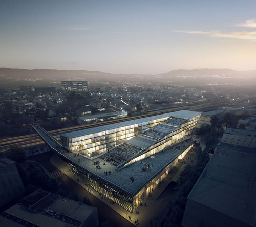
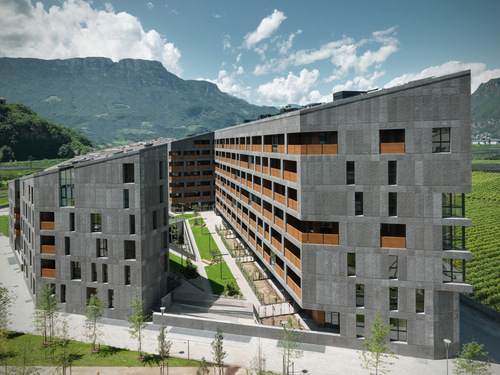
The project is located in an urban controlled BIA“Landy-Pleyel.” It enjoys an exceptional location with unobstructed views: west side of the park, east side of the tracks, south on Academy Fratellini. Our project is part of a current vision of contemporary city, with two strong aspirations: the implementation of a modern environment and the quality of life of a functional taking into account the requirements of sustainable development.
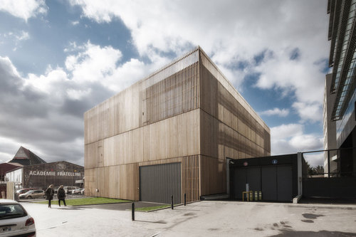
Antonini-darmon-architect-biblio_st_denis_001_large

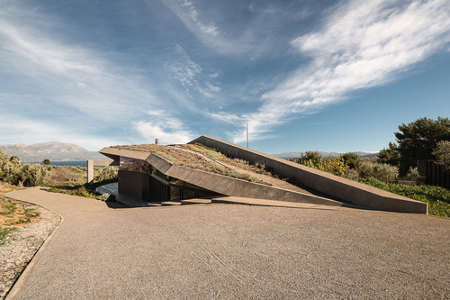
The building has a function “tarchives-premises” it is the heart and memory of the network media libraries Plaine Commune. We designed it like physical memory: a “hard drive”, its architecture is thaught as contemporary and ambitious. It’s goal is to be an icon, a signal in the city.
The starting point of our discussion focuses on the importance of the functionality of the program to interact with the architecture of the BIA, as well as users and visitors. Echoing the atypical and fun atmosphere offered by the occupants of the Academy Fratellini (respect for environment, wooden building, the desire to preserve and create an ecosystem ….), we designed an intervention respectful and simple.

Antonini-darmon-architect-biblio_st_denis_001-a_large

This induces the expression of contemporary architecture, dynamic and unifying for the neighborhood. The building is massive in order inertia and saving the project while having a significant environmental writing (wooden facades). The project, by its height of three levels, is visible from all the surrounding buildings. It must be visually appealing and should add value to the neighborhood. A neat graphic work will be done on signage within the building, its facade and its access. The orange color is available in plain common reference.

Antonini-darmon-architect-biblio_st_denis_002_large

Ground floor, is the hall which gives direct access to all functions of the program through a vertical circulation core of efficient and compact. At this level, to organize the logistics areas, locker rooms, garage bookmobile and shuttles. There is also the reception area / tri + waste disposal direct connection with the technical area and the local waste while maintaining a privileged position with the buffer space and collective reserves lie in first level.

Antonini-darmon-architect-biblio_st_denis_003_hd_fx_large

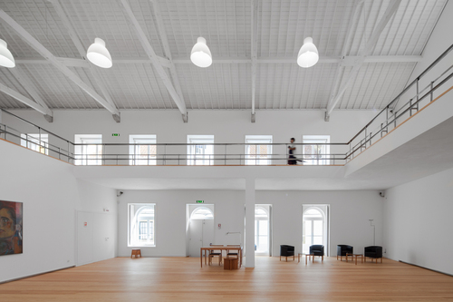
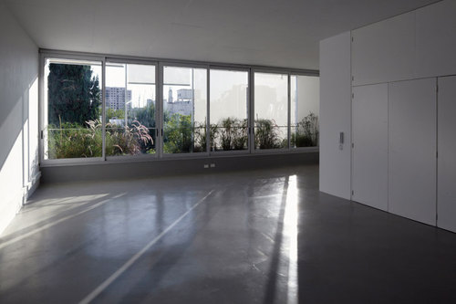
Second level, spaces are coiled and management training for which we wanted unobstructed views and a good amount of natural light. Management and administration and lie between offices and training space. A central patio provides outstanding image of a “cloister”, the patio lights and parts breakdown naturally, it is above all the creation of a place of sociability and encounters. This device combines strong environmental concerns closely to the improved quality of workspaces and life.

Program: archives, premises and Mobile library
Area : 1562 sqm
Cost : 2,6 M € HT

Antonini-darmon-architect-biblio_st_denis_004_large

Le projet se situe dans un tissu urbain contrôlé de la ZAC« Landy-Pleyel ». Il bénéficie d’une situation exceptionnelle avec des vues dégagées : coté Ouest sur le parc, coté Est sur les voies ferrées, au Sud sur l’académie Fratellini. Notre projet s’inscrit dans une vision actuelle, contemporaine de la ville, avec deux aspirations fortes : la mise en œuvre d’un environnement moderne et celle d’une qualité de vie fonctionnelle prenant en compte les exigences d’un développement durable. Le bâtiment a une fonction « technique-tertiaire », il est le cœur et la mémoire du réseau des médiathèques de Plaine commune. Nous l’avons conçu à l’instar d’une mémoire physique : un « disque dur » ; son architecture est pensée de manière actuelle et ambitieuse. Il doit être une icône, un signal dans la ville.

Antonini-darmon-architect-biblio_st_denis_005_large

Le point de départ de notre réflexion est axé sur l’importance de la fonctionnalité du programme qui doit dialoguer avec l’architecture de la ZAC, ainsi qu’avec les utilisateurs et les visiteurs. Faisant écho à l’ambiance atypique et ludique offerte par les occupants de l’Académie Fratellini (respect de environnement, bâtiment en bois ; la volonté de préserver et créer un écosystème….), nous avons imaginé une intervention respectueuse et simple. Cela induit l’expression d’une architecture contemporaine, dynamique et fédératrice pour le quartier. Le bâtiment est massif dans un souci d’inertie et d’économie du projet tout en ayant une écriture environnementale marquée (façades en bois). Le projet, par sa hauteur en R+2, est visible de tous les bâtiments qui l’entourent. Il doit être visuellement agréable et doit apporter une valeur ajoutée au quartier. Un travail graphique soigné sur la signalétique sera effectué au sein du bâtiment, de ses façades et ses accès. La couleur orange est proposée en référence à plaine commune.

Antonini-darmon-architect-biblio_st_denis_008_large

Au RDC, se situe le hall qui donne des accès directs à toutes les fonctions du programme grâce à un noyau de circulation vertical efficace et compact. A ce niveau, s’organisent les espaces logistiques, les vestiaires, le garage bibliobus et les navettes. On y trouve aussi l’espace de réception /tri+ élimination des déchets en connexion directe avec l’aire technique et le local des déchets, tout en gardant une position privilégiée avec l’espace tampon et les réserves collectives qui se situent en R+1.

Antonini-darmon-architect-biblio_st_denis_009_large

Au R+2, se lovent les espaces de direction et de formation pour lesquels nous avons voulu des vues dégagées et un très bon apport de lumière naturelle. La direction et ainsi que l’administration se trouvent entre les bureaux et l’espace de formation. Un patio central permet une circulation à l’image d’un « cloitre », ce patio ventile et éclaire les pièces naturellement ; il est avant tout la création d’un lieu de sociabilité et de rencontres. Ce dispositif mêle intimement préoccupations environnementales fortes à la qualité accrue des espaces de travail et de vie.

Antonini-darmon-architect-biblio_st_denis_010_large

Antonini-darmon-architect-biblio_st_denis_011_large

Antonini-darmon-architect-biblio_st_denis_012_large

Antonini-darmon-architect-biblio_st_denis_016_large

Antonini-darmon-architect-biblio_st_denis_017_large

Antonini-darmon-architect-biblio_st_denis_018_large

Antonini-darmon-architect-biblio_st_denis_020_large

Antonini-darmon-architect-biblio_st_denis_021_large

Ad_025_pro_pln-rdc_large

Ad_025_pro_pln-r_1_large

Ad_025_pro_pln-r_2_large

Ad_025_pro_pln-r_3_500_large

Ad_025_axo-legende-1_large


LINKAGE - Kengo Kuma & Associates, Architetti Pedrozzi e Diaz Saravia

$
0
0

L’intero intervento assume come principale caposaldo la volontà di ricucire le due zone della città di Mendrisio, lavorando sinergicamente con le infrastrutture ferroviarie esistenti e ribaltandone il ruolo di vincolo in quello di un possibile auspicato arricchimento: una passerella aerea ed un ampio sottopassaggio rinnovano l’intera circolazione nel comparto della stazione, facendo entrare in risonanza anche tutte quelle vie che raggiungono direttamente il centro storico ed il polo universitario dell’Accademia di architettura. Pensare alla vicina ferrovia, ha significato essenzialmente rivelare attraverso l’opera architettonica una possibile ragnatela di connessioni che non si limita alla città di Mendrisio, ma si estende all’intera regione insubrica: il progetto perciò resta volutamente in bilico tra l’infrastruttura ed il paesaggio artificiale, mantenendo, al contempo, i tratti distintivi di un edificio urbano e rappresentativo.

Walkupthehill_large

L’edificio è da intendersi come elemento catalizzatore di un futuro sviluppo urbano sul lato nord della linea ferroviaria, nell’ambito di un piano di riqualificazione e rinnovamento dell’area. In quest’ottica la chiusura verso la ferrovia e l’apertura sul lato nord sono il punto di partenza di un dialogo con l’intorno sia esso esistente o di futura costruzione. In particolare la presenza di una piazza lungo il confine sud della parcella guarda ad un ipotetico edificio di nuova costruzione con cui condividere o ampliare questo spazio pubblico in futuro.

001_large

Le riflessioni sui criteri di sostenibilità delle opere costruite rispondono ad una nuova consapevolezza sulla necessità di definire dei parametri comuni nella società contemporanea; parametri che regolino, secondo una convenzione condivisa, un uso parsimonioso delle risorse. Tuttavia tale concetto non può essere semplicemente appiattito su una mera parametrizzazione, ma richiede una elaborazione più sofisticata delle innumerevoli variabili che sono coinvolte nell’atto di costruire ed abitare gli spazi. Il progetto propone una strategia che intoni le soluzioni tecniche con la modulazione degli spazi, interni ed esterni, nella convinzione che non vi sia una soluzione univoca quanto un accordarsi di soluzioni parziali, dove le scelte progettuali dei diversi ambiti specialistici incontrano il proprio reale valore nell’intreccio di relazioni tra le diverse discipline. Il progetto della nuova sede della SUPSI presenta un programma ambizioso tanto per scala dimensionale, quanto per la volontà di proporre un edificio che si presenti nel territorio come un esempio di ingegno tecnico infrastrutturale e di gestione ed implementazione tecnologica delle risorse. Le strategie progettuali hanno riferito l’edificio ad un contesto ben più ampio, dando lettura dell’edificio come una parte di città, dove le decisioni progettuali hanno conseguenze tanto sul comfort degli utenti dell’edificio, quanto sul benessere dei cittadini di Mendrisio.

019_large

L’edificio è formato da corpi stretti che si allungano sull’intera estensione del sito, degradando dolcemente verso i quartieri retrostanti. L’impronta degli edifici disegna una sequenza di spazi aperti, pavimentati e verdi che permettono una gestione del suolo varia e ricca, con piantumazioni e disegni minerali. L’edificio si propone come un concentrato di possibili declinazioni dell’uso del verde: oltre alla copertura-promenade, una parete verde posta lungo via al Gas, è usata sia come schermo solare, sia come ingegnoso sistema di rinaturalizzazione antropizzata del sito. Gli ampi tagli nell’edificio e i corpi di fabbrica sottili offrono la possibilità alla luce naturale di entrare e di garantire una corretta illuminazione naturale, attenuando il problema dell’abbagliamento tramite un misurato sistema di schermature fisse e mobili fatto di sottili lastre di pietra alternate a pannelli di alluminio. La copertura promenade rappresenta la concretizzazione del collegamento tra la futura area universitaria della SUPSI, la stazione e il centro della città di Mendrisio. Il collegamento principale con la stazione è effettuato tramite il sottopassaggio esistente localizzato all’estremità nord della parcella. Questi è da intendersi ampliato ed adeguato in conseguenza di un incremento futuro del flusso di utenza e all’aggiunta di una corsia ciclabile al suo interno.

Img_2053_large

Assumendo che la maggior parte degli studenti, dei collaboratori e docenti giungerà all’università tramite questo sottopassaggio La quota d’arrivo di quest’ultimo è adottata come quota d’ingresso alla SUPSI. E’ previsto un secondo collegamento pedonale sotto forma di ponte leggero all’estremità opposta del sito. La copertura/promenade non è altro che il collegamento diretto fra questi due accessi. Lungo questo asse sono distribute quelle funzioni del programma destinate sia all’università sia ad un pubblico esterno. La ricchezza degli spazi esterni è data dalla molteplicità di luoghi offerti, spazi aperti e soleggiati, terrazze inclinate, luoghi riparati ed ombreggiati, piazze minerali che, durante l’anno, alternano squarci di luce diretta e zone ombreggiate e fresche a seconda della loro posizione lungo i corpi di fabbrica, grazie alle continue variazioni in sezione dell’edificio.

020_large

Si ipotizza un concetto impiantistico integrato di ventilazione naturale e meccanica nei locali. Particolare attenzione è stata rivolta allo studio dell’involucro edilizio e alla gestione dell’illuminazione naturale: La tecnologia costruttiva dell’edificio prevede un involucro con un livello di isolamento termico molto elevato, con ampie superfici vetrate che garantiscono luce naturale agli ambienti e apporti solari gratuiti durante la stagione invernale. La massa efficace dellʼedificio si concentra nei solai in cemento armato, attivati termicamente, che assumono il ruolo di accumulatori termici e gestori dei flussi energetici. La scelta dei materiali costruttivi sarà dettata sulla base delle raccomandazioni della KBOB/eco-bau per costruzioni sostenibili.

Img_2013_large

Overtherails_large

022_large

036_large

Atelierinterior_hirespreview_large

Gallery_large

Rooftop_large

Aerial02_large

JP House - MYCC

$
0
0

In most developed countries´ small villages it is very difficult to find craftsmen who work in the traditional way. Somehow, a manner of making products can be given up for loss. The romantic idea of a really traditional construction method is just too naïve. What is usually built are just cheap copies of rural houses that usually does not have an origin in that specific place, but in some ideal villages from Lord of the Rings or Joan of Arc films. Everything out of this becomes either too expensive or simply impossible.

Mycc_jp18_large

The area where this house finds itself has been very rich on wicker and had a quite prosperous industry. Now, when driving through it, a huge amount of plants grow wildly and nobody cares about harvest it. No more wicker chairs or basket are made. The idea of a house made out of wicker could be a good homage to an already past industry that probably will never come back. Anyway again, it would be too romantic, rather abstract and unbelievable expensive. So, another building method should be introduced in order to achieve an interesting result both for clients and architects.

Mycc_jp19_large

This commission started with one mail and a rather brief visit to the office of a person who wanted a second home in a remote village. The reason of choosing a prefab process was that the house he wanted could not be built by local traditional constructors. His desire was something different from the traditional houses that can be found in the area and, above all, a reliable process. Nevertheless, the house should of course fit in such a traditional compact urbanism of the small town.

Mycc_jp17_large

The first sketches already show a compact simple volume and a scale to fit the surroundings. And also there is a kind of contemporary action for a house which will be used just weekends and holidays by an urban family. The site is on an upper part of the village, very well oriented to the south and some views over the houses to the east. Big enough for the one hundred and forty four square meters to be build, and even some free space for a terrace and relaxed outdoor living. In order to achieve a singular space, a different interior use and a distinct image, only one single movement was made. The leaving needs more cubic meters and it grows up over dining table. So, the upper floor modifies also its volume and a room becomes a meeting point for the teenagers who will occupy the upstairs space. The outside image also gets modified and the main façade gives the volume a distinctive but quite quiet, non aggressive view.

Mycc_jp16_large

Just eight modules of eighteen square meters (six times three) and a small piece for the high part were needed. It follows a modest diagram and every module has its own function. The ground floor holds a master bedroom and a bathroom, the functional module of stairs, facilities and laundry, and a living+dining+kitchen room. Upstairs, are found two bedrooms at ends, again the functional module of stairs and bathroom, and the elevated room with no clearly-defined use.

Mycc_jp15_large

The image of the house is completed by large square holes, all facing south and east. The material used for cladding the structure is a larch rain screen façade. In order to reinforce the holiday open concept of the living, two sliding doors of the same material are built, as they will be always open to the outdoor terrace, made of wood polymer composites.

Mycc_jp14_large

Mycc_jp13_large

Mycc_jp12_large

Mycc_jp11_large

Mycc_jp10_large

Mycc_jp09_large

Mycc_jp08_large

Mycc_jp07_large

Mycc_jp06_large

Mycc_jp05_large

Mycc_jp03_large

Mycc_jp02_large

Mycc_jp01_large

Jp_fp0_large

Jp_fp1_large

Jp_model_large

Jp_renderfp0_large

Jp_renderfp1_large

Jp_s1_large

Jp_s2_large

Jp_s3_large

Apartment in Junqueira - aspa

$
0
0

Always seeking to maintain the original decorative and constructional characteristics of the building intact, the work performed on the apartment should be analyzed and understood not as restoration, but as an extension, putting to good use the “empty” space of the building in relation to its original characteristics. This is a single level apartment developed within a space that had a total ceiling height of 5.20 m, which can be fully seen in the living and dining rooms and bedrooms. In the other spaces the original ceiling height is hidden by a false ceiling that creates a lower ceiling height in circulation and service areas (corridors, bathrooms, hallways and kitchen).

13_large

Objectival in nature in order to set it apart from the work performed in 2006, the mezzanine occupies all of the spaces where the ceiling height is less than 2.80 m, namely in the living and dining rooms and the bedrooms. It is precisely in these spaces that the connection is made between the two levels.

57_large

Date: 2011 – 2012
Area: 110 mq
Cost 110.000 euros
Products used: Iron, Glass, Vinyl (floor), Stone

72_large

78_large

119_large

123_large

125_large

135_large

142_large

147_large

Before-01_large

Before-02_large

Longitudinal-section-01_large

Longitudinal-section-02_large

Plan---existing-_first-floor__large

Plan---proposal-_second-floor__large

Section-detail_large

Bacopari House - Una Arquitetos

$
0
0

The house is located in a neighborhood with abundant afforestation. The flat ground, surrounded by houses and no distant views, is longer than the standard. The project intends to build a large garden that permeates the house and builds the landscape, in continuity with the existing vegetation. The tall trees (pau ferro, with 8m height) were brought in the beginning of the works. Parallels concrete walls, with 10meters away, define the supports of the suspended plans.

19906pr120523_120d_large

At ground level, the idea was to allow transparency from the street to the end of plot. The access is made through a covered square were cars can be parked. The bound is marked by gardens with a reflecting pool, the first patio, which precedes the double-height living room, and the dining room, extending to the terrace. The second courtyard has gardens and swimming pool, for which the playroom is open too.

19906pr120523_017d_large

After the walls concreting, construction is an assembly: the upper labs supported by metallic beams between gables. Facilities are located in accessible shafts in each concrete plan.

19906pr120523_019d_large

Stairs connect wine cellar, in the underground, to the upper floor, at the treetops level. On this floor there is a library in a horizontal gallery, which opens onto the patio and the living room.

19906pr120523_027d_large

All bedrooms have the best insolation, northeast. The succession of open and closed spaces, associated with glass facades, water tanks and dark panels generate series of reflections and transparencies diluting the boundaries between inside and outside.

19906pr120523_032d_large

19906pr120523_039p_large

19906pr120523_057p_large

19906pr120523_075d_large

19906pr120523_100d_large

19906pr120523_127d_large

01_terreo_escala_large

02_superior_escala_large

03_corte01_large

04_corte02_large

05_eleva‡ao01_large

06_eleva‡ao02_large

R House - Frei + Saarinen Architekten , Barbara Frei, Martin Saarinen

$
0
0

Frei + Saarinen’s first constructed statement on how to build a living space can be experienced in Kilchberg, Switzerland: within the familiar structure of a cubic space with circular windows an area of spacious opulence unfolds which is based on three ideas: Firstly there is the ground floor which consists of an interlaced spatial concept connecting the East and West gardens through three slightly meandering offset tiers. Illuminated by streaks of light, the L shaped walls are so entwined in each other that Cartesian interaction occurs, this defines the ambiance in the living and eating areas, whose floor areas possesses no less than 14 corners. Secondly our standpoint is clear that communal areas should be generously appointed and usable for any activities required (in relation to corresponding, unobtrusively dimensioned individual spaces). This can be most consequently seen on the top floor, which consists of an S shaped continuum including the central hall and the adjoining terrace areas, which can be connected through the opening of fully concealable sliding glass. And thirdly not all double flight staircases have been set on top of one another which allows for the emergence of a promenade which is affected by a variety of in, through and outward views and highly varied room-heights. The design trajectory is also the connecting element which allows the four floors to be conceived in extremely different ways, without the threat of them becoming separate elements of the whole. That the overlaying of space, its exposure to light and that the view is carefully allocated, is assisted by twenty windows and door openings, this creates a very unique atmosphere, whereby on a subtle level the complex structure of the buildings shell and the interior decoration also play a part. The various spatial layouts on the individual floors have a requirement for a complex supporting structure which is based on the cumulative effect of the shear walls and floors. This also allows the possibility to coordinate a nonsupported parking garage of comparatively enormous dimensions for four automobiles under the house. The ability to arrange special features in conjunction with every day features and to concretize complex spatial constellations with trusted resources appears to be characteristic of our work. Whilst in the St.Joseph rectory it was the wall panels which relativized the dynamic of the space, in Kilchberg it is the interior design as well as the very normal perforated façade which in our opinion provides for a pleasant level of familiarity.

12_large

L-shaped walls form overlapping spaces

24_large

Open sliding doors

07_large

Start of the promenade

08_large

Window towards the main entrance

09_large

Lighting is incorporated in walls and ceilings

10_large

Entrance

11_large

Living room

13_large

Many small windows generate multiple views

14_large

The black hole is for the cat

15_large

Snake-like floor plan

16_large

Upper level

17_large

L-shaped walls again

18_large

Promenade leading from lower to upper stair

19_large

Homeoffice, connected by open sliding door

20_large

Railings and door-fames and walls are seamlessly connected

21_large

View towards terrace

22_large

Slidind door connecting leading to the terrace

23_large

Small living room between two terraces

25_large

Terrace

01_large

Street view

02_large

Cubic sculpture

03_large

Covered outdoor space

04_large

Similar colours, different shapes

05_large

22 different openings in total

26_large

Site

27_large

Floors

28_large

Sections

29_large

Promenade

30_large

Axonometry

31_large

Spatial sections

Social Housing CasaNova - cdm architetti associati, Edoardo Cappuccio, Giuseppe Donato, Tomaso Macchi Cassia

$
0
0

Il progetto nasce da un concorso bandito dall’Istituto per l’Edilizia Sociale della Provincia di Bolzano sulla base di un Piano di Attuazione per l’espansione residenziale voluto dall’amministrazione comunale, per far fronte al fabbisogno di edilizia sociale attraverso un modello insediativo di eccellenza, riconoscibile nel contesto periferico.

3_large

Il Piano prevedeva la creazione di un insieme di isolati, chiamati “castelli”, costituiti da 3-4 edifici disposti intorno ad una corte aperta verde.

Planimetria_large

Assumendo i numerosi vincoli del Piano come “materiali di progetto” l’edificio accentua l’unitarietà del lotto lavorando sul concetto di isolato, letto non più come una serie di edifici posati su una piastra attorno alla corte centrale, ma come un unico grande “elemento architettonico” nel quale si andranno ad effettuare operazioni di “sottrazione”.

1_large

Questa interpretazione porta a considerare di natura diversa tutte le superfici esterne rispetto alle superfici interne, scoperte dalle operazioni di sottrazione dal volume originario.

4_large

Architettonicamente, questa caratteristica viene espressa nel progetto con soluzioni differenti per le aperture nei prospetti esterni, rispetto ai prospetti interni affacciati verso lo spazio della corte, sottolineando così la diversa natura e valenza dell’affaccio.

6_large

La volontà di accentuare l’unitarietà dell’intervento porta all’individuazione di un unico registro compositivo di facciata all’interno del quale si introdurranno le diverse aperture. Questa soluzione consente l’inserimento di ritmi di finestre diverse alloggio per alloggio, oltre alla possibilità di introdurre elementi di eccezione in corrispondenza di specifiche situazioni planimetriche (verande, logge) mantenendo omogeneità su tutti i prospetti.

10_large

Per meglio cogliere l’insieme come unico elemento architettonico, sfruttando la possibilità offerta dai vincoli del Piano di Attuazione di avere un unico piano di collimazione delle coperture, il progetto considera l’insieme delle coperture come il quinto prospetto degli edifici, utilizzando lo stesso materiale di rivestimento delle facciate. L’edificio, in classe energetica CasaClima A, è interamente rivestito in pannelli di cemento fibro-rinforzato (GRC)

9_large

14_large

17_large

2_large

7_large

8_large

11_large

12_large

13_large

15_large

16_large

18_large

Dett_03_large

Dett_04_large

Dett_001_large

Dett_002_large

Dett_003_large

Marseille Vieux Port Pavilion - Foster + Partners

$
0
0

Marseille’s Vieux Port is one of the grand Mediterranean ports, but over time the World Heritage-listed site has become inaccessible to pedestrians and has been cut off from the life of the city. The masterplan for its regeneration will reclaim the quaysides as a civic space, creating new informal venues for performances and events and removing traffic to create a safe, semi-pedestrianised public realm. Its transformation is one of a series of projects to be completed in time for the city’s inauguration as European Capital of Culture in 2013.

4_large

Enlarging the space for pedestrians, the technical installations and boat houses on the quays will be replaced with new platforms and clubhouses over the water. The landscape design, which was developed with Michel Desvigne, includes a new pale granite surface, which echoes the shade of the original limestone cobbles. Planting is kept to a minimum in favour of hard-wearing, roughly textured materials appropriate to the port setting. The design eliminates kerbs and changes in level to improve accessibility, as well as using removable cast iron bollards to maximise flexibility.

3_large

Using very simple means, the space will be enhanced with small, discreet pavilions for events, markets and special occasions. At Quai des Belges, the prominent eastern edge of the harbour, a dramatic blade of reflective stainless steel will shelter a flexible new events pavilion. Open on all sides, its 46 by 22 metre canopy is supported by slender pillars – the canopy’s polished, mirrored surface reflects the surrounding port and tapers towards the edges, minimising its profile and reducing the structure’s visual impact.

1_large

The transformation of Marseille’s World Heritage-listed harbour was officially inaugurated on Saturday during a ceremony attended by Eugène Caselli, President of Marseille Provence Métropole and Jean-Claude Gaudin, the Mayor of Marseille. The event marked the completion of the new ‘club nautique’ pavilions and a new sheltered events space on the Quai de la Fraternité at the eastern edge of the port, built to commemorate the city’s year as ‘European Capital of Culture’.

2_large

Reclaiming the quaysides as civic space and reconnecting the port with the city, the boat houses and technical installations that previously lined the quays have been moved to new platforms and clubhouses over the water. The pedestrian area around the harbour has been enlarged and traffic will be gradually reduced over the coming years to provide a safe, pedestrianised environment that extends to the water’s edge. The landscape design, which was developed with Michel Desvigne, includes a new pale granite surface, in the same shade as the original limestone cobbles. The simple, hard-wearing, roughly textured materials are appropriate to the port setting, and to improve accessibility for all, kerbs and level changes have been eliminated.

5_large

Lord Foster: “I know the harbour at Marseille well and it is a truly grand space. This project is a great opportunity to enhance it using very simple means, to improve it with a large pavilion for events, for markets, for special occasions. Our approach has been to work with the climate, to create shade, but at the same time to respect the space of the harbour – just making it better.”

Spencer de Grey, Head of Design, Foster + Partners: “Our aim has been to make the Vieux Port accessible to all – the project is an invitation to the people of Marseille to enjoy and use this grand space for events, markets and celebrations once again. The new pavilion is quite literally a reflection of its surroundings – its lightweight steel structure is a minimal intervention and appears as a simple silver line on the horizon, but it brings a new focus, provides basic shelter and creates a venue for performances during this very important year for the city.”

Program: Regeneration and Semi-Pedestrianisation of the Vieux Port in Marseille
Appointment: Competition won with MDP/Paris in September 2010
Construction start date: March 2012
Construction end date: March 2013
Site Area: Approximately 100,000sqm in Phase 1
Gross Floor Area: Boat club 8 N° (200sqm – 300sqm)
Canopy 46m x 22m/1,012sqm
Canopy Height: Approximately 6m
Venues: 8 Club houses and platforms for the Marseille Boat Club canopy for events on Quai de Belge
Materials: Spanish granite/bush hammered and textured/beige French oak/super mirror stainless steel
Structure: Canopy:Mild steel / Boat club: Timber
Urban Furniture: Benches: Cast iron/iroko timber
Bollards: Cast iron
Bike racks: Cast iron
Bins: Mild steel/cast iron
Cladding: Canopy: Super mirror stainless steel
Boat club: French oak
Sustainability: Largely locally sourced building material


38 social housing units - LEM+

$
0
0

Positioned at the interface between suburban housing to the west and a large housing block to the east, the scheme designed by Pierre Lépinay and Bertrand Meurice of the LEM + architectural firm integrates two buildings that successfully create a true urban setting.

Com_lepinaymeuris_eaubonne_20130128-2-0392_large

Their project breaks down the wall-like effect of the linear blocks with their blank gable ends and creates a transition between them and the nearby suburban housing. The architects propose opening the public space towards the existing park by operating a transition of scale through the well thought-out siting of a first building built up against one of the existing blocks. A strong linking axis between the footpath leading towards the school to the west and a porch to the east has been created with a second L-shaped building constructed on a more domestic scale. Its volume and plan are designed to create transparencies while masking the isolating effect of the existing block lying to the rear.

Com_lepinaymeuris_eaubonne_20130128-0003_large

The result is a low key, well structured architecture that respects the residents having lived on this site for over ten years. The architects have provided glazed common areas as well as dual aspect housing units with living rooms giving onto balconies that generate a real visual continuity and offer residents generous views over the surrounding environment. Particular care has also been taken in the design of the functional aspects of the apartments with, for instance, sliding doors that open up to enlarge the indoor spaces.

Com_lepinaymeuris_eaubonne_20130128-2--0347-2-images_large

The project’s architectural identity is reflected in the strong commitment made by the architects to integrate the two new buildings into the existing site, privilege spaces allowing residents to communicate with one another and create a new, unified urban setting.

Com_lepinaymeuris_eaubonne_20130128-2-0333_large

PROGRAMME: Construction of 38 HEQ social housing units
LOCATION: 32-34 route de Margency 95 600 Eaubonne, France
SURFACE: 3,186 m2
COST OF THE WORKS: €4,758,500 excl. VAT
HANDOVER: January 2013

Com_lepinaymeuris_eaubonne_20130128-2-0371-9-images_large

Com_lepinaymeuris_eaubonne_20130128-2-0386-4-images_large

Com_lepinaymeuris_eaubonne_20130128-2-0570-2-0424_large

Com_lepinaymeuris_eaubonne_20130128-2-0420-3-images_large

Com_lepinaymeuris_eaubonne_20130128-2-0458-3-images_large

Com_lepinaymeuris_eaubonne_20130128-2-0471-5-images_large

Com_lepinaymeuris_eaubonne_20130128-2-0565_large

Com_lepinaymeuris_eaubonne_20130128-2-2-images_large

Com_lepinaymeuris_eaubonne_20130128-2--0584_large

Com_lepinaymeuris_eaubonne_20130128-2-0570-2-images_large

Com_lepinaymeuris_eaubonne_20130128-0098_large

Com_lepinaymeuris_eaubonne_20130128-0115-3-images_large

Com_lepinaymeuris_eaubonne_20130128-0171-6-images_large

Com_lepinaymeuris_eaubonne_20130128-0243-9-images_large

23-eaubonne---plan-massse_large

24-eaubonne---plan-rdc_large

25-eaubonne---plan-duplex-r_1_large

26-eaubonne---plan-duplex-r_2_large

27-eaubonne---coupe-duplex-aa_large

Atelier Museu Júlio Pomar - Álvaro Siza

$
0
0

O projecto para o Atelier – Museu Júlio Pomar propõe a remodelação do edifício existente, situado na Rua do Vale, n.o 7, em Lisboa.

Jm_museujuliopomar_siza_015_large

A proposta mantém o volume do edifício, eliminando as construções posteriores no interior do lote. O acesso ao atelier faz-se através de um pátio a poente e sul, sendo o piso do pátio a sul em rampa. Neste mesmo pátio situa-se um ascensor e escada de acesso ao 2o piso.

Jm_museujuliopomar_siza_002_large

Deste modo, as obras a realizar incluem: demolição de anexos existentes no tardoz do edifício; construção de um volume anexo para recepção e sanitários; criação de um piso em mezanino com vazio central; corpo para acessos verticais, incluindo escadas e elevador; piso técnico em cave sob a rampa de acesso; restauro da cobertura (madeira e telha marselha) e respectivo isolamento térmico, mantendo a cércea actual.

Jm_museujuliopomar_siza_001_large

Na fachada principal, sobre a Rua do Vale, serão criados três novos vãos seguindo o desenho e a métrica dos existentes. O programa estabelecido distribui-se da seguinte forma:
Piso 0 (rés-do-chão)
Sala de exposições -163.61m2
Arquivo geral – 26.52m2
Arquivo vertical – 32.37m2
Recepção – 17.17m2
Instalações sanitárias – 18.44m2

Piso 1
Galeria de exposição -157.20m2
Escritório – 22.53m2
Copa – 6,12m2
Cozinha – 4,65m2

Jm_museujuliopomar_siza_004_large

Jm_museujuliopomar_siza_005_large

Jm_museujuliopomar_siza_006_large

Jm_museujuliopomar_siza_008_large

Jm_museujuliopomar_siza_010_large

Jm_museujuliopomar_siza_012_large

Jm_museujuliopomar_siza_023_large

Jm_museujuliopomar_siza_027_large

Jm_museujuliopomar_siza_029_large

Jm_museujuliopomar_siza_036_large

Jm_museujuliopomar_siza_040_large

Jm_museujuliopomar_siza_042_large

Jm_museujuliopomar_siza_034_large

Jm_museujuliopomar_siza_047_large

Jm_museujuliopomar_siza_049_large

Jm_museujuliopomar_siza_059_large

Jm_museujuliopomar_siza_061_large

Planta-0-info-1_50_large

Planta-1-info-1_50_large

Planta-cobertura-info-1_50_large

Corte-1-1-1_50_large

Corte-2-2-1_50_large

Corte-3-3-1_50_large

Corte-3-3-1_50_large

Corte-4-4-1_50_large

Corte-5-5-1_50_large

Corte-6-6-1_50_large

Corte-7-7-1_50_large

Corte-8-8-1_50_large

Casa Do Pinheiro - Bernardo Amaral

$
0
0

Rehabilitation of a 18Th Century Townhouse
Honourable Mention in Premio Joao de Almada 2012

The building to be renovated and restored, corresponds to the typical townhouse model for Oporto’s middle class bourgeoisie from the 18th century. Around 1762, rationalist urban concepts were introduced in the city by Joao de Almada. After defining the main axes of expansion of the city, the public space, its streets, the plots and even the facades were previously designed in the City Council’s Urbanism Department. The housing blocks were formed by a dense sequence of row houses, with an average building plot of 6-8m wide and 18-20 long. This created a model that will define the housing construction throughout the 18th and 19th century in Porto, which is defined in it’s exterior by the standardization of the dimension of the windows and doors, but also the standardization of building parts and ornaments, like the granite balconies or the cast iron guardrails.

Bernardo-amaral_casa-do-pinheiro05_large

All these elements could still be found in this house in Rua do Pinheiro, but also the typical vertical circulation, which is a stairwell in the centre of the plot, illuminated by a dome-shaped skylight. Originally this house was designed for one big family, with different rooms along the staircase, that could be for different family members and a kitchen in the last floor. The toilets were in the rear façade with an access from the balcony. In the ground floor there were a space for a shop or small business.

Bernardo-amaral_casa-do-pinheiro04_large

The main challenge of this project was to readapt the original architecture to a new use and program, which in this case was the creation of 4 or 5 independent apartments. Having decided to restore the main staircase, the only solution was to have apartments that face either the garden or the street. The apartments to the street had only one façade, but the others facing the garden, were longer and had and extra window to the West. But in both cases, the apartments were not so big and had a rigid spatial structure. The next step was to create duplex apartments, creating different solutions and typologies and allowing more privacy, especially acoustically, since we kept the old timber structure as slabs. We could then offer some variety of living spaces, namely 3 Duplex apartments ( 2 T1, 1 T2), one Studio apartment and one office space in the ground floor. The next challenge was the introduction of kitchen, internal staircases and toilets and trying to keep or interpret the original proportions of these rooms. The interior rooms, that used to be illuminated and ventilated by the stairwell, were redesigned as cabinets where kitchen, toilets and inner staircases were either hidden or displayed, depending on the way the user has the opening of the cabinet. With this strategy, I managed to keep the original proportions of the main rooms and have the water areas concentrated along the stairwell, receiving ventilation and natural light.

Bernardo-amaral_casa-do-pinheiro06_large

Considering the construction details, my option was to respect the existing language and in some cases redo missing building parts, like one iron guardrail or the wooden doorhandles. On the other hand, a new language was introduced, when designing the attic, that was completely ruined or the metal staircase in one of the apartments, where the existing inner walls were also destroyed and a different typology was proposed. Although using contemporary spatial solutions or materials, my strategy was always in the sense of the integration and not in the sense of the contraposition or contrast. Above all, the main challenge was to demonstrate, that it is possible to propose new housing solutions within the typical 18th and 19th house of Porto (and there and hundreds of them falling to pieces) , that respect it’s original architecture both outside and inside.

Bernardo-amaral_casa-do-pinheiro02_large

Location: Rua do Pinheiro, 71/75, Porto
Project design and building: 2008 – 2011
Budget: 200,000 €
Client: Private
Gross Floor Area: 480 m2
Landscape architecture consultants: Noemie Pons Robardt and António Moreira

Bernardo-amaral_casa-do-pinheiro22_large

Bernardo-amaral_casa-do-pinheiro26_large

Bernardo-amaral_casa-do-pinheiro28_large

Bernardo-amaral_casa-do-pinheiro30_large

Bernardo-amaral_casa-do-pinheiro33_large

Bernardo-amaral_casa-do-pinheiro34_large

Bernardo-amaral_casa-do-pinheiro35_large

Bernardo-amaral_casa-do-pinheiro36_large

Bernardo-amaral_casa-do-pinheiro37_large

Bernardo-amaral_casa-do-pinheiro53_large

Bernardo-amaral_casa-do-pinheiro55_large

Bernardo-amaral_casa-do-pinheiro56_large

Bernardo-amaral_casa-do-pinheiro57_large

Bernardo-amaral_casa-do-pinheiro62_large

Bernardo-amaral_casa-do-pinheiro65_large

Bernardo-amaral_casa-do-pinheiro66_large

Al_large

Pl-0_large

Pl-12_large

Pl-34_large

Va-1_large

Va-2_large

Va-3_large

Va-4_large

Casa Itu - Studio Arthur Casas

$
0
0

Located about an hour from São Paulo, the house in Itu is a refuge for a young couple with children. A prime position on the banks of a small lake and the presence of a large yellow ipe tree led us to create a house that takes maximum advantage of the landscape.

158_large

The floor plan in L shape divides the house in a simple way: the main volume contains the children´s room in the ground floor, a courtyard next to the home theater forms an intimate living room, a large living room opens onto the terrace and garden , erasing the boundaries between inside and outside. Above this volume are situated the master suite and a gym. In the secondary volume are the dining room, kitchen and the service areas. On the first floor of this volume are the guest rooms.

085_large

The house is marked by horizontality and fluidity between the spaces. The entry is made at the point where the two volumes converge; a low-ceiling guides the look to the external landscape. On one side the stone floor of the dining room goes towards the terrace, gradually merging into the garden.

112_large

The living room is at a slightly lower level and has a higher ceiling. A tree trunk dominates this space, covering the single column present in the room. The windows slide completely and are hidden inside the walls, bringing the terrace and landscape into the house.

186_large

The wood floor and ceiling give a warm and domestic aspect to that space that is merged with nature. A second terrace room was created under the pergola in continuity with the living room. The whole side of the volume is dominated by a large wooden deck and a swimming lane, integrated with the landscape by rocks that penetrate the pool.

190_large

The old Yellow Ipe tree was preserved and merges with the architecture, a staircase was created aligned with that tree to connect the deck with the first floor. Several pathways are possible between inside and outside, being one of the most strong characteristics of the plan.

222_large

Covered in cumaru wood and painted with a colour that uses the local earth, even though it contains a large volume the house holds a discrete insertion in the landscape, its strong horizontality in dialogue with the tree canopies that surround the site.

236_large

244_large

251_large

263_large

Térreo_large

Ground Floor

Superior_large

First Floor

Corte_large

Section

Elevação_leste_large

East Elevation

Elevação_sul_large

South Elevation

Elevação_oeste_large

West Elevation

Elevação_norte_large

North elevation

Carling Residence - TACT Architecture

$
0
0

Located in Canada’s beautiful Muskoka region, the Carling Residence was built for a young couple looking to leave the city behind. The 3600 square foot home is set into a rustic forest on the shores of the Georgian Bay. The clients’ aspiration for their new permanent residence was to create a comfortable, modern and sustainable home that would respect, and become part of, the terrain of their 26-acre lot.

1060-01_01_sc_v2com_large

Entrusted with the clients’ vision TACT Architecture crafted a calm and elegant design. Particular care was taken to site the home to optimize the landscape’s natural features while preserving the natural topography. The house nestles itself into a clearing between two ridges of rock to the east and west. Set amongst the towering trees the house benefits from their natural shade and privacy while still allowing for spectacular views of the forest and Georgian Bay.

1060-01_02_sc_v2com_large

Approaching the house from the north you are presented with a resolutely understated façade with minimal glazing. Once inside the home you are struck by spectacular views from large picture windows that make up most of the southern building face. The minimalist inspired interiors compliment the rugged surroundings enhancing the beauty of the landscape and making it an integral part of the design. The simple restrained material pallet of stone, wood, concrete, and white walls contribute to the elemental feeling of the house.

1060-01_03_sc_v2com_large

Ultimately the design demands little of the site and its resources. The residence sits in the midst of the treed lot, with minimal east-west glazing, and large trellised overhangs above south facing windows. This optimizes views and day lighting, while minimizing solar gain. To ensure a comfortable interior climate the building envelope features insulated concrete form walls and a spray-foam insulated roof. The home is heated by a zoned radiant floor system via a high efficiency boiler supplemented by a heat recovery ventilation system.

1060-01_04_sc_v2com_large

While the concrete floor slab is the source of heat, it also serves as a heat sink in the winter months and helps keep the home cool during the summer. The house does not have, nor does it require, an air conditioning unit for cooling. Both the north and portions of the south windows are operable permitting natural cross ventilation, further contributing to the comfort and natural feeling of the home. The disciplined use of materials, balance of environmental and design impacts, and optimization of the client’s prescribed budget, were all considered as carefully as the spatial qualities of the home.

1060-01_05_sc_v2com_large

Though the house is a new insertion into a pristine landscape, the design allows it to reside as though it has always been a part of the land.

Location: Northern Muskoka, Georgian Bay, Ontario
Surface: 3600 square feet
Project end date: December 2010
Source “v2com”: http://www.v2com.net/

1060-01_06_sc_v2com_large

1060-01_07_sc_v2com_large

1060-01_08_sc_v2com_large

1060-01_09_sc_v2com_large

1060-01_10_sc_v2com_large

1060-01_11_sc_v2com_large

1060-01_12_sc_v2com_large

1060-01_13_sc_v2com_large

1060-01_14_sc_v2com_large

The Building that Grows - Maison Edouard François

$
0
0

The Building that Grows is a rare encounter between architect and developer in the field of desires. The desire was for something different, material, purposeful, pleasurable, ephemeral and meaningful.

1-l_immeuble-qui-pousse_-montpellier_-¸borel_large

The study of the balcony was a key part of the project. There are “balcony-gardens” to dine in with many friends, “balcony-cabins” perched among the trees for more intimate encounters, “balcony-lookouts” to curiously explore the foliage of the treetops, and “balcony-terraces” for reflection and contemplation. The project could have been called “the balcony in all its forms” but instead it was named “the building that grows.”

2-l_immeuble-qui-pousse_-montpellier_-¸borel_large

One morning, when handling rocks, chicken wire , and concrete, we invented a living skin. It had to grow; to sprout. We put bags of potting soil and plants behind the stones. We watered it with organic fertilizer. It was seeded by mountain climbers. Then we installed an automatic irrigation system on the façade.

3-l_immeuble-qui-pousse_-montpellier¸edouard-fran‡ois_large

The building grows. Slowly. Its skin has become a kind of mini-ecosystem. The water collects in the interstices, algae forms and then dies, mosses grow and herbs colonize the resulting compost. Scattered, physical traces reflect these transformations.

4-l_immeuble-qui-pousse_-montpellier¸edouard-fran‡ois_large

This project was used in a campaign for architectural quality by the French Ministry of Culture and Communication.

6-l_immeuble-qui-pousse_-montpellier_-gabion¸edouard-fran‡ois_large

8-l_immeuble-qui-pousse_-montpellier_--balcons¸edouard-fran‡ois_large

11-l_immeuble-qui-pousse_-montpellier_-¸edouard-fran‡ois_-terrasse_large

15-l_immeuble-qui-pousse_-montpellier_-¸paul-raftery_large

16-l_immeuble-qui-pousse_-montpellier_-¸paul-raftery_large

Plan_etagen_b_large

Section1_large

Section2_large

Residence in Sikamino - Tense Architecture Network

$
0
0

The field is elongated, rural, planted with olive trees. The land is dominant. –How could a residence rise out of the ground, how could it be confined to a roof? The residence is its roof. A sixty meters long one. While approaching the plot, it can be perceived as a slightly elevated strip of earthy crust in front of the distant mountains of Euboea. It can be walked on. The roof is born from and returns back to the ground; it is planted likewise: helichrysum, rosanthemum, lavender, gauras, thyme. The roof’s shape is rhomboid and the living space is hosted under its central, maximum width area, while the sleeping quarters occupy the edges. The composition seeks to vigorously merge the residence with its elongated site. An additional, fully underground level has been introduced to facilitate the increased needs that the intent agricultural life requires. A curvilinear car ramp enters the rhombus in transverse, therefore creating an opening towards the cultivable part of the field. Building shell is of reinforced concrete, exposed on roofs and walls. Iron frames, sun-protecting blinds, metallic shutters palliate the sense of transparency. The sculptural clarity of the ex-tended, concrete roof was attained by means of inversion of all beams but one, which abuts at the central column: the hearth. The Residence is nominated for the European Union Prize for Contemporary Architecture, Mies Van der Rohe Award 2013.

01_pl_0908_large

02_pl_0630_large

03_pl_1141_large

04_pl_1149-modifica_large

05_pl_1012_large

06_pl_0861_large

07_pl_0707_large

08_pl_1176_large

09_pl_1188_large

10_pl_1208_large

Site_plan_large

Basement_plan_large

Ground_floor_plan_large

Roof_structure_large

Northwestern_elevation_large

Southeastern_elevation_large

Model_view_large


Casa S - Alric Galindez arquitectos

$
0
0

El primer interrogante que surge es: ¿como plantear una casa en un terreno donde la naturaleza tiene fuerte presencia? En respuesta propusimos una relación con el paisaje a través de la materialidad, emulando, la casa, una roca que siempre estuvo en la montaña.

P1010093_large

La casa es el resultado de apilar cajas sobre la ladera de una montaña. Cada una de ellas apunta y enmarca diferentes vistas, haciendo foco principalmente en los cerros Catedral, Otto, y Ventana, todos hitos protagonistas del paisaje visto desde el interior. Estas cajas estan revestidas exteriormente con piedras del lugar buscando una conexión visual con las rocas de los cerros que la circundan. Los interiores fueron planteados como espacios ¨blancos¨, de modo de buscar un contraste y destacar el paisaje, siendo este el protagonista del espacio.

Img_0333_large

Se organiza principalmente en 2 plantas. La de acceso se ubica en el nivel superior de modo de alcanzar las mejores vistas. En este nivel se encuentran el living-comedor-cocina, el dormitorio principal y el de huéspedes. Todos estos ambientes están vinculados a una terraza conectada al jardín a través de una escalera que acompaña la pendiente natural del terreno. En el nivel inferior se encuentran los dormitorios de los hijos, un playroom  y el area de servicio. Se organiza de manera tal de poder ser dividida en zonas, dependiendo de la cantidad de personas que estén viviendo en la casa, en las diferentes épocas del año.

Img_0301_large

Se plantearon las circulaciones de la casa como espacios de distintas geometrías que rematan en miradores de modo de que el paisaje este siempre presente en el recorrido de la casa. La cubierta fue diseñada de modo de generar distintas aperturas y relaciones espaciales entre los distintos ambientes y el paisaje exterior.  La misma esta compuesta por varios faldones con distintas inclinaciones de modo de generar entradas de luz entre sus pliegues y permitir un libre escurrimiento del agua.

Casa-s-_2__large

Los estudios del Instituto Nacional de Tecnologia Industrial (INTI) explican que las viviendas consumen el 24 por ciento del total de energia y gran parte de este porcentaje se pierde por un uso inadecuado. Esto repercute especialmente en el problema climatico., ya que a traves de la calefacción, la refrigeración y la iluminación se emiten el 24 por ciento de los gases que producen el calentamiento global. En ese sentido se planteo ahorrar y optimizar al máximo la energía. Se realizó un estudio detallado del clima del lugar y se diseñaron en consecuencia los cerramientos horizontales y verticales. Las paredes están compuestas por 2 muros de ladrillo hueco separados por poliestireno expandido de 100mm de espesor, la cara exterior está completamente revestida en piedra de modo de reducir al minimo los trabajos de mantenimiento de la casa. La aislación térmica del piso está compuesta por 2 contrapisos separados por poliestireno expandido de 50mm de espesor y la cubierta por 50mm de lana de vidrio y 150mm de poliestireno expandido. Se realizó en la instalación de calefacción y agua caliente una futura conexión a 9 colectores solares de modo de reducir al minimo  el uso de la caldera.

Casa-s-_4__large

Casa-s-_5_-agregar_large

Dsc_0842_large

Img_0433_large

Img_0448_large

Img_0454_large

Img_0476_large

Img_9977_large

Img_9987_large

Img_9989_large

Img_9990_large

144-planta_abajo_large

144-planta_acceso_large

144-planta_techos_large

144-cortes_1_large

144-cortes_1_large

144-corte_2_large

144-vista_1_large

144-vista_2_large

144-vista_3_large

144-vista_4_large

Costa Esmeralda House - BAKarquitectos

$
0
0

The place
Costa Esmeralda is a real estate development over the dunes on the coast, 390 km from Buenos Aires. This is a recent urban development with young acacias and pines forestation and some sectors of consolidated forest.

01_large

The batch to intervene is in a scarce zone of and without vegetation variety of species. One has a thick line of acacias on the front. So what is constructed there will be exposed to intense sun and strong coastal winds. The land is located in a depression regarding the access road and one of its sides.

02_large

The commission
The request was a house with aesthetic constructive proposal similar to those built in the forest of Mar Azul, valued by the client both by its formal austerity as by the low maintenance required.

03_large

With an area of approximately 130 m2, should have a generous place for meetings, a visually integrated kitchen, two bedrooms (one en suite) and a place integrated to the living room to be used as audio and video room, and eventually as a guest bedroom. It must also have a grill, an expansion terrace and storage for beach items.

05_large

The client highlighted the lack of neighboring buildings and the rugged landscape of the chosen batch, free of any landscaping attempt.

06_large

Building on the coastal dunes
The proposed constructive aesthetic system for the houses located in the forest of Mar Azul had arisen as a response to the environment highly connected source. To repeat the same proposal as required by the client was necessary to study the necessary adjustments to make their use possible in an area so different such as defining the dunes of the Atlantic coast. First, it was critical to optimize the thermal insulation in a location subjected to the intensity of direct sunlight in summer and cold wet and strong gusts of wind and rain in winter. The way to achieve this was to propose a housing where the decks may be partly different environments expansions made with wood decks supported on the slabs. Very effective for the development of outdoor activities, they could also fulfill the role of “umbrella” that protects from sunlight, just as the forest does on the other houses.

07_large

We also had to control, from the proposal, the glare effect that the intense summer sun produces when reflected over the sand. We decided it was appropriate that the apertures were protected by eaves or sunshades, as well as having control over their size and position relative to the sun and sweeping winds. With these fundamental premises we faced the Costa Esmeralda House project.

08_large

The proposal
The situation created by the depression in the ground to intervene regarding the access road and its immediate environment was crucial for the decision to solve the housing on two levels, although inverting the classic cut placement of the bedrooms area above the main floor.

09_large

Thus the social sector of the house was solved as an elongated parallel prism to the street and elevated to a half-level above it, seeking through its two long sides the distant views to the rugged landscape, so valued by the client. Below and perpendicular to this volume, was solved the bedrooms sector as another elongated prism whose cover may be used as viewpoint and social sector expansion with a very open facade facing NE expandable at sand level.

11_large

The privacy of the home in relation to the street would be guaranteed by the existing line of acacia trees on the front of the lot, which interrupts only to make way for pedestrian and vehicular access.

13_large

The functional organization
For pedestrian access to the house the height difference with the street was saved via a stairway and crossing a small bridge that makes its way through the acacias. Access by car is located half level down and then going up a whole floor to the main floor from the half covered area that serves as garage. At this level the common activities of the family are solved in a free plan with two fixed elements: a small toilette whose location allows the use of a section of the living room as a casual bedroom, and a single tranche staircase that descends to the bedrooms floor and leaves kitchen functionally linked with the rest of the floor via a single passage although is fully integrated visually. Both elements of this free plan are featured not only for its location but for the natural light entrance from two roof openings.

16_large

Activities at this level of the house have its expansion in the large terrace which also fulfills the function of being a place of contemplation of the surrounding landscape.

17_large

Down the stairs are the bedrooms and bathrooms with access to the sand level and protected from the street view and boundaries lots by the height difference and acacia trees plantations surrounding the lot.

19_large

Structural resolution
The volume of the bedrooms is resolved with a reinforced concrete slab supported by bearing walls and a slab with ring beams.

20_large

The higher volume, which required great flexibility and transparency, is solved with a slab supported by two beams that run through to the volume in its longest direction. Towards the front, a 40 cm height beam and, facing the back, an inverted beam works as back parapet for fenestration.

25_large

Construction
The work was done in exposed concrete, a material that unifies in a single element structure and finishing. H21 concrete was used with the addition of a fluidifiant so that this mixture, with little amount of water to harden, results very compact and doesn’t require sealing. Furthermore, the expressive quality of concrete and its resistance and impermeability, made superfluous any type of surface finish. It achieves a low cost of execution at finishing and needless future maintenance.

26_large

To adapt the building system used in the forest to this new environment of more extreme conditions was necessary to improve the thermal insulation using as final cover in the volume of the bedrooms, an “umbrella deck” and, in the elevated volume cover, was made a low density underlayment which is hidden behind two inverted beams. Furthermore, to improve the insulation of the exterior walls a second concrete wall was constructed on the inside, leaving between the two partitions a space where the insulating material was placed. Cross ventilation was designed both in the bedrooms and on the main floor to allow air circulation and thus to ensure that the house will be refresh in summer with the sea breeze.

Img_1192_large

To protect the main facade of the high volume from intense heat of the afternoon sun, as oriented towards the NW, and to avoid the direct incidence of sunlight over the glazed enclosure, was projected a sunshade built with quebracho sleepers cut in half and placed vertically with an aleatory rhythm.

Img_1235_large

The heating system of this house is given by the use of hot and cold air conditioners. Was also included a home-salamander to complement the heating system. The few interior partition walls are of brick, plastered and painted with white latex. Bathrooms feature white enameled ceramic coating on the walls that are not of concrete. The floor cloths are also from concrete screed divided with aluminum plates. The meeting between walls and the floor was resolved with a recessed aluminum profile, as a base.

Img_1257_large

Planta-baja_large

Planta-alta_large

Vista-no_large

Vista-se_large

Vista-ne_large

Vista-so_large

Deck House - TEZUKA ARCHITECTS, OHNO JAPAN Co., Ltd

$
0
0

This is a house composed of three trays. There is a small green urban square in front of the house. Three trays are pulled out and they look like a stair being continuous with the green park. The three edges of the trays have1.2 meter high walls, which are just high enough to keep privacy and 360 degree view to the urban context. There are only glass sliding doors dividing between inside and outside. The atmospheric division line is not the primary element of the architecture but subsidiary. There are only six columns on the ground floor and four on the upper level as if the three trays are flying in the air. (Tezuka Architects)

_fot1742_re_large

location of site: Kodaira-shi, Tokyo
program: Residence
client: undisclosed
project: Tezuka Architects, OHNO JAPAN Co., Ltd
principal designer: TAKAHARU+YUI TEZUKA/ Tezuka Architects, Hirofumi Ohno/ OHNO JAPAN Co., Ltd
design team: Masafumi Harada, Yumi Saito/ Tezuka Architects
contractor: Maekawa construction inc.
lighting designer: Masahide Kakudate/Masahide Kakudate Lighting Architect & Associates,Inc.
landscape designer: Masako Yamazaki, Hiromi Iwao/GA yamazaki inc.

site area: 230.36m2
total floor area: 142.92m2
foot print: 81.55m2
cost of construction: undisclosed
year of completion: 2012

_fot1760_large

_fot1890_large

_fot5661_large

_fot5676_large

Ksk034_large

Ksk042_large

Deck_large

Ksk01-02_large

Ksk02-02_large

Ksk03--02_large

Casa Martos - adamo-faiden

$
0
0

La casa está situada en Villa Adelina, un barrio ubicado en el norte de la provincia de Buenos Aires donde conviven grandes comercios, industria y vivienda.

Cp-adamofaiden-martos-021_large

La construcción se ubica próxima a la calle en un lote donde ya existe una casa prefabricada que ocupa la zona central del mismo. Las características de los inmuebles vecinos determinan la posición de la nueva vivienda. Un edificio industrial genera hacia uno de los lados un muro medianero de diez metros de altura que se utiliza para estructurar longitudinalmente la casa y orientar de esta forma todos los locales interiores hacia los jardines del terreno opuesto. Una bandeja metálica recorre todo el largo de la estructura transformándose en soporte para una nueva vegetación que observada desde el interior parece fundirse con el jardín vecino.

Cp-adamofaiden-martos-058_large

Cp-adamofaiden-martos-066_large

Cp-adamofaiden-martos-089_large

Cp-adamofaiden-martos-102_large

Cp-adamofaiden-martos-123_large

Cp-adamofaiden-martos-152_large

Cp-adamofaiden-martos-219_large

Cp-adamofaiden-martos-257_large

Martos_arq_1_large

Martos_arq_2_large

Matos_arq_3_large

Edificio 11 de Septiembre 3260 - adamo-faiden

$
0
0

El edificio está situado en Núñez, un barrio cuyo desarrollo aporta una densificación balanceada a la ciudad de Buenos Aires. Su condición periférica y su eficiente conectividad con el resto de la ciudad lo convierten hoy en una alternativa deseable para programas residenciales y terciarios.

Edificio11sep-0183_large

El edificio incorpora a su propia organización esta noción de ciudad mixta mediante la construcción de seis ambientes programáticamente indeterminados pero espacialmente específicos, entendiendo que a partir de esta aparente contradicción se abre un camino hacia la intensificación del habitar.

Edificio11sep-0044_large

La ampliación de la altura libre interior a 3.15 mts. posibilita ambientes con mayor profundidad sin perder las condiciones óptimas de confort que garantizan su habitabilidad. Logrando un edificio profundo y compacto que reduce al mínimo el intercambio energético entre el interior y el medio ambiente. Las envolventes son materializadas con un colchón vegetal que protege las tres fachadas expuestas al sol, a la vez que incorporan un espacio de esparcimiento donde la naturaleza encuentra el protagonismo deseado. Los toldos micro perforados dispuestos en ambas fachadas devuelven hacia la ciudad una imagen velada de la vegetación que encierran, haciendo eco de la ambigüedad que el edificio pretende instalar.

Edificio11sep-0109_large

Edificio11sep-0172_large

Edificio11sep-0237_large

Edificio11sep-0635_large

Edificio11sep-0647_large

Edificio11sep-0958_large

Edificio11sep-1068_large

Edificio11sep-1138_large

01-11s-arq---pb_large

02-11s-arq---ptipo_large

03-11s-arq---pazotea_large

04-11s-arq---clong_large

05-11s-arq---ctrans_large

Viewing all 1949 articles
Browse latest View live


Latest Images