Quantcast
Channel: Divisare - Projects — Top Favorites of the Week
Viewing all 1949 articles
Browse latest View live

State archive of the Evangelical Lutheran Church of Bavaria - Gmp Architekten - Von Gerkan, Marg und Partner

$
0
0

Today, the Evangelical Lutheran State Church of Bavaria is inaugurating its new archive in Nuremberg with a special ceremony. The new building, which was designed by architects von Gerkan, Marg and Partners (gmp), took three years to build and is located on a former factory site in the direct vicinity of the existing main building. With 34 kilometres of shelving, the State Church archive now has more than twice the storage space compared to previously and, in addition, accommodates a restoration workshop and enough space for visitor rooms. In the “Memory of Evangelical Bavaria”, the Church is archiving – amongst many other original documents – letters by Martin Luther and documents by popes and emperors, as well as numerous historically important books and paintings. The State Church archive has been designed to include passive air conditioning of the archives.

Leiska_3479-07_large

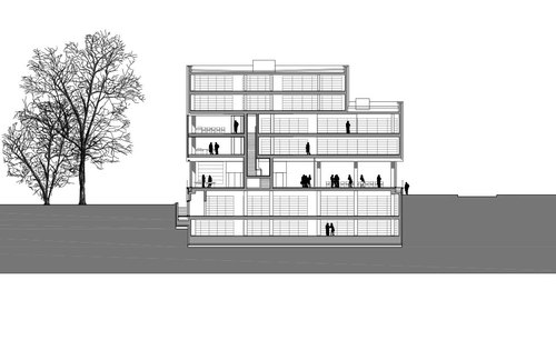
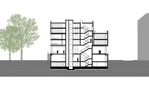
The new building consists of two intersecting solid cubes which seem to float above a transparent receding ground floor. The structure rises from a basement floor about one metre high along the road, which develops into full storey height along the downward slope towards the south, including a large terrace which offers views of the Wöhrder See lake. The ensemble consists of a solitary building sculpture with main facades on all sides. It thereby confines the adjacent Zeissstrasse on the one side, and the garden of the Theological Seminary to the east on the other side. Seen from across the garden, the new archive appears as a continuation and extension of the Theological Seminary. The plinth of the reinforced steel structure is clad with reddish sandstone which forms a continuation of the existing sandstone wall and anchors the building in the landscape context. The external walls of the archive are finished in a shiny copper facade with a subtle vertical structure. The natural metal surface will undergo various oxidation stages and colour changes until it finally develops a velvety, brownish appearance.

Leiska_3479-15b_large

Visitors enter the public areas of the archive via Veilhofstrasse. From there they also reach the lecture hall, which can also be used for exhibitions. This hall faces the corner of Veilhof-/Zeissstrasse in a manner that welcomes the public. The reading room faces both east and west and is located on the quiet garden side. The offices are located above, on two levels surrounding the archive areas, and provide easy access for members of staff to the repository. The repository areas themselves occupy four floors above the ground floor, as well as the two lower ground floors. Since the first lower ground floor extends out on the slope towards the south, access is available from Zeissstrasse to the workshop and functional rooms.

Leiska_3479-01_large

Leiska_3479-21_large

Leiska_3479-23_large

Leiska_3479-28_large

Leiska_3479-14_large

2_large

3_large

4_large

5_large

6_large

1_large


E3 - Kaden Klingbeil Architekten

$
0
0

7-storey wooden structure residential building in Esmarchstrasse 3 Berlin.

Beim Projekt e3 auf dem Berliner Grundstück Esmarchstraße 3 handelt es sich um die erste 7-geschossige Holzkonstruktion im großstädtischen Zentrumsbereich Europas.
Die drei Kernelemente des Brandschutzplans Esmarchstrasse 3 sind die sehr kurzen und komplett rauchfreien Fluchtwege, die signifikante Erhöhung des Feuerwiderstands der tragenden und aussteifenden Holzbauteile durch eine lücken- und hohlraumlose Brandschutzbekleidung (Kapselung) mit Gipsfaser-Platten sowie eine Rauchmeldeanlage.

E3-1506_large

Abgesehen von den beiden vorelementierten Brandwänden zum linken und rechten Nachbargebäude sowie zwei Ortbetonkernen für die haustechnischen Installationen besteht die Konstruktion des Wohnbereichs komplett aus Holz. Die tragenden 320×360 mm dicken Riegel und die ebenso dimensionierten Brettschichtholzstützen in den Außenwänden sind mit 160 mm starken Massivholzwänden ausgefacht, wodurch schwer zu beherrschende Hohlraumbrände zuverlässig ausgeschlossen werden. Gegen eine Entzündung schützt zusätzlich die lückenlose Bekleidung aller tragenden Bestandteile, die innen aus zwei jeweils 18 mm dicken Gipsfaser-Platten besteht und nach dem Abspachteln der Fugen auf der Sichtseite sofort die malerfertige Oberfläche bildet.
Auf der Außenseite benötigt die Konstruktion eine 12,5 mm dicke einlagige Beplankung mit Gipsfaser-Platten und eine 100 mm dicke Steinwollelamellen-Platte mit einer erhöhten Rohdichte von 70 kg/m3 sowie einem Schmelzpunkt von >1000 oC.

E3-1492_large

Die industrielle Vorfertigung der Holzkonstruktion in der Zimmerei unter den kontrollierten Bedingungen einer klimatisierten Halle garantieren eine große Ausführungs- und Qualitätssicherheit sowie sehr kurze Bauzeiten: Nach rund 9 Monaten Gesamtbauzeit konnte die Bauherrengemeinschaft e3 im Frühjahr 2008 ihr Haus beziehen.
Die Nichtsichtbarkeit des Werkstoffes Holz an der Außenfassade war für uns von Anfang an ein städtebaulicher Imperativ. In dieser urbanen innerstädtischen Situation könnten wir uns keine langsam verwitternde Holzfassade vorstellen. Bei diesem Projekt betrachten wir Holz in aller ersten Linie als ein Konstruktions- und Dämmmaterial mit ausgesprochen positiven bauphysikalischen Eigenschaften und einer sehr guten Energiebilanz.
Bewiesen ist damit zweierlei: Holzkonstruktionen mit 22 m Höhe und sieben Geschossen lassen sich konstruktiv sicher und unter Beachtung aller Brandschutzvorgaben in Deutschland realisieren. Sie müssen im Allgemeinen und in innerstädtischen Lagen im Besonderen keine historisierend bzw. anheimelnde Assoziationen wecken. Und die Gebäudeklasse „Hochhaus“ ist nur noch wenige Zentimeter entfernt!


Location: Esmarchstraße 3, 10407 Berlin – Prenzlauer Berg
Realisation: 2007-2008
Surface: 970 m²

E3-1510_large

E3-1519_large

E3-1474_large

E3-1477_large

E3-1559_large

E3-1563_large

E3-1567_large

E3-1569_large

E3-1581_large

E3-1625_large

E3-1631_large

E3-1634_large

E3-1656_large

E3-1672_large

E3-1278_large

E3_lageplan_1zu500_large

E3_eg_1zu100_large

E3_og1_1zu100_large

E3_og3_1zu100_large

E3_og4_1zu100_large

E3_og5_1zu100_large

E3_og6_1zu100_large

E3_querschnitt_1zu100_large

Esmarchstr-002_large

Esmarchstr-005_large

Esmarchstr-021_large

Esmarchstr-031_large

Therapeutic community in Arenys - Josep MiAS ARCHITECTS

$
0
0

Previously, this health facility complex consisted in a main building, and two auxiliary buildings apart from the first. The proposal links both auxiliary pre-existing buildings maintaining its use as a workshop in the ground floor and adding rooms in the first floor. Thus, a single L-shaped geometry dialogues with the main building. Between both shapes a patio is defined as a relation space and the main outdoor space of the complex.

_mg_6907_08_large

The functional programme defined by the owners consists mainly in the extension of the auxiliary pre-existing buildings through the coverage of the patio between them. A corridor is proposed as a system for the entrance and exit of the workshops and the room on the first level. It surrounds the central space of the courtyard. This corridor is a transition between the inner part of the workshops and the patio.

_mg_6715_16_large

The addition of rooms in the programme will allow concentrating the internal activities and the management of the main building, apart from giving the patients more spaces in the new building.

_mg_6881_82_large

The proposal establishes a great difference between what is maintained and what is newly built. Therefore, the façades and the gable roofs of the old buildings are refurbished with the minimum interventions.

_mg_6885_large

On the other hand, the exterior T-shaped gallery which links both buildings has a very different tectonic appearance. It is supported by a metallic structure covered with multilayer panels. The new intervention is built with a dry process, with semi-industrial materials which build the corridor, a filter between the rooms and the exterior.

_mg_6889_90_large

_mg_6949_large

_mg_6958_59_large

_mg_6983_84_r_large

_mg_7034_large

_mg_7082_83_large

_mg_7118_19_large

Ground-floor_large

1st-level_large

Sections_large

Vinícola Cuna de Tierra - CCA Centro de Colaboración Arquitectónica

$
0
0

The use of the winery’s name as a concept driver (Cuna de Tierra / Soil Cradle), and its connection to the context, shows an exploration on the relationship between wine development and the site where these grape fields are.

Cdtcca-19_low_large

The soil as one of the main elements for the growth of the vine trees becomes the main material for the construction of a group of built spaces that intend to merge with its landscape.

Cdtcca03_full_large

By working with independent structures, the project explores the possible interactions and tensions created between the volumes, the voids between them, and their relation with the functional process of the winery.

Planta01_large

The approach on designing a high standard winery with a less-than-average number of high-tech constructive systems, show different solutions to the project. These are revealed on the design of natural lighting and ventilation cavities around the spaces of the winery.

Concept_low_large

The mix of the soil walls, with the wood and concrete gathered natively tends to transmit to Cuna de Tierra’s workers and visitors a clean man-made construction taken out of the richness of its natural context.

003-cca-cdt-maqueta-viñedo_large

006-cca-cdt-maqueta-vinicula_large

Cdtcca-04_low_large

Cdtcca-07_low_large

Cdtcca-09_large

Cdtcca-18_large

Cdtcca-14_large

Cdtcca-11_low_large

HAUS IM ODERBRUCH - Heide & von Beckerath Architekten

$
0
0

Es handelt sich um ein direkt hinter dem Deich gelegenes Grundstück im Außenbereich einer Ortschaft im Oderbruch, das mit einem Stall und einem ehemaligen, inzwischen verfallenen Fischerhaus bebaut war. Jenseits des Deiches eröffnet sich die Flusslandschaft der Oder. An Stelle des Fischerhauses wurde innerhalb des vorgefundenen Volumens ein neues Haus gebaut. Wegen einer unter Naturschutz stehenden alten Ulme wurde die Position des Baukörpers leicht verschoben. Um den Bau des Hauses und die Bewilligung des Bauantrages zu ermöglichen, wurde seitens der Gemeinde die Außenbereichssatzung geändert. Das neue Haus folgt in seiner räumlichen Disposition und manchen Details lokalen Traditionen und eröffnet der vierköpfigen Familie und ihren Freunden dennoch ein ausgesprochen helles, großzügiges und komfortables Feriendomizil. Der Grundriss folgt dabei einer grundsätzlichen Drei-Teilung, wobei die beiden zweigeschossigen Randfelder im Erdgeschoss Küche und Bad, sowie zwei Schlaf-zimmer aufnehmen, während das mittlere Feld bis in den Giebel reicht und einen Kamin mit angeschlossener Sitzbank zum Thema hat. Dabei lässt sich der zentrale Wohnraum durch die Verwendung von raumhohen Schiebetüren in der Diagonalen um Küche und Bad erweitern.

Ode_mm_3313_large

Die mit schwedischer Schlammfarbe anthrazit-grau gestrichene Holzfassade korrespondiert mit den farblich verwandten Biberschwanzziegeln des Daches. Die Fassade wird von vier gleich großen, raumhohen Glasfeldern unterbrochen, die sich in den Längswänden und den Dachflächen befinden, und von hölzernen Rolltoren verschlossen werden können. Kleine Fenster, die mit fassadenbündigen Fensterläden versehen sind, dienen der Belichtung der Zimmer und Nebenräume. Der Boden besteht in großen, nämlich den öffentlichen Teilen des Hauses, und auch im Bereich der Terrasse, aus Ziegel. Die Böden der Schlafzimmer und der Räume im Obergeschoss, sowie die Schränke, Schiebetüren und Elemente in Küche und Bad, sind in Eiche ausgeführt.

Ode_mm_3321_large

Ode_mm_3361_large

Ode_mm_3372_large

Ode_mm_3386_large

Ode_mm_3402_s_large

Ode_mm_3416_s_large

Ode_mm_3459_s_large

Ode_mm_3436_s_large

Ode_mm_3459_large

Ode_mm_3507_large

Ode_mm_3513_s1_large

Ode_mm_3519_large

Ode_mm_3526_large

Ground_large

Top_large

Ode_cross-section_large

Ode_longitudinal-section_large

Bulgari Winery in Southern Tuscany - Alvisi Kirimoto + Partners

$
0
0

The Winery at Podernuovo is located near San Casciano dei Bagni, in the outskirts of Siena, in Southern Tuscany. It overlooks a vineyard named after the agricultural estate it belongs to. The vineyard, designed to contain spaces accessible to the public, spaces of production, and offices endeavors to reduce as much as possible its impact on the environment.

18_image-akp-bulgari-39400-292_photofernandoguerra_large

The winery can be accessed from two points: the first situated by the service entrance near the loading docks, the second by the parking lot used by both visitors and staff. The main county road diverges, branching off into a local road (Strada delle Vigne, “of the vines” in English) which curves left, and intersects the access that leads all transport to the main terrace. By planning the entrance in this manner, the architects managed to avoid the overlap of flows between general and specialized traffic. This zone, on the Eastern side of the winery, is where the first parking area is found. The access road continues uphill towards a secondary parking area and ends at a third parking area, intended principally for staff and visitors. At this point the entrance used by the workers is also accessed, only separately, merging with the office spaces and the production areas, as well as passing by the changing rooms. This split access was intentionally designed in this manner to once more avoid interference with production.

Bulgcan1_large

Upon access through the principal loading dock, on the left are located three main program areas: the vat cellar, the barrel cellar, and the wine cellar where the bottled wine is stored and left to mature; on the right of the corridor, instead, the architects placed the zones where the final stages of wine production are undertaken (i.e. the main bottling area, a storage for oenological products, a secondary processing area where wine is fined in steel barrels), the staircase to the upper floors, the water reserves (intended for sprinklers, irrigation, flushing) and the warehouse space where the barrels are cleaned.

Bul2_large

A height of +6.10 meters creates a series of interstitial zones amongst the intermediate programs, like the mechanical rooms above the main production space, the staff changing rooms, the toilets for visitors and the laboratories. The latter are accessed via a private staircase which also leads to the offices. At a similar height of +5.30 meters above the fermentation areas, a wine tasting room overlooks the program. Large panels of glass compose two sides of the room, allowing incredible visibility into the barrel storage area and into the garden, which is enclosed by two of the concrete walls and slopes towards the upper levels of the project. A ramp also at this level allows access to the exterior of the winery and continues the plane out towards the landscape. A large entrance serves as a vestibule for both the people who access the space via the staircase and those coming from the outside. By means of a glass door, the main corridor overlooking the terrace is once more accessed. The wine tasting room, the meeting rooms, the offices with six workstations, and toilets, can be entered from both sides of the axis. The production zones and the meeting rooms are enclosed by large glass walls that overlook the terrace which was partly tiled, whilst the rest forms a distinctive green roof over the program areas.

02_image-akp-bulgari-39400-091_photofernandoguerra_large

The shades are a distinctive detail throughout the building. Conceived as a light metallic frame structure, they cover the entrance, act as a roof in specific locations and protect the offices from direct sunlight. On the ground floor the large glass panels span the entire width of the rooms and visually connect the vat cellar with the exterior whichm during harvest, is transformed into an incredibly dynamic space and is one of the most fascinating sights to oversee.

The materials for the building were chosen to integrate the architecture, as much as possible, with the landscape of its surroundings. Exposed concrete, brick, klinker, varnished steel, glass are all the materials that characterize the envelope of the winery. The long walls that traverse and anchor the project are exposed and painted in a color similar to the hue of clay which characterizes the earth in Tuscany; it is as if they had just emerged from the ground to house a process older even than the Etruscan antecedents of the land. The building is further embellished by a green roof and shades over the offices and main production areas.

PROJECT DATA AND CREDITS
architectural design: Alvisi Kirimoto + Partners
client: Podernuovo a Palazzone of Giovanni and Paolo Bulgari
structural engineering: ESAPROGETTI– Eng. Cianfrini / TECNO STUDIO– Eng. Lattini
mechanical and electrical engineering: Studio Tecnico Emanuele Mucci and Fabrizio Corridori
other consultants: Ing. Pupo (process systems) / TOSCANA PROJECT Srl (project management)
contractor: ALTO soc. coop
photos: Fernando Guerra | FG+SG fotografia de arquitectura (http://ultimasreportagens.com)

Nowhere but Sajima - Yasutaka Yoshimura Architects

$
0
0

Cutting resort environment out of urban environment

Nowhere resort is the resort program that is renting out weekly vacation house. Suggesting new urban life style by making shorten the distance to weekend house from standard 3 hours up to 1 hour. The environment must get close to urban when shorten the distance, the issue comes to how to cut off resort environment out of there. Therefore Nowhere but Sajima comes to build long and thin tube-like spaces that bundle them into one home unit. The tube-like spaces are facing toward the ocean and at the same time intercept the sight from the next condominium. The building is controlling both privacy and scenery.

Principal Use: House
Completion: Jun/2009
Structure: RC 3 stories
Site Area: 132.09 sq.m
Building Area: 63.88 sq.m
Total Floor Area: 176.65 sq.m
Max Height: 9,459 mm

_mg_4700rgb_large

_mg_2735_large

_mg_2804-4539_large

_mg_2794_large

_mg_2812-2794_large

_mg_4532_large

_mg_5491_large

_mg_5493_large

_mg_5494_large

_mg_5496_large

_mg_2842-a_large

Plan-bk100-h_scalebar__large

Sjm_sec-100y_scalebar__large

Sjm_site-diagram_1000_large

Centro de Salud de Las Palmeritas - CHS arquitectos

$
0
0

La construcción responde estrictamente al programa funcional de atención médica según normas y recomendaciones del Servicio Andaluz de Salud.
Entendemos que la obra pública tiene carácter de referencia.

348-59-chs-arquitectos-centro-de-salud-de-las-palmeritas-sevilla_large

El edificio asume su condición protagonista frente a un entorno urbano amorfo y desequilibrado: un vacío heterogéneo rodeado por bloques de viviendas. Entendimos podía tratarse de una propuesta revitalizadora que supusiera un revulsivo urbano en ese espacio excedente, periférico e impreciso y degradado.

348-71-chs-arquitectos-centro-de-salud-de-las-palmeritas-sevilla_large

Dos gestos fueron decisivos: acotar un recinto de privacidad en el centro de ese espacio, con un muro continuo de hormigón y vidrio, e introducir dentro de su perímetro, un prisma resplandeciente, visualmente pesante, que se incorpora por encima del muro reclamando su papel de elemento referencial. Levitando.

348-74-chs-arquitectos-centro-de-salud-de-las-palmeritas-sevilla_large

La piel brillante de cerámica vidriada, conforma una carcasa suspendida que envuelve un interior hermético accesible desde un solo punto. Sus perforaciones evocan tradiciones constructivas: celosías vinculadas a la tradición islámica, palomares ó secaderos de tabaco, que consiguen una definición del edificio. Pieza de carácter autónomo que resuelve la necesidad privada de luz y reserva adquiriendo hacia el exterior un aspecto hermético.

348-95-chs-arquitectos-centro-de-salud-de-las-palmeritas-sevilla_large

Envoltorio identificable que privatiza. Vibrante en su expresión exterior y algo conmovedor por dentro. El gran vacío estructural ordena las funciones en las tres plantas del edificio. Visibles al tiempo que oxigena los lugares de espera. Estos se elevan como caverna hasta el lucernario. Es el principio generador de toda la estructura. Deambulatorios alrededor del vacío y una pasarela diagonal que lo cruza, convierten este espacio en recorridos que vinculan a las diferentes funciones.

348-68-chs-arquitectos-centro-de-salud-de-las-palmeritas-sevilla_large

En Planta Baja, en su frente, bajo un dintel masivo, desde un atrio cubierto, se dispone la entrada principal atravesando una franja/puerta horizontal de vidrio hacia el interior. Rotundo, desnudo y palpitante.

348-67-chs-arquitectos-centro-de-salud-de-las-palmeritas-sevilla_large

Durante el día, el interior queda irradiado desde el lucernario y desde la celosía envolvente, que filtra la luz y reverbera el color que llega del exterior.

348-65-chs-arquitectos-centro-de-salud-de-las-palmeritas-sevilla_large

En la noche, más allá de sus aspiraciones funcionales, utiliza su condición material como lámpara urbana. La luz artificial se incorpora a la arquitectura con voluntad expresiva, y aparece desde el interior, para convertirse en un referente.

348-64-chs-arquitectos-centro-de-salud-de-las-palmeritas-sevilla_large

348-63-chs-arquitectos-centro-de-salud-de-las-palmeritas-sevilla_large

348-57-chs-arquitectos-centro-de-salud-de-las-palmeritas-sevilla_large

Planta-baja-gris-palmerita_large

Planta-primera-gris-palmerita_large

Planta-segunda-gris-palmerita_large

Planta-cubierta-palmerita_large

Seccion-l1-gris-palmerita_large

Seccion-l2-gris-palmerita_large

Seccion-t1-gris-palmerita_large

Seccion-t2-gris-palmerita_large

Alzado-oeste-color-palmerita_large

Alzado-sur-color-palmerita_large


Centro de Salud en Cartaya, Huelva - CHS arquitectos

$
0
0

La adhesión total al programa y a las exigencias de la pequeña ampliación de un Centro de Salud en funcionamiento, constituye el móvil del proyecto.

7368_06_large

Entendimos que la ampliación no debía ser una mera prolongación de lo existente en sus límites temporales de caducidad y desposeído de cualquier interés que justifique una ampliación mimética o contextualizada. Su imagen responde a un periodo de arquitectura pública sin “afectos”. Nos integramos por divergencia, proponer otras formas de usar, de confrontar y entender estas características, como expansión de nuevos registros.

575-9-chs-arquitectos-centro-de-salud-cartaya-huelva_large

Se coloca con levedad una pieza, sin alterar el entorno, asumiendo y adjudicándonos todos los elementos y formas que encontramos. El edificio encaja dejando intacto su paisaje y evidenciando de igual forma nuestra discrepancia. Se propone el programa requerido en dos plantas, tratando de aproximar todos los usos en su interior, distribuyendo desde un espacio central en cada planta, encajándose como pieza aislada, cerrada sobre sí misma. De apariencia clausurada, hermética; responde a elementales razones que velan prioritariamente por la característica de privacidad del acto médico y al mismo tiempo el imprescindible control de la intensa luminosidad.

575-4-chs-arquitectos-centro-de-salud-cartaya-huelva_large

Se partía de un presupuesto muy bajo, por lo que las soluciones constructivas debían ser fácilmente ejecutables por una pequeña constructora local y los materiales elegidos, muy económicos, perdurables, de fácil mantenimiento y quizás paradójicos. Esta elección tiene voluntad expresa de no identificarse con los del edificio colindante. Revestimos todo el edificio de piedra caliza de la zona, recorriendo paramentos y huecos que en sus mismos despieces hendidos, dejan el necesario paso de luz. Lamas fijas pétreas, procurando una continuidad hacia el interior, alternadamente recogido e íntimo.

575-1-chs-arquitectos-centro-de-salud-cartaya-huelva_large

El edificio, es facetado, “poliedro de piedra esculpida” de manera que la luz provoca vibraciones y sombras al incidir en sus planos. Y busca recursos estructurales livianos, mostrándose en su interior con apariencia de planos, que recogen y encierran, logrando, en algún caso, soluciones formales expresivas, creando episodios atractivos, como la bóveda artesonada de hormigón visto que cubre la escalera. La cubierta es prolongación de las fachadas y se proponía que la misma piedra de revestimiento, buscando una unidad en un elemento tan concreto.

575-3-chs-arquitectos-centro-de-salud-cartaya-huelva_large

Verificar contrastando, entre un exterior terso, continuo en un matiz que envuelve, muy pulido y un interior despejado, conciso en sus funciones, introduciendo leves planos de expresión, sensibles en espacios claros y fluidos. Detrás de la parcela existe un colegio público y el espacio de juegos es colindante con el edificio. Existía la posibilidad de que desde el espacio interior se observara ese mundo infantil de niños jugando como si fuera un monitor sin sonido, lo cual proporciona una nota visual alegre en un espacio habitualmente aséptico.

575-2-chs-arquitectos-centro-de-salud-cartaya-huelva_large

1_cartaya---situacion_large

2_cartaya---planta-baja_large

3_cartaya---planta-alta_large

4_cartaya---planta-de-cubiertas_large

5_cartaya---alzado-sur-principal_large

5_cartaya---alzado-sur-principal_large

6_cartaya---alzado-lateral-este_large

7_cartaya---alzado-norte-posterior_large

8_cartaya---alzado-lateral-oeste_large

9_cartaya---seccion--transversal-1_large

10_cartaya---seccion-longitudinal-1_large

11_cartaya---seccion-longitudinal-2_large

Haus der Essener Geschichte - Ahlbrecht Felix Scheidt Kasprusch

$
0
0

The city of Essen invited to an Europe-wide competition in 2005 with the goal to accomodate the insufficient and at different places stored archival documents of the city, the administration of the city archive, its public library, an auditorium and a museum for the recent history of the city. An important point was to keep the architectural monument Luisenschool from 1906, which was only partially used as school, as a cultural heritage of the city and to employ it still useful. The requested utilisations could be well integrated into the historic building structure. The new extension of the needed archive is built as a massive four-storeyed building. The new building closes an urban cut of the former block structure, which was a result of the war. It accomodates the necessary 17 rack kilometers via movable rack systems.

Heg_01_large

School building
The listed existing building is refurbished according to the regulations for historical monuments. The groined vaulted hall form the common foyer for students, guests and employees of the „Haus der Essener Geschichte“ and is the prelude of the exhibition, which is situated in the former class rooms. According to the demands of the city archive, the offices are also placed in the former class rooms. The auditorium is located close to the foyer facing the Bismarkstraße. The reading room and the administration are situated in the calmer extension from the 1950s. In connection to the archiv the basement floor houses the take-over of the archival documents with their workshops. The air raid shelter, left nearly original since 1945, is integrated with its authentic condition as extension of the exhibition „Resistance and persecution during the Third Reich“.

Heg_02_large

Depot building
The four-storeyed depot building is connected with the extension of the 1950s by a glazed gap. A new disabled friendly lift balances the differences of elevation. The facades of the new archive building are covered with Corteen-steel. This material, that constantly alters, communicates the change of time and appears safe-like conserving. Furthermore it is a reference to the history of the former steel city Essen. The structure of the openings in the facade playfully reflects the flexible used movable rack systems inside. Room-high aslant embedded ventilation openings in the facade penetrate the facade, decrease direct insolation and support the air circulation because of their different positions. The building has an outdoor temperature sensor and meters, installed on every floor. Every floor is supplied with cross ventilation and heating with conventional radiators by an intelligent regulation. A natural, regulated ventilation was planned for the depot. A ventilation and air conditioning is not necessary.

Completion: 2010
gross floor area: 6700 sqm
cubature: 24900 cbm
construction cost: 5,23 m euro
awards: – Essener Architekturpreis 2010, acknowledgement
- Auszeichnung vorbildlicher Bauten NRW
- Auszeichnung guter Bauten des BDA 2010, acknowledgement

Heg_03_large

Heg_04_large

Heg_05_large

Heg_06_large

Heg_07_large

Heg_08_large

Heg_floorplan_groundfloor_text_large

Heg_floorplans_basement_text_large

Heg_floorplans_basement_text_large

Heg_siteplan_text_large

Heg_elevation-north_72dpi-768_large

Heg_cross-section_text_large

Heg_detail_text_large

Row Houses "Jardins da Ponte" - Jose Gigante, Nuno Valentim Lopes

$
0
0

The site, located in a pronounced slope, comprises a parcel of terrain with mischaracterized surroundings, sprinkled with single family houses, wildly deployed in the area, that as a whole, are unable of stating a clear principle of spatial planning of the area they occupy. This context, marked by discontinuities and unbalances, was perceived as an incentive for a brainstorming in the construction of an architecture idea. Given this framework, we contrast a design able to confer to the new set its own identity, recognizable in a spatial planning where each housing unit is to be assumed as a part of the same indivisible whole. Therefore, we adopted a combination of row houses in order to obtain volumes whose dimension clearly detaches them from the surrounding area. Furthermore, and to better ensure the integrity of such volumes, we decided to arrange them in different leveled platforms, spaced throughout the slope.

Jose Gigante, Nuno Valentim Lopes — Row Houses "Jardins da Ponte"

This is how we sought to ensure the stability of the volumetric set, through a planned monitoring of elevations and limits, essential to regulate the overall picture from as many points of view as possible, thereby trying to establish the planning principle for a balanced appropriation of the slope. The composition of the exterior volumes, based on the presence of the discrete structure and the modular and functional complicity among the solid spaces and voids, rehearses a balance between the unity of the whole and the individualized reading of each parcel, transforming the sum of the several fractions in large compact blocks where we sought to express the inseparability between individual and collective.

Jose Gigante, Nuno Valentim Lopes — Row Houses "Jardins da Ponte"

Jose Gigante, Nuno Valentim Lopes — Row Houses "Jardins da Ponte"

Jose Gigante, Nuno Valentim Lopes — Row Houses "Jardins da Ponte"

Jose Gigante, Nuno Valentim Lopes — Row Houses "Jardins da Ponte"

Jose Gigante, Nuno Valentim Lopes — Row Houses "Jardins da Ponte"

Jose Gigante, Nuno Valentim Lopes — Row Houses "Jardins da Ponte"

Jose Gigante, Nuno Valentim Lopes — Row Houses "Jardins da Ponte"

Jose Gigante, Nuno Valentim Lopes — Row Houses "Jardins da Ponte"

Jose Gigante, Nuno Valentim Lopes — Row Houses "Jardins da Ponte"

Jose Gigante, Nuno Valentim Lopes — Row Houses "Jardins da Ponte"

Jose Gigante, Nuno Valentim Lopes — Row Houses "Jardins da Ponte"

Jose Gigante, Nuno Valentim Lopes — Row Houses "Jardins da Ponte"

Jose Gigante, Nuno Valentim Lopes — Row Houses "Jardins da Ponte"

Jose Gigante, Nuno Valentim Lopes — Row Houses "Jardins da Ponte"

Jose Gigante, Nuno Valentim Lopes — Row Houses "Jardins da Ponte"

De Burgemeester - Studioninedots

$
0
0

From an abandoned and anonymous office building to a vibrant multi-tenant complex. That’s De Burgemeester, a commercial property in Hoofddorp renovated by Studioninedots and opened on 5 November 2013. The secret of the transformation? A vertical lobby featuring an open staircase where people meet face to face, a space that brings people together both literally and figuratively.

Studioninedots — De Burgemeester

We space. That’s our name for this communal area at the heart of the building. It’s a place that brings people together. Out of the concrete floors we carved a 14-metre-tall void that houses a giant staircase that cuts diagonal lines through the void as it makes its way upwards, linking the different floors to one another. Now people are on the move, making their way back and forth on the timber steps. Some of them linger for a chat, and there’s space on the broad treads to sit for a moment. The sound of chatter and the aroma of coffee from the café below now fill the hall. Most of the office space has already been leased, bringing the building back to life once again.

Studioninedots — De Burgemeester

De Burgemeester was part of the ‘cloud’ of blue foam models on show in the Dutch pavilion at the 2010 Venice Architecture Biennale. In an exhibition entitled Vacant NL, the pavilion housed a vast model that depicted all the unoccupied buildings in the Netherlands. The exhibition proved confrontational for the way it captured the sheer scale of empty space and rendered it visible at a glance, and for the conclusion expressed: the era of growth is finished, and scarcely anything more needs to be built. At the same time, that sea of blue also contained a promise. Vacant NL posed a creative challenge to architects: discover the potential of these buildings; adapt them for our era of economic stagnation and population decline; transform them, temporary or otherwise, into flexible and sustainable structures; to ensure a new appreciation of these buildings.

Studioninedots — De Burgemeester

What’s more, the crisis offers opportunities. The pressure of cost-cutting measures creates scope for other values. More does not necessarily mean better, and that’s something increasing numbers of people are coming to realize. Born out of the idea of cutbacks and facilitated by the internet, a flourishing culture of sharing has emerged. Thanks to Greenwheels, Peerby and Airbnb we borrow and rent cars, tools and even homes from one another. People in more and more cities are setting up resident associations to make their neighbourhoods more sustainable. And vacant sites are taken as ‘test sites’ for new spatial developments such as urban farming. The sense that ‘everybody for himself’ no longer works, and the feeling that we can really achieve something by joining forces, is gaining widespread support. And, just as important: we’ve come to realize that it’s all much more fun together.

Studioninedots — De Burgemeester

The renovation of De Burgemeester is a response to these developments. Ymere housing association granted the building a new life as an office complex and in 2012 asked us to draw up a proposal. But the persistent crisis thwarted that ambition; it turned out to be unfeasible for a single client to occupy the entire building. That’s the reason it was decided to team up with an investor called Lingotto and turn the building into a multi-tenant complex.

Studioninedots — De Burgemeester

Since office space with all sorts of extra amenities was no longer a realistic option with a lower budget, we completely changed our original proposal. Workspaces are fitted out without any frills so that we could channel more resources into one spectacular, shared amenity that boosts the whole building. The sculptural staircase, a social space where people can meet, a place that connects people to one another both literally and figuratively. The staircase as a tool for communication, lends the building a collective identity. As a vertical lobby that offers views of all floors, it tells occupants that they are part of a larger world. And precisely that feeling is the major quality of the renovated building. On top of that, we maximized those qualities that De Burgemeester already possessed: views of the surrounding neighbourhood and generous amounts of daylight. The openness and transparency achieved through the addition of glass partition walls and the voluminous atrium ensures views to the outside from almost everywhere within. Suspended ceilings have been removed to reveal the authentic concrete floor with T-beams. Now this rough, column-free load-bearing structure determines the atmosphere.

Studioninedots — De Burgemeester

The timber-clad stairs and banisters add warmth to the interior. The staircase is constructed of steel and wrapped with simple sheets of plywood with a transparent varnish finish. Custom-made railings are milled from the same sheets using an affordable industrial technique that lends the result an almost handcrafted appearance. To complete the story, we also designed the building’s visual identity. The leitmotif for the colourful graphic design is the comma, an optimistic punctuation mark that evokes positive expectations. De Burgemeester is already well on its way to meeting those expectations.


Studioninedots — De Burgemeester

Type: Re-use of 4700m2 officespace
location: Burgemeester Pabslaan, Hoofddorp
plot: 980 m2
design-completion: 2012-2013

Studioninedots — De Burgemeester

Studioninedots — De Burgemeester

Studioninedots — De Burgemeester

Studioninedots — De Burgemeester

Studioninedots — De Burgemeester

Studioninedots — De Burgemeester

Studioninedots — De Burgemeester

Studioninedots — De Burgemeester

Studioninedots — De Burgemeester

Studioninedots — De Burgemeester

Studioninedots — De Burgemeester

Studioninedots — De Burgemeester

Studioninedots — De Burgemeester

Studioninedots — De Burgemeester

Studioninedots — De Burgemeester

Studioninedots — De Burgemeester

Slim House - alma-nac

$
0
0

Alma-nac were approached by a young couple in order to investigate the possibilities of maximising their slim plot on the busy high street of St John’s Hill, Clapham, London. The uniquely narrow proportions, measuring just 2.3m internally throughout, presented certain challenges in terms of organising the spaces. It is understood that the location of the property was the original stable access to the rear of the adjacent public house. The resulting narrow proportions meant that the centre of the plan was potentially dark and gloomy. There was also a stark contrast between the noisy north facing front of the plot and the tranquil south facing rear. These issues were coupled with a strict budget within which to work; the property had been re-valued since the original purchase and the bank loan was based on the difference of the increased value.

alma-nac — Slim House

The neighbouring property, an art gallery and studio at ground level and apartment above, had extended almost to the full depth of the plot with a terraced rear facade. An immediate response might have been to continue this form with a series of terraces forming the new rear facade. However, the complexity of constructing multiple terraces and roofs meant that this option was deemed prohibitively expensive as well as proving problematic in terms of bringing light into the centre of the plan. A response to this was to form a continuous slate clad sloped roof creating a simple and easily understood construction method. This material treatment is continued on the rear facade and reflected in the slate shingle ground cover of the rear garden. In order to enhance the sense of space within the newly formed rooms the floor plates at each level were cranked, allowing an increased floor to ceiling height and encouraging light to penetrate deep in to the plan. A light-well was formed over the central stair by opening up the ceiling to the sloped roof. This allows natural light to flood deep in to the plan at first and second floor levels and provides a natural stack effect when the roof lights are opened. The brick flank ‘book end’ walls are left exposed at the top of the stairwell to convey the original context of the site.

alma-nac — Slim House

A key consideration was storage space and every corner of the property has been utilised, from the bed-head with integrated storage, loft space over the top bedroom and compact bathroom layouts. The elongated form of the main bedroom at first floor level allowed for the creation of a dressing room area so that the bedroom space remains uncluttered of furniture. The design of the roof build-up ensured the minimum depth (250mm) in order to maximise the space internally and achieving a high U-value (0.14 W/m2K).

alma-nac — Slim House

The staggered window pattern on the rear elevation plays with the scale. The roof lights are organised to allow views through to the exterior along the corridor side and to illuminate the top section of the sloped ceiling.

alma-nac — Slim House

alma-nac — Slim House

alma-nac — Slim House

alma-nac — Slim House

alma-nac — Slim House

alma-nac — Slim House

alma-nac — Slim House

alma-nac — Slim House

alma-nac — Slim House

alma-nac — Slim House

alma-nac — Slim House

alma-nac — Slim House

alma-nac — Slim House

alma-nac — Slim House

alma-nac — Slim House

alma-nac — Slim House

alma-nac — Slim House

alma-nac — Slim House

alma-nac — Slim House

SAN JERONIMO HOSPITAL - SV60 arquitectos

$
0
0

The old hospital was presenting a conventual domestic cloister altered by successive interventions and that was preserving the optical sense of the wall and the value of intimacy in the perimeter structures. The transformations on the original convent during the hospital period have been hiding part of the past structures and the conventual decoration. The emergence of the Renaissance secret courtyard behind the bricks allowed an intervention of recovery of the transparency and enhancement of the original spaces.

SV60 arquitectos — SAN JERONIMO HOSPITAL

After Analyzing and studying the whole construction we concluded in a silent, white and intimate character that enhances the cloister to the detriment of the alleged protagonism of the urban facade.

SV60 arquitectos — SAN JERONIMO HOSPITAL

SV60 arquitectos — SAN JERONIMO HOSPITAL

SV60 arquitectos — SAN JERONIMO HOSPITAL

SV60 arquitectos — SAN JERONIMO HOSPITAL

SV60 arquitectos — SAN JERONIMO HOSPITAL

SV60 arquitectos — SAN JERONIMO HOSPITAL

SV60 arquitectos — SAN JERONIMO HOSPITAL

SV60 arquitectos — SAN JERONIMO HOSPITAL

SV60 arquitectos — SAN JERONIMO HOSPITAL

SV60 arquitectos — SAN JERONIMO HOSPITAL

Casa a Bozzolo - paola marini

$
0
0

La casa occupa un piccolo terreno alla periferia del paese, fuori dal tracciato delle antiche mura Gonzaghesche i cui resti ancora oggi delimitano lo spazio denso della città dalla campagna. Il volume dal quale si sviluppa l’idea, forma primitiva ed astratta, viene scolpito direttamente a partire dalla geometria irregolare del lotto e dai suoi propri limiti, rompendo da subito qualsiasi possibile regola di simmetria a favore di un gioco di linee inclinate in pianta e in alzato, alterando le proporzioni delle facciate. Il progetto prende forma attraverso gesti di sottrazione della materia: la massa scavata modella lo spazio in una continuità tra interno ed esterno. Sui lati della casa quattro incisioni astratte e decise determinano le aperture delle facciate che prolungandosi nel terreno ne ritagliano i patii: il piano terra infatti, si sviluppa su una quota leggermente inferiore a quella del giardino, attribuendogli un carattere più riservato ed accogliente, proteggendolo dalla strada.

paola marini — Casa a Bozzolo

alzato ovest

paola marini — Casa a Bozzolo

alzato sud

paola marini — Casa a Bozzolo

paola marini — Casa a Bozzolo

paola marini — Casa a Bozzolo

paola marini — Casa a Bozzolo

paola marini — Casa a Bozzolo

paola marini — Casa a Bozzolo

paola marini — Casa a Bozzolo

paola marini — Casa a Bozzolo

paola marini — Casa a Bozzolo

paola marini — Casa a Bozzolo

paola marini — Casa a Bozzolo

paola marini — Casa a Bozzolo


Joseph Pschorr Haus building - KUEHN MALVEZZI

$
0
0

Hybrid
The commercial building, which was completed in October 2013, is a hybrid of two different building typologies. On the one hand, the building follows the historic model of a mixed-use building, with the retail functions on the lower two floors and apartments on the top floor which, in this case, has been extended to include a full residential loft. On the other hand, the building represents a development of the department store typology; three separate units are interwoven over four levels in the middle zone and the upper floors are largely shielded from the street. As a result, the building is more open to the city on the top floor and lower two floors, while the design of the elevations of the middle floors is more withdrawn.

KUEHN MALVEZZI — Joseph Pschorr Haus building

City spaces
The compact organisation of the inside of the building and the city structure – its immediate environment – create a tension that is the basis of this design. The commercial building has been built on several historic plots, and forms a perimeter block along three very different streets. It is situated opposite two historic churches, St Michael (1583-97) to the north and St Anna (1735) to the south, as well as the connecting buildings of the “Alte Akademie” at Neuhauser Strasse and the former convent at the Altheimer Eck. Eisenmannstrasse at the front of the building is a narrow alley, which connects Neuhauser Strasse, a busy shopping street, with the Hackenviertel behind Altheimer Eck. 

KUEHN MALVEZZI — Joseph Pschorr Haus building

The building
The commercial building is semi-detached at the end of the block: two distinct building volumes at the two main elevations form two heterogeneous opposites – bronze and glass versus render; pitched roof versus recessed penthouse floor; angled versus rounded – and face the historic buildings on the other side with their contrasting elements, forming different city spaces with them. The two building volumes with their contrasting design rules are linked by a third one along Eisenmannstrasse. This does not form an additional volume, but merely presents a sculpturally articulated surface in its own right. In this way the whole development comprises three different elements, which seamlessly merge on the inside.

KUEHN MALVEZZI — Joseph Pschorr Haus building

Neuhauser Strasse building
Opposite the “Alte Akademie”, the building creates a new urban space. The corner development is dominated by a bronze and glass curtain wall façade, which, in the upper floors, envelops the building as a non-tectonic cloak of pilaster strips of varying widths. In contrast, the bronze pillars on the ground floor continue through to the roof in five places only, and mark the historic plots. The other pillars are arranged in a specific order on the lower two floors and correspond with that of the attic floor, which also features an independent rhythm of pilaster strips of varying widths.

KUEHN MALVEZZI — Joseph Pschorr Haus building

All glass elements in the lower two floors and the rainscreen glazing in the storeys above consist of clear glass with a low iron oxide content; the slender, over 11 m outer panes consist of two parts of laminated glass which is 3 cm thick and bonded with structural foil. The glazing of the shop windows on the ground and first floors is fitted flush with the outside of the metal pilasters, thus revealing their sculptural quality only on the inside.

KUEHN MALVEZZI — Joseph Pschorr Haus building

Altheimer Eck building
Opposite St Anna, continuity with the adjoining and opposite developments has been achieved with a solid tectonic building, without imitation. The theme on the rear – with its largely closed façade – is structured in the form of a large-scale relief with only a few open windows and a primarily blind window structure. The large scale of the glass panels – with their few details – matches the side façade of St Anna and, with only a few high storeys, has a calming effect on the alley. An important design element, which has an impact on the alley, is the slight curvature of the light-coloured rendered façade, which projects in a concave curve and thereby visually widens the street.

KUEHN MALVEZZI — Joseph Pschorr Haus building

In order to achieve a façade without construction joints, it was constructed in reinforced concrete including a 20 cm thick intermediate insulation layer. Special concrete anchors were used to tie the three layers together while also allowing sufficient flexibility for the construction to withstand thermal expansion movement. The outer skin of the external wall is firmly connected with the overall building through its monolithic tie to the lower floors. In contrast to the usual insulated render system, it does not consist of a detachable and replaceable outer insulation but instead of a concrete skin that has been textured in relief form during the shell construction and then finished with a lime-based plaster.

KUEHN MALVEZZI — Joseph Pschorr Haus building

Eisenmannstrasse façade
The third façade, which has as much a separating function as it has a connecting one, is purely a blind façade. It is characterised by display windows on the ground floor and a suspended curtain wall façade in bronze on the upper floors. The patinated metal has been folded in irregular patterns and forms a relief along the narrow Eisenmannstrasse. In this way it adopts the type and material of the main façade while also relating to the sculptural relief of the rendered rear façade. All bronze elements used in the building consist of 2 mm thick brass sheeting with a CuZn37 alloy. In total approx. 45 tonnes of brass were used for the project. Some of the sheets are up to 4 m long. Each individual sheet was dipped in its completed shape into two different patinating liquid baths in sequence using a manual process; between dips the panels were cleaned by hand, polished and protected against corrosion with a special wax solution.

KUEHN MALVEZZI — Joseph Pschorr Haus building

Courtyard
As a trace of the historic structure, a central courtyard has been retained from first floor level as a morphological element without concrete function. It serves to subdivide the building volume while at the same time, functioning as a threshold area, it can only be seen from a few places inside the building. This inside-outside relationship is further enhanced by using a theatre-like greenhouse on the south side. Seen from the opposite, northern side, the dense vertical winter garden is reflected in the folded mirror glass of the blind side walls; this reflection becomes a kaleidoscope and allows the artificiality of this hidden space to become real.

KUEHN MALVEZZI — Joseph Pschorr Haus building

All plants, both inside and outside, are watered and fertilised with the help of systems that are installed underground or within the steel structure. In addition, the greenhouse includes high-pressure spray nozzles, plant lights, heating elements and ventilation flaps which are controlled by a sensor and thus ensure an ideal climate for the exotic plants used here. Particularly notable are the passion flowers that climb across several floors creating a delicate cloak of flowers.

KUEHN MALVEZZI — Joseph Pschorr Haus building

GFA: approx. 41,700 m² gross floor area (above and below ground)
28,000 m² floor space for retail and rental apartments; additional areas for the public underground car park and plant rooms
Retail area: 19, 100 m²
Parking spaces: approx. 214 spaces
Apartments: 25 rental apartments
Number of floors: four underground floors, ground floor and five upper floors

Sustainability:
Application for DGNB Gold certification has been made Solar system with approx. 250 solar modules on the roof Solar power is used for the supply of the electric vehicle charging station in the underground car park, amongst others Rainwater collection in an underground cistern Use of rainwater for watering planted areas and for use in the retailers’ WC facilities Almost exclusive use of LED lighting (with very few exceptions) in all shared public spaces

Edificio E1E2 - Porta Nuova, Milano - Piuarch

$
0
0

L’intervento dell’edificio per showroom e uffici si inserisce nel più ampio piano di recupero urbano di Porta Nuova, che comprende le zone di Garibaldi, delle Varesine e dell’Isola, nel pieno centro di Milano. Quest’area, che si estende per circa 300.000 mq, svolge un ruolo di cerniera fra i tre diversi ambiti urbani su cui si affaccia ed è oggetto di riqualificazione con l’obiettivo di restituirla alla città e renderla parte integrante delle future dinamiche urbane.

Piuarch — Edificio E1E2 - Porta Nuova, Milano

All’interno di questo articolato e complesso intervento, l’edificio cerca di dialogare con la parte pubblica dell’intera area, configurandosi come uno dei punti di accesso al parco interno, posto a una quota più alta rispetto alla strada. Da qui la scelta di posizionare l’edificio su un podio di collegamento tra i due ambiti.

Piuarch — Edificio E1E2 - Porta Nuova, Milano

Affacciato per un lato sulla piazza centrale, accanto alle tre torri di Cesar Pelli, il volume distribuisce 22.500 mq su cinque livelli e il piano terra con un’altezza complessiva di 30 metri. Questa scelta è stata determinata dal rispetto delle altezze degli edifici residenziali esistenti circostanti ma anche dalla volontà di rendere l’edificio un segno forte e riconoscibile all’interno dell’area di intervento, in contrapposizione con il piano generale che prevede volumi molto più alti.

Piuarch — Edificio E1E2 - Porta Nuova, Milano

L’edificio, dalla forma semplice e sinuosa, articola e raccoglie le due diverse volumetrie previste dal piano in un unico elemento segnato da un profondo taglio centrale. Una copertura aggettante nella parte sud corre lungo tutto il perimetro dell’edificio fino a chiuderlo alla base del primo piano, a formare una sorta di contenitore aperto sui due lati più lunghi.

Piuarch — Edificio E1E2 - Porta Nuova, Milano

Le due facciate sono trattate in maniera differente: la parte rivolta a nord che guarda alla piazza centrale è ritmata dalle grandi vetrate che fanno da sfondo all’area pedonale e al parco di Porta Nuova. La facciata a sud, dal profilo curvo e sinuoso, è protetta da un sistema di schermi solari che ne ritmano l’andamento.

Piuarch — Edificio E1E2 - Porta Nuova, Milano

L’edificio, che si estende per circa 140 metri, è scavato da un sistema di corti interne, con pareti colorate. Il piano terra è ritmato da un grande portico commerciale che si apre direttamente sulla piazza principale ed è protetto dall’aggetto del volume soprastante.

Piuarch — Edificio E1E2 - Porta Nuova, Milano

Piuarch — Edificio E1E2 - Porta Nuova, Milano

Piuarch — Edificio E1E2 - Porta Nuova, Milano

Summer House - Khachaturian Architects

$
0
0

The project is located within the industrial area of Moscow.  The client requested a multi-functional recreational area for the warm summer season, where he can bring his family, invite business partners, gather a large company or work alone in silence and meditation.

This location is chosen intentionally, to be distanced from the road and production noise, and to be closer to the forest.  The primary objective was to limit the visual contact with the factory and open the views to the natural landscape.  The whole shape of the arbor supports this concept, as each of its facades is turned to a particular angle to create the intimate atmosphere inside.

The basement of the object is a rectangular terrace.  The volume of the arbor divides it into three spaces.

Khachaturian Architects — Summer House

The first is the open area, facing the factory and organizing the entrance to the pavilion.  The center of this space is a tree that shades from the summer sun.  The two other spaces are shielded from the factory.  One is the covered volume of the arbor, consisting of more and less open areas to create an opportunity for functional separation of the internal space, and the other is the open terrace looking at the forest.

The slope of the roof is designed to be a continuation of the facade, maintaining the integrity of the volume . The western facade is fractured diagonally to create a milder shape and transition to more of a human scale, as the maximum height mark is four meters from the terrace level.

The entire volume of the arbor is formed by its structure; there are no hidden substructures.  The main building material is natural wood, resistant to Russia’s climate.  The facades are made of wooden slats, which are attached to the structure along with polycarbonate. 
During the day, depending on the movement of the sun, the space is filled with different patterns of light and shadow, as the project was carried out with maximum attention to details and nodes.
Area: 136 sqm
Year: 2013

Khachaturian Architects — Summer House

Khachaturian Architects — Summer House

Khachaturian Architects — Summer House

Khachaturian Architects — Summer House

Khachaturian Architects — Summer House

Khachaturian Architects — Summer House

Khachaturian Architects — Summer House

Khachaturian Architects — Summer House

Khachaturian Architects — Summer House

Khachaturian Architects — Summer House

Khachaturian Architects — Summer House

Khachaturian Architects — Summer House

Khachaturian Architects — Summer House

Khachaturian Architects — Summer House

Khachaturian Architects — Summer House

Khachaturian Architects — Summer House

Khachaturian Architects — Summer House

Khachaturian Architects — Summer House

Khachaturian Architects — Summer House

Khachaturian Architects — Summer House

Khachaturian Architects — Summer House

MAST - Labics

$
0
0

MAST Foundation is a cultural and philanthropic institution that focuses on art, technology and innovation and favours the development of creativity and entrepreneurship also cooperating with other institutions, in order to support economic and social growth. Conceived by the president of COESIA– an innovation-based industrial solutions company – Isabella Seragnoli , MAST is a private initative open to the community that improves both staff welfare and the company’s public image . The activities offered to external visitors, as well as the services dedicated to company employees, share the same philosophy based on technology, art and innovation. The building is the result of a restricted design competition held in 2006. The winning architectural firm studio Labics (leaded by Maria Claudia Clemente and Francesco Isidori) was appointed to develop the project.

Labics — MAST

Building as a border.
The competition brief asked to develop a series of buildings across the company campus, providing staff facilities – creche, canteen, academy, staff club and wellness centre – as well as public spaces such as a training centre, auditorium, and a company museum. The program of the competition has been interpreted by Labics who aimed at bringing together different functions in a single complex and giving the building greater strength and identity, so as to delineate an interface between public and private. The final result is a composite building, a sort of micro-city dedicated to arts, innovation and technology appearing as compact volume from the outside, yet articulated in pathways and functions on the inside. Starting from the ground floor, MAST hosts a company canteen, an exhibition hall, service rooms, a gym and a large nursery with its own garden. First level has an exhibition space and a cafeteria, whereas the top floor is partly occupied by a number of classrooms, a spacious foyer and an auditorium which can accommodate 400 people. Therefore, an underground three-level parking for company staff as well as visitors.

Labics — MAST

Between building and path.
To fulfill the elaborate and diverse functional programme requests, the building was designed studying the possible dynamics of users flows through various inner spaces. A continuous path runs through the entire building and links together all the activities , connecting them with the city and turning the complex into an lively place open to the community. Two major pedestrian ramps extend from the core of the building to the main access, from where you can reach the exhibition space on the first floor and then continue toward the foyer and the auditorium, one of the nerve centre of the complex. Passing through the full height space, you can go down to the cafeteria and the company canteen. The complex expresses a somewhat hybrid identity, which cannot be identified with one of the activities hosted, but at the same time, it is able to represent them all.

Labics — MAST

Between public and private.
The building differs from the surrounding fragmented urban fabric in that it addresses its context, mediating between the solidity of the existing buildings on the company campus and the open spaces of the nearby River Reno park. It therefore has two ‘fronts’: a private, linear one which relates to the existing company buildings, and a second, public front that opens toward the city and park. This entrance consists of long ramps which directly address the park, inviting the public into the heart of the building.

Labics — MAST

Wrapping.
MAST appears as a light, translucent and changeable building. The double skin-glass envelope covers the entire facade and it is composed of two layers: a transparent curtain wall and a glazed layer screenprinted with a pixelated photographic design; at night, the building becomes a bright see- trough object.

Labics — MAST

The landscape project is designed by architect Paolo Pejrone. At the main entrance, the monumental red sculpture ‘Old Grey Beam’ by Mark di Suvero.

Program: Creche, Canteen, Wellness centre, Exhibition space, Academy, Auditorium, Caffè, Parking
Project&esecution dates: 2009-2013
Gross floor area: 25,000 sqm
Net floor area: 12,000 sqm
Cost: 40,000,000 euro

Construction:
General contractor: CESI (2009-2012)
General contractor: DOTTOR Group (2013)
Facades structures: FOCCHI Group
Mechanical and electrical systems: CEFLA
Special systems: VIDEOWORKS
Security systems: METROVOX
Floor and wall’s finishes: LABORATORIO MORSELETTO
Auditorium’s finishes: POLTRONA FRAU
Garden: ARCADIA

Labics — MAST

Labics — MAST

Labics — MAST

Labics — MAST

Labics — MAST

Labics — MAST

Labics — MAST

Labics — MAST

Labics — MAST

Labics — MAST

Labics — MAST

Labics — MAST

Labics — MAST

Labics — MAST

Labics — MAST

Labics — MAST

Labics — MAST

Labics — MAST

Labics — MAST

Labics — MAST

Labics — MAST

Labics — MAST

Labics — MAST

Labics — MAST

Théâtre de Liège - Pierre Hebbelinck

$
0
0

La captivité tue vite
ien connue des Liégeois qui l’ont fréquenté en grand nombre jadis, l’Émulation est un bâtiment de style néo-classique situé sur la place du Vingt-Août, au cœur de Liège, face au siège historique de l’Université. Elle fut construite de 1934 à 1939 par l’architecte Julien KOENIG pour abriter les activités de la Société libre de l’Émulation, organisme culturel ancré dans la vie liégeoise depuis la fin du 18ème siècle. La façade à rue, la toiture, le promenoir et la salle de spectacles du rez- de-chaussée, ainsi que l’escalier d’accès au premier étage ont été classés comme monuments en 1998.

Pierre Hebbelinck — Théâtre de Liège

Le projet s’articule sur la réaffectation du bâtiment existant – dont la restauration des parties classées – et son extension afin qu’il puisse accueillir le Théâtre de la Place dans un cadre prestigieux et adapté. Il se base sur la conception d’un lieu évolutif et global. Le bâtiment sera un outil pluridisciplinaire au service de la création, de l’accueil de spectacles théâtraux, chorégraphiques et musicaux d’ampleur internationale et permettra le regroupement des services techniques pour une meilleure rationalisation. Le complexe proposera aux spectateurs une grande salle comprenant 565 places avec un plateau de 18×21 mètres et d’une petite salle comprenant 145 places. Cette dernière – dotée d’un gradin rétractable pour la transformer en espace de répétition et de création – sera largement ouverte en perspective sur la place du XX Août.

Pierre Hebbelinck — Théâtre de Liège

Au total, la surface utile du nouveau théâtre sera portée à plus de 7800 m2 ce qui fait plus que doubler la surface initiale. Le bâtiment existant sera affecté à l’identité du théâtre et à l’accueil du public, l’entrée de celui-ci se fera par la façade néoclassique derrière laquelle s’implanteront l’accueil, la billetterie ainsi que le bar-café. Les spectateurs transiteront vers le vestibule classé– équipé d’un vestiaire – qui donnera l’accès à la grande salle et à la salle d’exposition. La grande salle, dont la configuration actuelle des sièges n’est pas adaptée au théâtre, a été étudiée en tenant compte des nombreux paramètres régissant l’outil théâtral et ses exigences pointues (courbe de visibilité, isolation et diffusion acoustique, mise au noir, confort des spectateurs) et le respect de l’héritage patrimonial du lieu. Il en résulte la création d’un nouveau gradin libre dans la salle, s’appuyant à peine sur le sol et libérant les murs de toute accroche laissant ainsi aux limites de l’espace la définition de la mémoire.

Pierre Hebbelinck — Théâtre de Liège

L’intégration des techniques de scène et des équipements techniques en général est un enjeu accompli pour préserver la cohérence et l’esprit du lieu. Aux premier et deuxième étages, se trouveront l’espace pédagogique, les sanitaires publics, les salons « Régence » comme espace de rencontres, de restauration et d’événements ainsi que l’accès à la deuxième salle. Les derniers niveaux accueilleront tous les services administratifs du théâtre ainsi qu’une conciergerie.

Pierre Hebbelinck — Théâtre de Liège

Outre cette réaffectation, un ensemble de nouvelles constructions compléteront l’ensemble permettant ainsi une optimisation des espaces. Les nouvelles parties s’articuleront entre la place du XX Août et la rue des Carmes. Ces constructions accueilleront d’une part les services techniques du Théâtre (accès décors, réserves, les ateliers de couture, décoration, maquillage/perruque, rangement accessoire) les outils nécessaires à la création et à l’accueil des artistes (salle de répétition, loges, foyer,...). Sur la place du XX Août, la mise en avant de la petite salle et sa mise en relation avec la ville révèlera l’existence d’un théâtre de création contemporaine dans les lieux. La contrainte liée à la création d’une nouvelle sortie de secours vers la rue Sœur de Hasque permettra de reconfigurer et valoriser l’espace de la cour de l’implantation de la Société Libre d’Emulation et des espaces d’exposition du Cercle des Beaux-arts. Un des plus grands défis architecturaux de ce projet fut de trouver les stratégies adéquates pour tendre à réaliser un bâtiment avec une forte valeur unitaire malgré qu’il soit formé de deux ensembles mais surtout qu’il ai des façades sur trois rues et une place.

Pierre Hebbelinck — Théâtre de Liège

L’une de ces stratégies est la recherche d’une unité de matériaux. Le verre, le béton et le bois seront largement utilisés dans l’expression des nouvelles interventions, extraits de la matérialité du premier projet, accompagnant et valorisant le bâtiment existant. Ils contribueront à la transparence et la mise en lumière des lieux selon la même philosophie établie en 1934 par l’architecte Julien KOENIG. Outre d’autres facteurs d’unité (techniques,...) le travail en symbiose avec le plasticien Patrick Corillon s’est révéler une manière de rendre toute l’épaisseur de l’activité du lieu. Nous lui avons proposé un travail non seulement sur les accueils du public mais également pour tous les usagers (acteurs, régisseurs, administratifs, direction,...). Nous avons accompli un long travail de partage des objectifs architecturaux proposant les interventions de Corillon comme autant d’ouvertures vers l’imaginaire qui sous-tend l’activité théâtrale dans toutes ses composantes.

Pierre Hebbelinck — Théâtre de Liège

Le corps est le lieu de la conception et aussi celui de la perception. Concevoir un lieu s’est lui donner une tactilité, une sensualité. La création a aussi trouvé un accomplissement au travers un travail de collaboration intense autour de la question du mobilier. Tout d’abord avec les équipes du théâtre pour lequel nous avons conçu de multiples objets prolongeant l’ergonomie des gestes. Mais aussi au travail en collaboration profonde avec la société Vitra en mettant en avant les convergences d’attitudes constructives entre les meubles de Jean Prouvé et nos intentions. Une table, pièce unique de la collection Vitra, déclinera une pièce de Jean Prouvé avec la composante de matière et les proportions souhaitées pour ce lieu.
Pierre Hebbelinck et Pierre deWit Architectes

Surface 7800 m2
Budget (hors tva et honoraires) 17000000€
Livraison (mois et année) Octobre 2013

Pierre Hebbelinck — Théâtre de Liège

Pierre Hebbelinck — Théâtre de Liège

Pierre Hebbelinck — Théâtre de Liège

Pierre Hebbelinck — Théâtre de Liège

Pierre Hebbelinck — Théâtre de Liège

Pierre Hebbelinck — Théâtre de Liège

Pierre Hebbelinck — Théâtre de Liège

Pierre Hebbelinck — Théâtre de Liège

Pierre Hebbelinck — Théâtre de Liège

Pierre Hebbelinck — Théâtre de Liège

Pierre Hebbelinck — Théâtre de Liège

Pierre Hebbelinck — Théâtre de Liège

Pierre Hebbelinck — Théâtre de Liège

Pierre Hebbelinck — Théâtre de Liège

Pierre Hebbelinck — Théâtre de Liège

Pierre Hebbelinck — Théâtre de Liège

Pierre Hebbelinck — Théâtre de Liège

Pierre Hebbelinck — Théâtre de Liège

Viewing all 1949 articles
Browse latest View live