Quantcast
Channel: Divisare - Projects — Top Favorites of the Week
Viewing all 1949 articles
Browse latest View live

The Pier - Kavakava

$
0
0

Pier was part of the “lift 11” urban installations festival (www.lift11.ee). The aim of the installation was to encourage temporary uses and bring out beauty of decaying place.

Kavakava — The Pier

The installation explores the territory before its “real” and official use. Time has weathered and deformed the pier over decades. It does not fit for landing boats any more. However, it would be perfect for sitting, relaxing and having a good time. The constantly changing surface is living a life of its own – a fact that is underlined by covering the concrete pier with wooden boarding. Thus a desolate crumbling object has been returned to the contemporary urban space.

Kavakava — The Pier

The boarded surfaces reflect exact shapes of concrete slabs created upon disintegration. Contemporary architects make efforts to create spaces and surfaces that look unstable. Here this situation is found and can be used as a test ground.

From 12 June to 22 October 2011
Total cost of the project: 5000.eur

Kavakava — The Pier

Kavakava — The Pier

Kavakava — The Pier

Kavakava — The Pier

Kavakava — The Pier

Kavakava — The Pier

Kavakava — The Pier

Kavakava — The Pier


Villa/ Gallery in Karuizawa - Makoto Yamaguchi

$
0
0

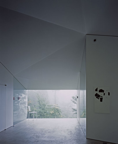
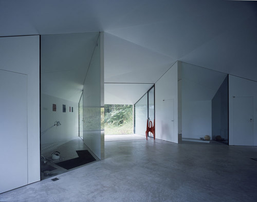
Karuizawa is a resort town surrounded by the forest, well known as a bijou town for the summer retreat and favored by weekenders from Tokyo and the region. The Villa is located in the forest, perched on a steep slope wrapped by the snow in the winter and by the foliage in the summer, oriented to the south, looking out the magnificent views of mountains.

Makoto Yamaguchi — Villa/ Gallery in Karuizawa

The Villa is one story of a polygonal building for a couple of musicians. They wanted a flexible space that could work as a villa; as a gallery for contemporary art – mainly sculptures; as a salon for music concerts; and as a place to entertain friends. To fulfill the functions, the ‘blank space’ was required. The kitchen and the bathroom, which are needed for functioning as a house, are built into the floor. Use of materials are requested as all wooden materials should be invisible, and as glass, mirrors and polished stainless steels reflect the light. The light flows into the interior space where no obstacles are found. The impression of the space is uniquely expanded – the white space with a plenty of void.

Makoto Yamaguchi — Villa/ Gallery in Karuizawa

Makoto Yamaguchi — Villa/ Gallery in Karuizawa

Makoto Yamaguchi — Villa/ Gallery in Karuizawa

Makoto Yamaguchi — Villa/ Gallery in Karuizawa

Makoto Yamaguchi — Villa/ Gallery in Karuizawa

Makoto Yamaguchi — Villa/ Gallery in Karuizawa

Makoto Yamaguchi — Villa/ Gallery in Karuizawa

Makoto Yamaguchi — Villa/ Gallery in Karuizawa

Makoto Yamaguchi — Villa/ Gallery in Karuizawa

Makoto Yamaguchi — Villa/ Gallery in Karuizawa

Makoto Yamaguchi — Villa/ Gallery in Karuizawa

Makoto Yamaguchi — Villa/ Gallery in Karuizawa

Makoto Yamaguchi — Villa/ Gallery in Karuizawa

Makoto Yamaguchi — Villa/ Gallery in Karuizawa

Makoto Yamaguchi — Villa/ Gallery in Karuizawa

Makoto Yamaguchi — Villa/ Gallery in Karuizawa

Makoto Yamaguchi — Villa/ Gallery in Karuizawa

Makoto Yamaguchi — Villa/ Gallery in Karuizawa

Makoto Yamaguchi — Villa/ Gallery in Karuizawa

Library Joan Maragall - BCQ arquitectura barcelona

$
0
0

The main decision has been to construct the new building under the old existing garden and not to occupy a part of this space. The motto with which the project was presented in the ideas competition was “Garden of Light”. These two words sum up the two ideas of the project: maintaining and improving the existing garden, while at the same time providing joyful and well lit spaces.

The library inserts under the garden of Vil·la Florida civic center under the shade of its trees. Inside, a landscape in itself, articulated and changing, where each use and each user find their place. It is a personalized and unique space.

The building will be primarily connected to Sant Gervasi de Cassoles Street. The unevenness between the garden and Sant Gervasi Street naturally provides access to the new facilities. On the other hand, the gardened roof will be on the same level as the old garden, so that the construction of the new facility will mean the restoration of the civic center garden at its maximum dimension, where Vil·la Florida is the building dominating the complex.

The building is shaped by “light and silence patios” and “books and knowledge patios”. The first, surrounded by glass, light and ventilate the interior while isolating the library from the street. The second, solid prisms filled with books, are part of the supporting structure of the library.

BCQ arquitectura barcelona — Library Joan Maragall

Among the courtyards and the volumes, indoor reading and work spaces are articulated. Areas that should be small, seeking to provide a comfortable feeling of domesticity to their users. The interior is solved easily with little textures; ceiling, floor, furniture and walls are white in general, while the face that hide concrete retaining walls and structures of the building are covered with clay tiles. This porous material, sound absorbent and warm, reminds us that it is a half-buried building carved into the earth.

BCQ arquitectura barcelona — Library Joan Maragall

To link the library with the upper garden area two volumes stand out. One is a supported space of the library with direct access from the hall, located in a privileged spot. The other is an entry of skylight to the children’s area.

The existing garden extends through the roof of the new library to the street of Sant Gervasi de Cassoles, where is planned a new access point to the gardens (next to the entrance to the hall of the library). The old garden’s original trees have been replanted on the roof of the new library.


BCQ arquitectura barcelona — Library Joan Maragall

BCQ arquitectura barcelona — Library Joan Maragall

BCQ arquitectura barcelona — Library Joan Maragall

BCQ arquitectura barcelona — Library Joan Maragall

BCQ arquitectura barcelona — Library Joan Maragall

BCQ arquitectura barcelona — Library Joan Maragall

BCQ arquitectura barcelona — Library Joan Maragall

BCQ arquitectura barcelona — Library Joan Maragall

BCQ arquitectura barcelona — Library Joan Maragall

BCQ arquitectura barcelona — Library Joan Maragall

BCQ arquitectura barcelona — Library Joan Maragall

BCQ arquitectura barcelona — Library Joan Maragall

BCQ arquitectura barcelona — Library Joan Maragall

BCQ arquitectura barcelona — Library Joan Maragall

BCQ arquitectura barcelona — Library Joan Maragall

BCQ arquitectura barcelona — Library Joan Maragall

BCQ arquitectura barcelona — Library Joan Maragall

BCQ arquitectura barcelona — Library Joan Maragall

BCQ arquitectura barcelona — Library Joan Maragall

BCQ arquitectura barcelona — Library Joan Maragall

Ampliamento edificio uffici delle Cantine Settesoli a Menfi (AG) - Santi Albanese, Gaetano Gulino, Antonino Bilello

$
0
0

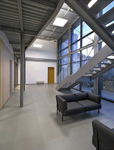
A seguito dell’acquisto della grande area della ex stazione ferroviaria, situata tra lo stabilimento enologico della SS 115 e l’imbottigliamento, la CANTINE SETTESOLI s.c.a. ha programmato la realizzazione dei “lavori di sistemazione delle aree esterne al servizio della struttura di trasformazione e confezionamento vini e l’ampliamento dell’edificio direzionale dell’azienda. L’area interessata dall’intervento di riqualificazione ricade al centro dello stabilimento enologico, costituendo una netta separazione tra la zona dove sorge il complesso edilizio che accoglie le fasi di vinificazione e l’area più a est dove sorge l’edificio che ospita l’impianto di imbottigliamento. Il luogo di intervento consiste in una grande spianata sterrata della superficie di circa 15.000 mq che è stata sede della ex stazione ferroviaria di Menfi. All’interno infatti vi ricadono il fabbricato dell’ex stazione viaggiatori, oggi destinato a sede di alcuni uffici della Settesoli, ed il magazzino merci, oggi destinato a punto vendita dell’azienda. L’edificio di ampliamento della sede direzionale ha un carattere architettonico contemporaneo ed è stato pensato con un “linguaggio” teso a sottolineare il nuovo intervento che si inserisce nel contesto cercando di bilanciare, dal punto di vista volumetrico, l’edificio esistente. Un prisma bianco a base rettangolare a due livelli, “scavato” da ampie logge sui fronti principali è la sede, a piano terra, del laboratorio enologico e degli uffici di pertinenza mentre, a primo piano, è stato destinato a sala riunioni e ad open space di lavoro per l’ufficio marketing. Il nuovo edificio si collega all’esistente tramite una struttura in acciaio vetrata che costituisce il fondale dalla grande scalinata diventando il sistema di ingresso. All’interno della struttura di collegamento si trova una reception ed una ampia hall a doppia altezza al primo livello mentre al secondo ci sono un bar e una piccola sala riunioni. L’edificio è stato costruito con materiali, tecniche e impianti atti a contenere al massimo il consumo energetico; un impianto fotovoltaico integra il fabbisogno elettrico, l’acqua calda sanitaria è prodotta da un impianto solare termico e l’involucro è stato realizzato con una muratura ad alta inerzia termica. Le ampie vetrate della struttura di collegamento sono realizzate con vetri a controllo solare schermati da brise soleil in alluminio i quali in base all’inclinazione solare si orientano automaticamente per evitare l’irraggiamento diretto. Un altro aspetto importante per la riqualificazione dell’azienda è stato il progetto del verde; su tutta l’area di intervento sono state piantumate secondo un disegno che è stato oggetto di numerose consulenze specifiche, una serie di essenze (agrumi, ulivi, vigne, piante aromatiche), con l’obiettivo, da parte della committenza, di riproporre la campagna menfitana all’interno dell’azienda.

Santi Albanese, Gaetano Gulino, Antonino Bilello — Ampliamento edificio uffici delle Cantine Settesoli a Menfi (AG)

Santi Albanese, Gaetano Gulino, Antonino Bilello — Ampliamento edificio uffici delle Cantine Settesoli a Menfi (AG)

Santi Albanese, Gaetano Gulino, Antonino Bilello — Ampliamento edificio uffici delle Cantine Settesoli a Menfi (AG)

Santi Albanese, Gaetano Gulino, Antonino Bilello — Ampliamento edificio uffici delle Cantine Settesoli a Menfi (AG)

Santi Albanese, Gaetano Gulino, Antonino Bilello — Ampliamento edificio uffici delle Cantine Settesoli a Menfi (AG)

Santi Albanese, Gaetano Gulino, Antonino Bilello — Ampliamento edificio uffici delle Cantine Settesoli a Menfi (AG)

Santi Albanese, Gaetano Gulino, Antonino Bilello — Ampliamento edificio uffici delle Cantine Settesoli a Menfi (AG)

Santi Albanese, Gaetano Gulino, Antonino Bilello — Ampliamento edificio uffici delle Cantine Settesoli a Menfi (AG)

Santi Albanese, Gaetano Gulino, Antonino Bilello — Ampliamento edificio uffici delle Cantine Settesoli a Menfi (AG)

Santi Albanese, Gaetano Gulino, Antonino Bilello — Ampliamento edificio uffici delle Cantine Settesoli a Menfi (AG)

Santi Albanese, Gaetano Gulino, Antonino Bilello — Ampliamento edificio uffici delle Cantine Settesoli a Menfi (AG)

Santi Albanese, Gaetano Gulino, Antonino Bilello — Ampliamento edificio uffici delle Cantine Settesoli a Menfi (AG)

Santi Albanese, Gaetano Gulino, Antonino Bilello — Ampliamento edificio uffici delle Cantine Settesoli a Menfi (AG)

Santi Albanese, Gaetano Gulino, Antonino Bilello — Ampliamento edificio uffici delle Cantine Settesoli a Menfi (AG)

Santi Albanese, Gaetano Gulino, Antonino Bilello — Ampliamento edificio uffici delle Cantine Settesoli a Menfi (AG)

Santi Albanese, Gaetano Gulino, Antonino Bilello — Ampliamento edificio uffici delle Cantine Settesoli a Menfi (AG)

Santi Albanese, Gaetano Gulino, Antonino Bilello — Ampliamento edificio uffici delle Cantine Settesoli a Menfi (AG)

Santi Albanese, Gaetano Gulino, Antonino Bilello — Ampliamento edificio uffici delle Cantine Settesoli a Menfi (AG)

Santi Albanese, Gaetano Gulino, Antonino Bilello — Ampliamento edificio uffici delle Cantine Settesoli a Menfi (AG)

Santi Albanese, Gaetano Gulino, Antonino Bilello — Ampliamento edificio uffici delle Cantine Settesoli a Menfi (AG)

Santi Albanese, Gaetano Gulino, Antonino Bilello — Ampliamento edificio uffici delle Cantine Settesoli a Menfi (AG)

Santi Albanese, Gaetano Gulino, Antonino Bilello — Ampliamento edificio uffici delle Cantine Settesoli a Menfi (AG)

Office Addition, DAMIANI HOLZ&KO SpA - MoDus Architects

$
0
0

The project is the result of an invited competition that called for the refurbishing of, and addition to the administrative and logistical headquarters of the wood-building company Damiani Holz&Ko located in the light industrial zone of Bressanone along the Isarco River. The competition brief outlined the need for a structure that embodied not only the company’s activity but also the company’s philosophy; the company designs and develops building systems in wood and pursues the use of environmentally conscientious wood-building products and techniques. As a result, the addition uses multiple construction systems in wood and showcases the use of ‘raw’, industry-grade wood as a finished material in many different forms.

MoDus Architects — Office Addition, DAMIANI HOLZ&KO SpA

Concept
The building is a compact, wooden monolith resting upon a black concrete base. The façade is a vertically oriented wooden brise-soleil that is punctuated by the three large apertures of the main entrance, and the two large windows on the upper floor. The irregular, jagged outlines of the wooden slats pull together the draping second skin in an undulating rhythm that wavers between an impenetrable, solid construction to then dematerialize into a light and airy volume depending on one’s vantage point. This double reading and binary use of wood as heavy and light, robust and delicate, static and dynamic accompanied the design process in both its architectural and technical conception. Moreover, the inherent dependency between the concrete base and the wooden building is also played-out in the technical and tactile symbiosis of concrete and wood. For example, the inherent repercussions of conceiving wood as a prefabricated product is mirrored in the design approach to the prefabricated, sandwich concrete paneled walls of the underground functions of the garage and service spaces. Similarly, the form-work used for the cast concrete of the base encode in the surface of the concrete the grain and type of the wooden formwork: OSB, wooden studs of varying dimensions, and sanded 3-ply panels.

MoDus Architects — Office Addition, DAMIANI HOLZ&KO SpA

Programmatic organization
The office addition is a five-storey building with two entrances split between the upper entry for visitors from the street side and the lower entry located in proximity to the production facilities and stockpile yard of the company. The underground level houses a parking structure for 40 cars and a series of service and mechanical spaces while the ground level houses the commercial (purchasing and sales) department. The entrance from the street gives onto a small reception area from which visitors access the design and engineering offices of the company that connects to the existing building with a glass pavilion housing the informal meeting point for the employees. Administrative offices are found on the first floor followed by the open seminar and event-space of the top floor.

MoDus Architects — Office Addition, DAMIANI HOLZ&KO SpA

Wood Structure
The wooden structure is comprised of two load-bearing wall systems: a perimeter, light-frame construction and two cross-laminated timber structural cores (the central service spaces core and the stair and elevator core) that rise from the concrete base at the lower ground level 3 floors to the wooden roof. The various floor constructions are characterized by one or more structural solutions, showcasing not only the versatility of wood engineering, but also the very malleability of wood itself. All elements used in the flooring systems are strictly structural.

MoDus Architects — Office Addition, DAMIANI HOLZ&KO SpA

Finish materials and furniture design
The structural concrete floor slabs are finished with a polished concrete floor while the wood floor systems are finished with a wooden subflooring and a naturally stained solid oak flooring. Both the pre-fabricated concrete panels and the poured concrete remain exposed while the perimeter stud-walls are finished with the 3-ply sanded formwork panels painted white. All the furniture was custom designed and built with the exception of the chairs with a careful chromatic study of the various surfaces.

MoDus Architects — Office Addition, DAMIANI HOLZ&KO SpA

Energy and Environmental design
Among various energy design strategies, the project uses a biomass heating and cooling system whereby energy production exceeds energy consumption and a mechanical ventilation system with a high coefficient of “recycled” heat. The project obtained the highest category of energy efficiency awarded by the local green building council with the CasaClima Gold title along with the stringent certification of Casaclima Nature for the use of ecological materials and renewable energy sources. The building has also been awarded the CasaClima Work&Life certification for sustainable workplaces.

MoDus Architects — Office Addition, DAMIANI HOLZ&KO SpA

MoDus Architects — Office Addition, DAMIANI HOLZ&KO SpA

MoDus Architects — Office Addition, DAMIANI HOLZ&KO SpA

MoDus Architects — Office Addition, DAMIANI HOLZ&KO SpA

MoDus Architects — Office Addition, DAMIANI HOLZ&KO SpA

MoDus Architects — Office Addition, DAMIANI HOLZ&KO SpA

MoDus Architects — Office Addition, DAMIANI HOLZ&KO SpA

MoDus Architects — Office Addition, DAMIANI HOLZ&KO SpA

MoDus Architects — Office Addition, DAMIANI HOLZ&KO SpA

MoDus Architects — Office Addition, DAMIANI HOLZ&KO SpA

MoDus Architects — Office Addition, DAMIANI HOLZ&KO SpA

MoDus Architects — Office Addition, DAMIANI HOLZ&KO SpA

MoDus Architects — Office Addition, DAMIANI HOLZ&KO SpA

MoDus Architects — Office Addition, DAMIANI HOLZ&KO SpA

MoDus Architects — Office Addition, DAMIANI HOLZ&KO SpA

MoDus Architects — Office Addition, DAMIANI HOLZ&KO SpA

MoDus Architects — Office Addition, DAMIANI HOLZ&KO SpA

MoDus Architects — Office Addition, DAMIANI HOLZ&KO SpA

MoDus Architects — Office Addition, DAMIANI HOLZ&KO SpA

MoDus Architects — Office Addition, DAMIANI HOLZ&KO SpA

MoDus Architects — Office Addition, DAMIANI HOLZ&KO SpA

MoDus Architects — Office Addition, DAMIANI HOLZ&KO SpA

MoDus Architects — Office Addition, DAMIANI HOLZ&KO SpA

MoDus Architects — Office Addition, DAMIANI HOLZ&KO SpA

MoDus Architects — Office Addition, DAMIANI HOLZ&KO SpA

MoDus Architects — Office Addition, DAMIANI HOLZ&KO SpA

MoDus Architects — Office Addition, DAMIANI HOLZ&KO SpA

132 Social Housing Block - Estudio Entresitio

$
0
0

This project is the result of a competition run by Madrid’s Municipal Housing Agency at the end of 2003. The philosophy of the competition was that each team would offer the best architecture solution that was able to imagine, subject to compliance with the “economic” parameters for the lot; maximum surface to be built and number of dwellings, and always considering that it is a social housing development. It was the choice of the contestants to decide whether a “measured” solution that would meet the other urban planning conditions of floor occupation, alignments, heights, etc.., or if, as was our case, raised a proposal that needed further planning changes.
Our winning proposal was a tower of 22 floors.

Estudio Entresitio  — 132 Social Housing Block

The project can be explained in many ways, but there is one to which we do not like to resign, that has to do with the floor plan’s efficiency and the resolution of a given functional program such as housing. We deal with apartments “for rent” that are characterized by their small size, as they are, from sheltered housing, those most in line with the minimum dimensional regulations.

Estudio Entresitio  — 132 Social Housing Block

The project builds a total of 132 one and two bedrooms housing units, for a net floor area of 9000 sqm plus 300 sqm of ground floor commercial use.

Estudio Entresitio  — 132 Social Housing Block

Above ground, the building occupies 70% of the limit set by the alignment of the façades, with a general setback to liberate more public space on the front sidewalk access and natural relief of ground floor commercial use. This setback can avoid the typical chamfers of the area planning and work with sharper volume geometry.

Estudio Entresitio  — 132 Social Housing Block

For a certain floor area, reducing the footprint of the building necessarily implies growing in height and in this case we propose a shaped volume with a profile proportions, lets say, uncommon. One might think of the building as an aggregation of a tower and a block by a central body, but we are more interested in the idea of a free development in height, where the balance between the parts and the whole is somewhat disturbing.

Estudio Entresitio  — 132 Social Housing Block

The floor plan solution is based on the geometric process of “double symmetry”, as in the ambigrams, which are words or figures that can be read alike when rotated 180 degrees. This strategy works to blur the different parts as the order of each one is not clear and becomes associated with the order of the others. It also has to do with the fact that the building, as a free block, is perceived as a piece in which there is no distinction between front and rear or beginning and end, and responds similarly to both the access road as to the green zone that runs lengthwise on the other front.

Estudio Entresitio  — 132 Social Housing Block

Only in a clinical cut of this mixed development, we would begin to understand how diversity has ordered the program. Although all the apartments have 1 or 2 bedrooms, the smallest elements are set in height, and developed on one floor, while the duplex, as repetition of functionally undifferentiated units, occupy the longitudinal development of the plinth. The homes are not the result of an a priori subdivision of the plant but are solved interlaced both in plan and section.

Estudio Entresitio  — 132 Social Housing Block

The duplex units are composed of two versatile rooms that cross section to enjoy both North and South directions. By having access by the first floor can respond to both, the characteristic use (planning) of housing or to tertiary application, commercial and offices at the first floor and hosting at any level above ground floor.

Estudio Entresitio  — 132 Social Housing Block

As indeed there are many ways of explaining a project, there is another one that deals with the urban character of the building, with the construction of the city and the need to, somehow, characterize new residential tissues, in this case of Madrid, that as many others lack of intention in its definition. In this sense the project works on several levels. The outer shell uses resources of non-differentiation and scale ambiguity. It is a skin of zinc scales set in horizontal bands that slide one over another with a slight offset, and in which voids are inserted with the intention of not making clear the floor levels. We propose a combinatorial system of recognizable types of housing windows which are placed at the best position from the inside of the rooms.

Estudio Entresitio  — 132 Social Housing Block

On this support structure of unity and also of diversity, are added some projecting crates, that as free forms of distortion, introduce a slight vibration on the elevation.

Estudio Entresitio  — 132 Social Housing Block

The relationship between the concepts of “coexistence of scales” and “scaling ambiguity”, what is big and what is small along with what is not revealed either as large or small, establishes the dialogue that occurs in other settings by the historic city and the successive developments that occur in it over the time. Somehow, duality becomes almost a search method, on the one hand we work with the intention that the city does not only speak of its buildings but the void that they generate, there is a well-defined function scheme in plan and no clear translation in the elevations, the condition of continuous wrapping is enhanced that, despite its lightweight material, contributes to the perception of the building as a solid, and we propose for construction of such a sharp and crisp volume, a scaled and not very smooth finish but certainly homogeneous. In this way we mix day-to-day and extraordinary, the regular domestic window that corresponds to a clear functional order with extraordinary placements, removing the composition and helping to understand the whole as a uniform mass.

Estudio Entresitio  — 132 Social Housing Block

There is also a third way of explaining the project that could be the titled as “architecture and technique”, which deals with the fitting of ideas to make them buildable. In developing the execution project and during the construction process occurs filtering of legislation, planning, budgeting, constructive feasibility and, above all, the real spatial translation of the topics raised.

Estudio Entresitio  — 132 Social Housing Block

Thus, the zinc facade becomes the central argument not only for its physical implementation, but also as an energy efficiency strategy. We propose a low maintenance solution, ventilated, which facilitates the transpiration of the facade, protects the building from rainwater infiltration and prevents interstitial condensation. It involves the optimization of acoustic and thermal insulation of the building, which being located on the outside of the brick walls, avoids possible thermal bridges. In the hot season, it produces a “chimney effect”, the sun heats the air standing in the chamber, rising by convection and forcing fresh air to enter on the lower part of the façade, preventing the accumulation of heat in the inter layer space.

Estudio Entresitio  — 132 Social Housing Block

In winter, however, solar radiation is not sufficient to produce the movements of air and ventilated facade acts as a heat accumulator to produce the opposite effect.#socialhousing

Estudio Entresitio  — 132 Social Housing Block

Estudio Entresitio  — 132 Social Housing Block

Estudio Entresitio  — 132 Social Housing Block

Estudio Entresitio  — 132 Social Housing Block

Estudio Entresitio  — 132 Social Housing Block

Estudio Entresitio  — 132 Social Housing Block

Elementary school Addition and renovation - MoDus Architects, bergmeisterwolf

$
0
0

Two white, compact volumes frame the existing historical building of the town’s elementary school to create a carefully calibrated ensemble of new and old. These two flanking wings work to better define the front school courtyard and mark out separate access points to the two constituent schools. The adjacent centennial chestnut tree commands an important role not only within this newly reconfigured school courtyard, but also finds new ground in the white façade and beyond: delicate tracings overlay the elevations with leafy outlines to then reappear imprinted into the bare concrete walls within the building itself. Indeed, a strong contrast of materials mark the exterior and interiors of the school with an emphasis however on tactile surfaces and robust materials able to hold their ground into the future.

MoDus Architects, bergmeisterwolf — Elementary school Addition and renovation

All the public and common programs shared between the two schools (multipurpose hall, administrative offices, library, changing areas, etc.) are found at the ground level and lower level while the remaining spaces of the schools are distributed across the upper three floors. A zigzagging corridor connects the three volumes of the new school complex horizontally and pulls them together into one fluent didactic space.

MoDus Architects, bergmeisterwolf — Elementary school Addition and renovation

The head-teacher of the school saw the renovation and addition of the school as an opportunity to review the school’s pedagogical approach and in turn worked to implement radically new teaching and learning methods. A close collaboration between the architects and the school ensued. Every space of the school became a space of learning whereby different kinds of spaces leaned towards different kinds of learning. This dialogue between architecture and pedagogical content downplayed the classroom as the epicenter of learning and imagined corridors, niches and landings as informal, didactic venues. Apertures, windows, sliding doors and glass walls were but a few of the architectural answers for a more communicative and agile place of learning.

MoDus Architects, bergmeisterwolf — Elementary school Addition and renovation

MoDus Architects, bergmeisterwolf — Elementary school Addition and renovation

MoDus Architects, bergmeisterwolf — Elementary school Addition and renovation

MoDus Architects, bergmeisterwolf — Elementary school Addition and renovation

MoDus Architects, bergmeisterwolf — Elementary school Addition and renovation

MoDus Architects, bergmeisterwolf — Elementary school Addition and renovation

MoDus Architects, bergmeisterwolf — Elementary school Addition and renovation

MoDus Architects, bergmeisterwolf — Elementary school Addition and renovation

MoDus Architects, bergmeisterwolf — Elementary school Addition and renovation

MoDus Architects, bergmeisterwolf — Elementary school Addition and renovation

MoDus Architects, bergmeisterwolf — Elementary school Addition and renovation

MoDus Architects, bergmeisterwolf — Elementary school Addition and renovation

MoDus Architects, bergmeisterwolf — Elementary school Addition and renovation

MoDus Architects, bergmeisterwolf — Elementary school Addition and renovation

MoDus Architects, bergmeisterwolf — Elementary school Addition and renovation

MoDus Architects, bergmeisterwolf — Elementary school Addition and renovation

MoDus Architects, bergmeisterwolf — Elementary school Addition and renovation

MoDus Architects, bergmeisterwolf — Elementary school Addition and renovation

MoDus Architects, bergmeisterwolf — Elementary school Addition and renovation

MoDus Architects, bergmeisterwolf — Elementary school Addition and renovation

MoDus Architects, bergmeisterwolf — Elementary school Addition and renovation

MoDus Architects, bergmeisterwolf — Elementary school Addition and renovation

MoDus Architects, bergmeisterwolf — Elementary school Addition and renovation

ponte pedonale sul Navigliaccio - Vincenzo Casali

$
0
0

Ponte pedonale sull’affluente del Ticino, il Navigliaccio, a Ovest della città di Pavia in prossimità del ponte della Ferrovia. Il ponte consente di percorrere la riva fino al bosco della Sora.

Vincenzo Casali — ponte pedonale sul Navigliaccio

La quota dell’imposta del ponte è stata determinata dallo studio di compatibilità idraulica, che ha preso come riferimento la quota più alta dello scarico delle acque confluenti da monte, aumentandolo di un metro.

Vincenzo Casali — ponte pedonale sul Navigliaccio

Vincenzo Casali — ponte pedonale sul Navigliaccio

Vincenzo Casali — ponte pedonale sul Navigliaccio

Vincenzo Casali — ponte pedonale sul Navigliaccio


CMS Villaverde - Estudio Entresitio

$
0
0

The Villaverde health center is part of a process we call 3×1, or “why” is that we have built 3 times the same building. The beginning goes back to an unusual competition called for the construction of two identical buildings (the same customer, even functional program and same budget) in two different places in Madrid (Usera and San Blas) whose common characteristic was their lack of relevance. Our winning proposal was one building whose formal and functional autonomy was enough to “exist” independently of the site, a building misplaced. We were interested to note the value and interior space, and thinking about lecorbuseriana idea of “reconciliation of opposites”, putting a tight image and the outside rotunda off the interior light and ambiguous. 
On the occasion of a second contest for the site of Villaverde had the opportunity to verify that the spatial model and the solution in new plant were viable, although in this case in an urban situation more committed to the street alignment and building next to the pedestrian. 

For the third time and equally to the above, the health center program is developed extensively in a single floor.

Estudio Entresitio  — CMS Villaverde

The various program units are ordered by generating a sparse irregular orthogonal grid, where 13 yards staggered distributed between public and private placements through three (non)-parallel corridors. The corridor dissolved, ceases to exist as a linear structure of traditional connection, because the alternative management of empty spaces and hospitality towards the public allows a weak relationship between the coordinates “x” and “y” of space. 

As opposed to this light system, atomized by the courts, the rotunda and impenetrable facade is conceived as a mass of glass modulated continuous and blind. Compared to their twin buildings of the cms Villaverde resolve the contrast between two opposite situations in a more smooth, which is expressed by the use of a constructive tectonic: metal, glass and polycarbonate enclosures with varying degrees of opacity and transparency .

Estudio Entresitio  — CMS Villaverde

The building from outside is destined to camouflage where the white glass reflects the surrounding space without allowing an interior-exterior visual relationship yet remains almost disappearing. From inside the contact with the outside through the vertical closure is eased from the world of shadow, shadows cast on the translucent walls of what happens on the other hand, pedestrians, trees, etc.

Estudio Entresitio  — CMS Villaverde


The idea of the impenetrability of the glass facade is reinforced at two levels: on one hand, the different sizes of glass panels arranged without forming a grid, combining different heights and widths with the desire not to reveal floor heights and looking for some balance between horizontal and vertical. On the other hand, seeks to solve the continuity between two types of glass, opaque white and translucent white, using a simple mathematical rule of greatest common divisor.

Estudio Entresitio  — CMS Villaverde

The three panels are multiples of 25cm wide, which check relationships among the type b = 2a, c = 3a, c = a + b, 2b = a + c. 

The absence of holes in vertical panels of exterior glass enclosure makes the interior-exterior relationship building occurs vertically. Inside clear glass without woodworking but do not define patios horizontal holes in the facade of the outer shell of the building and creates a vertical relationship that generates an isotropic interior space and a fifth facade, covered buildings seen from surrounding houses. Inside the transparent qualities of glass and mirror visions multiply reflected symmetry, likewise the qualities of reflection and diffuse lighting of translucent polycarbonate vertical panels help create a spacious and luminous interior environment with a certain sense atmospheric .

Estudio Entresitio  — CMS Villaverde

Estudio Entresitio  — CMS Villaverde

Estudio Entresitio  — CMS Villaverde

Estudio Entresitio  — CMS Villaverde

Estudio Entresitio  — CMS Villaverde

Estudio Entresitio  — CMS Villaverde

Estudio Entresitio  — CMS Villaverde

Estudio Entresitio  — CMS Villaverde

Silesian Museum Katowice - Riegler Riewe Architekten ZT-Ges.m.b.H.

$
0
0

The history of the city of Katowice is closely tied with the themes of heavy industry and mining. They have left behind distinctive arti cial landscapes, industrial complexes, and buildings and are anchored in the collective consciousness as an unmistakable cultural heritage endowing a sense of identity. The museum is located on the premises of the former “Warszawa mine,” directly adjacent to the city center. The design uses interventions that are nearly imperceptible from the outside and is based on the idea of creating an expansive museum with diverse offerings. Borrowing from, and as homage to the former function of the terrain, the spatial program was placed entirely below ground. Only the abstract glass cubes, which provide daylight for the exhibition levels below—one of them houses administration, development, and climate control—are visible from the outside and meld harmoniously in the ensemble of existing historicalstructures. The newly created network of paths, squares, and green areas gives rise to a gracefully built public recreational area. Through the addition of a lift, visitors can access the existing hoist frame and obtain a view over all of Katowice.

Riegler Riewe Architekten ZT-Ges.m.b.H. — Silesian Museum Katowice

Riegler Riewe Architekten ZT-Ges.m.b.H. — Silesian Museum Katowice

Riegler Riewe Architekten ZT-Ges.m.b.H. — Silesian Museum Katowice

Riegler Riewe Architekten ZT-Ges.m.b.H. — Silesian Museum Katowice

Riegler Riewe Architekten ZT-Ges.m.b.H. — Silesian Museum Katowice

Riegler Riewe Architekten ZT-Ges.m.b.H. — Silesian Museum Katowice

Riegler Riewe Architekten ZT-Ges.m.b.H. — Silesian Museum Katowice

Riegler Riewe Architekten ZT-Ges.m.b.H. — Silesian Museum Katowice

Riegler Riewe Architekten ZT-Ges.m.b.H. — Silesian Museum Katowice

Riegler Riewe Architekten ZT-Ges.m.b.H. — Silesian Museum Katowice

level 0

Riegler Riewe Architekten ZT-Ges.m.b.H. — Silesian Museum Katowice

level -4

Riegler Riewe Architekten ZT-Ges.m.b.H. — Silesian Museum Katowice

longitudinal section

Citylife - Zaha Hadid Architects

$
0
0

Il lotto residenziale C, parte integrante del piano di riqualificazione del quartiere ex-Fiera di Milano, si compone di 7 edifici con tipologia in linea e si sviluppa secondo un percorso continuo all’interno delle due aree fondiarie Rc1 (comprendente gli edifici C1, C2. C3) ed Rc2 (comprendente gli edifici C4, C5, C6, C7).

Zaha Hadid Architects — Citylife

L’ambito di intervento si trova nella zona più a sud del masterpian per l’area del Quartiere Storico della fiera di Milano, ed è rivolto a nord verso il nuovo quartiere ed il parco. L’andamento del profilo delle coperture degli edifici è caratterizzato da un andamento continuo e sinuoso e si configura come elemento di caratterizzazione dell’intero complesso, crescendo con continuità a partire dall’edificio C2 prospiciente sul piazza Giulio Cesare per salire verso il suo punto più alto costituito dall’edificio C6, unificando così idealmente lo skyline degli sette edifici.

Zaha Hadid Architects — Citylife

Al fine di soddisfare entrambi i requisiti di visuale ed esposizione le volumetrie sono state organizzate in modo da rivolgersi in parte sul parco e in parte verso l’esposizione a mezzogiorno, in modo che tutti gli appartamenti possano di vista sul parco e/o sulla città, e gran parte di essi dell’esposizione sud/ovest. Le facciate degli edifici sono state progettate a ‘rilievo’ al fine di permettere una varietà di spazi diversi fra esterni ed interni; in linea con l’andamento sinuoso delle coperture l’andamento curvilineo dei balconi definisce il movimento sulla facciata che fa eco al paesaggio sottostante.

Zaha Hadid Architects — Citylife

Alla quota del piano terra sono state studiate ampie aperture a doppia altezza in corrispondenza degli ingressi ai vari edifici, che attraversandone trasversalmente la sagoma indirizzano la vista dei pedoni e conferiscono un forte senso di apertura visiva verso il parco. Benché sia stata data ampia considerazione alle condizioni morfologiche dell’attacco a terra, ciò che formalmente domina il progetto è l’orizzonte urbano, il profilo dei tetti, che offre eleganti forme curvilinee a tutti gli attici dell’ultimo piano con generose terrazze di copertura. Il profilo delle coperture è ritenuto parte fondamentale del progetto, sia perché l’insediamento abitativo sarà visto in gran parte dai piani alti (i tre grattacieli proposti sul sito della Fiera che guardano il complesso residenziale dall’alto), sia perché all’interno dello lotto stesso il movimento del profilo dei tetti riesce a creare un ricco paesaggio abitabile caratterizzato da una profonda dinamicità.

Zaha Hadid Architects — Citylife

Progetto: 2004-2014

Credits
Design: Zaha Hadid with Patrik Schumacher
Project Director: Gianluca Racana
Residential Project Architect: Maurizio Meossi
Residential Design Team: Vincenzo Barilari, Cristina Capanna, Giacomo Sanna, Paola Bettinsoli, Gianluca Bilotta, Fabio Ceci, Veronica Erspamer, Arianna Francioni, Stefano Iacopini, Mario Mattia, Serena Pietrantonj, Florindo Ricciuti, Giulia Scaglietta, Giovanna Sylos Labini, Anja Simons, Marta Suarez, Tamara Tancorre, Giuseppe Vultaggio, Massimiliano Piccinini, Samuele Sordi, Alessandra Belia
Residential Site Supervision Team: Cristina Capanna, Veronica Erspamer, Stefano Iacopini, Giulia Scaglietta, Florindo Ricciuti Competition Team: Simon Kim, Yael Brosilovski, Adriano De Gioannis, Graham Modlen, Karim Muellem, Daniel Li, Yang Jingwen, Tiago Correia, Ana Cajiao, Daniel Baerlecken, Judith Reitz
Structural Engineer: Adams Kara Taylor, MSC
M&E Max Fordham Partnership, MilanoProgetti, Hilson-Moran Italia
Lift Consultant: Roger Preston
Fire Safety: Silvestre Mistretta
Transport: Systematica

Zaha Hadid Architects — Citylife

Zaha Hadid Architects — Citylife

Zaha Hadid Architects — Citylife

Zaha Hadid Architects — Citylife

Zaha Hadid Architects — Citylife

Zaha Hadid Architects — Citylife

Zaha Hadid Architects — Citylife

Zaha Hadid Architects — Citylife

Zaha Hadid Architects — Citylife

Zaha Hadid Architects — Citylife

Zaha Hadid Architects — Citylife

Zaha Hadid Architects — Citylife

Zaha Hadid Architects — Citylife

Zaha Hadid Architects — Citylife

Zaha Hadid Architects — Citylife

Zaha Hadid Architects — Citylife

Zaha Hadid Architects — Citylife

La Città delle Culture - David Chipperfield Architects

$
0
0

Storia, progetto e funzioni
Rientra nella strategia di recupero del patrimonio immobiliare dismesso scelta dal comune di Milano, questo intervento unico nello sviluppo e nel concept ideativo. Rispecchia le nuove strategie urbanistiche che cercano di giungere al rallentamento del consumo del suolo, la nuova operazione milanese per rifunzionalizzare aree abbandonate, anche disegnandone nuove porzioni per far riacquistare alla città una sua parte importante e storica. Sotto la spinta di questa nuova sensibilità, il cuore dell’immenso quadrilatero occupato un tempo dai capannoni dell’Ansaldo di via Bergognone, in zona Tortona, è stato destinato, nel 1999, a trasformarsi da archeologia industriale del primo Novecento a “la Città delle Culture”. L’impianto originario risale infatti al 1904 ed è riconducibile all’impresa automobilistica di Roberto Zϋst. Già nel 1908 però le officine vengono rilevate dall’AEG per la produzione di componenti elettriche e dinamo, giungendo, dopo una serie di passaggi, al gruppo Finmeccanica-Ansaldo, nel 1966, che si occupava qui della costruzione di locomotive, carrozze ferroviarie e tramviarie.

David Chipperfield Architects — La Città delle Culture

Il concorso per l’assegnazione del progetto, bandito dall’allora assessore a Cultura e Musei Salvatore Carrubba con il direttore centrale Alessandra Mottola Molfino, premia David Chipperfield, stimando la proposta dell’architetto di fama internazionale la soluzione che “meglio risolve il rapporto tra nuovo e vecchio, senza dissonanze, ricercando i propri valori in un non facile contesto”. L’idea del progettista è in sostanza quella di recuperare la lunga cortina edilizia su via Tortona, dentro la quale ricavare con disposizione sequenziale gli spazi destinati al Museo archeologico, al Casva, al Laboratorio di marionette Colla e alla Scuola di cinema, con un colonnato in cemento aperto verso il lato interno e di costruire invece una parte nuova da dedicare al centro delle culture extraeuropee. Questo nuovo volume nasce per essere la vera e propria immagine distintiva dell’intero intervento, un grande corpo ondulato, polilobato, assolutamente in contatto diretto con la luce.
Tra il 2001 e il 2003 vengono redatti e consegnati i progetti preliminare, definitivo ed esecutivo. Ad oggi il lavoro è completato al 90%, tutte le strutture sono state terminate, mancano solo gli arredi interni.

David Chipperfield Architects — La Città delle Culture

Lo sviluppo architettonico
L’edificio si mostra sostanzialmente fedele al progetto iniziale imperniato sulla ricerca di leggerezza dell’originaria imponenza del lotto attraverso la creazione del corpo centrale caratterizzato, in opposizione all’esterno dell’edificio senza aperture, dall’atrio completamente vetrato messo in opera con una particolare forma organica con sagoma ondulata, a riprendere il concetto di piazza coperta, attorno alla quale si apriranno le sale espositive di tagli diversi e modificabili in modo flessibile. Il volume, costruito in vetro acidato con superfici paraboliche, fungerà da lanterna per la città nelle ore serali. Costretta su tutti i lati da edifici e strutture nate nel tempo per necessità lavorative senza un previo studio urbanistico, l’architettura gioca sull’introspezione, filtrando lo sguardo del fruitore attraverso il contrasto tra linee e curve, le prime a protezione delle seconde, centrando il tema comunicativo sull’introflessione, sul raccoglimento quasi meditativo. All’esterno dunque la struttura si può leggere come un allineamento di stereometrie squadrate interamente rivestite in zinco-titanio, atto di riverenza nei confronti del contesto industriale dell’Ansaldo. Questi corpi spigolosi e rigidi circondano, quasi a proteggerlo, il cuore dell’intervento, che pare sbocciare con linee di luce che disegnano la struttura quadrilobata dell’atrio di vetro opalescente. Un cristallo di luce, inaspettatamente flessuoso e dagli ampi respiri, introduce le retrostanti sezioni del museo, organizzate in cluster di sale rettangolari adiacenti che si susseguono in ordine gerarchico di grandezza, studiate per dare la possibilità di scegliere chiusure selettive degli ambienti e assecondare la rotazione delle collezioni a museo aperto, tutto ciò mantenendo la filosofia della continuità del percorso del visitatore.

David Chipperfield Architects — La Città delle Culture

A occuparsi dell’atrio centrale, delle facciate e di tutto l’involucro in generale Stahlbau Pichler con un team di ingegneri e tecnici impegnati su un progetto ambizioso, ma allo stesso tempo davvero appagante. Saliti nel cuore del progetto quindi, si emerge in questo alto e luminoso corpo di vetro opaco, una sorta di fiore dalle forme fluide e accoglienti, snodo dei percorsi che di qui portano all’auditorium, agli spazi per le esposizioni temporanee, dove l’insolita altezza è illuminata dalla luce zenitale, intercettata da lucernari in copertura e integrata da lampade a regolazione automatica. Sempre partendo da quest’anima centrale è possibile recarsi ad altre sale destinate a ospitare piccoli nuclei delle raccolte etnografiche, pensati per instaurare di volta in volta un dialogo con le mostre di contemporanea che si terranno nelle aule contigue. All’ultimo piano, il bar e il ristorante, anch’essi vetrati e quindi pieni di luce.

David Chipperfield Architects — La Città delle Culture

Le strutture e le facciate
La struttura in acciaio della grande “lanterna” centrale e le facciate sono state realizzate da Stahlbau Pichler seguendo un disegno tanto pulito visivamente quanto complesso dal punto di vista realizzativo. Andando a vedere la sezione verticale della lanterna possiamo identificare: scossalina in alluminio preverniciato, lastra di compensato marino da 20 mm, manto impermeabilizzante a base bituminosa, supporto puntuale per lastra di compensato marino, elemento stabilizzante del montante verticale, isolamento termico con doppia lastra di polistirene estruso, elementi di ancoraggio del montante della facciata vetrata alla struttura in acciaio retrostante, corpo illuminante, struttura in acciaio verniciato bianco, colonna in acciaio verniciato bianco, trave di bordo in acciaio.

David Chipperfield Architects — La Città delle Culture

La facciata continua esterna è realizzata con profilati in acciaio e cartelline esterne in alluminio preverniciato. Il vetrocamera è composto da doppio vetro stratificato con interlayer di pvb opalino e lastra interna ad assorbimento termico. Il grigliato in acciaio preverniciato bianco presenta una maglia 44×44, di altezza 25/10 mm e s=2 mm, fermapiede in acciaio preverniciato bianco, giunto orizzontale con sigillatura siliconica, corpo illuminante con riflettore bianco, staffa di ancoraggio in acciaio preverniciato bianco della facciata continua esterna alla struttura in acciaio retrostante, colonna in acciaio verniciato bianco, struttura d’irrigidimento in acciaio.

David Chipperfield Architects — La Città delle Culture

Il rivestimento in alluminio preverniciato è stato predisposto con isolante termico a doppia lastra di polistirene estruso di spessore minimo pari a 8 cm, massetto di pendenza in calcestruzzo alleggerito a pendenza min. 1%, soletta in calcestruzzo armato, struttura in acciaio di supporto per la vetrata della vetrina espositiva, controsoffitto in lastre fonoassorbenti avvitate su orditura metallica, piatti in acciaio calandrati preveniciati in bianco per il fissaggio del vetro, corpo illuminante montato su binario a incasso.
La parete vetrina espositiva è stata realizzata in vetro curvo extrachiaro stratificato 10+10 mm e il pavimento sopraelevato ha finitura in basaltina, supporti verticali regolabili, cordolo in calcestruzzo armato. La base della vetrina espositiva è stata prevista in pannelli modulari di mdf verniciato con piastra in acciaio verniciato bianco da 10 mm pantografata al plasma.
La facciata continua interna è realizzata con intelaiatura perimetrale in alluminio e vetro curvo extrachiaro stratificato con interlayer di pvb opalino e acidatura sulla superficie interna all’atrio.
La struttura è in acciaio, il telaio di supporto della vetrata interna è in alluminio preverniciato bianco, la lastra di tamponamento in cartongesso e i pannelli sono modulari sandwich in mdf bianco, apribili per ispezione con cerniere a scomparsa e meccanismo di chiusura nascosto.
Montanti e traversi in acciaio sono tutti verniciati in colore bianco. Il vetrocamera, del tipo doppio stratificato, è composto da: lastra esterna extrachiara 66.2 con pvb opalino, intercapedine d’aria 16 mm, lastra interna float 44.2 ad assorbimento termico.
Testo: Stahlbau Pichler

David Chipperfield Architects — La Città delle Culture

CREDITI
Progettista
David Chipperfield Architects: David Chipperfield Giuseppe Zampieri, Cristiano Billia, Oliver Ulmer; Responsabili di Progetto: C. Billia, G. Sirica, O. Ulmer; Architetti di contatto: PiùArch (concorso), F&P Architetti; Consulente per l’architettura: Alberto Izzo & Partners

Modelli
David Chipperfield Architects, A-Models, Metthew Marchbank, Vista Models

Illuminotecnica
Ove Arup & Partners, Mario Nanni Progettista

Preventivi e computi
Tim Gatehouse Associates, F & P Cantieri

Direzione artistica
David Chipperfield Architects e Italsocotec (consulenti)

Direzione lavori
Comune di Milano, Direzione Centrale Tecnica

Strutture in acciaio e involucro
Stahlbau Pichler (per le strutture e le facciate dell’atrio centrale, per le facciate vetrate ed i rivestimenti in Zn-Ti di tutto l’intervento)
Project Manager: Diego Pulici
Design Manager: Massimo Colombari

Imprese
Consorzio Cooperativa Costruzioni: Ansaldo 2011 composta da Cooperativa di Costruzioni Lavoranti e Muratori, Società Cooperativa Muratori Sterratori ed Affini per le opere edili e le finiture;
Stahlbau Pichler per tutte le strutture in acciaio e le facciate; Gemmo Impianti per impianti elettrici e speciali;
Cooperativa Cefla per impianti meccanici.
Strutture: Sajni & Zambetti.
Impianti: Manens Intertecnica, Ove Arup & Partners

Cronologia
1999-2000 concorso; 2001-2007 progettazione; 2008-2013 realizzazione

CMS San Blas - Estudio Entresitio

$
0
0

El centro de salud de San Blas es un edificio que desde su inicio en la fase de concurso ha tenido clara la idea o premisa de “edificio desubicado”. Esta idea no es algo nuevo que nosotros aportamos a la arquitectura, sino más bien que nos parece una forma eficaz y rotunda de desarrollar un programa funcional sanitario en un entorno poco relevante.

Estudio Entresitio  — CMS San Blas

Para acentuar el valor espacial interior recurrimos a la lecorbuseriana idea de “conciliación de contrarios”. Se antepone un edificio hermético y pesado al exterior ante un espacio abierto y ligero al interior. Para conseguir esto utilizamos tanto una determinada ordenación del programa funcional por bandas como las posibilidades que nos permiten materiales como hormigón, vidrio y azulejo.

Estudio Entresitio  — CMS San Blas

El programa del centro de salud se desarrolla básicamente en una planta baja, aunque existe un sótano para albergar el garaje y parte de las instalaciones del edificio. En planta las distintas dependencias del programa se ordenan generando una parrilla ortogonal irregular poco densa, donde 13 patios se distribuyen al tresbolillo entre las estancias públicas y privadas siguiendo tres (no)-corredores paralelos.

Estudio Entresitio  — CMS San Blas

En oposición a este sistema ligero, atomizado por los patios, la fachada rotunda y pesada se concibe como una masa continua y ciega de hormigón visto. Idea de pesadez que se refuerza con una textura rugosa formada por encofrado de tablas horizontales que principalmente se modula cada 90cm de ancho. De esta manera la inexistencia de huecos en los paños verticales de la envolvente exterior hace que la relación interior-exterior del edificio se produzca verticalmente, casi con el firmamento. Los vidrios no definen patios sino huecos en la fachada horizontal de la concha exterior del edifico y se crea una relación vertical que permite generar un espacio interior isótropo. Las cualidades de transparencia y especulares del vidrio multiplican las visiones por simetría reflejada y junto con las cualidades de reflexión de los paños verticales de azulejo azul colocado con juntas terciadas a modo de escama ayudan a producir un ambiente interior espacioso y luminoso, casi como se introdujera el firmamento en el interior. Así el corredor se disuelve, deja de existir como una estructura lineal de conexión tradicional, porque la ordenación alterna de espacios vacíos y estanciales de carácter público permite una relación débil entre las coordenadas “x” e “y” del espacio. Para poder conseguir esta alternancia es necesario que la distribución del programa funcional se organice en barras programáticas compuestas a su vez por subunidades porque son fácilmente adaptables y alternables.

Estudio Entresitio  — CMS San Blas

Estudio Entresitio  — CMS San Blas

Estudio Entresitio  — CMS San Blas

Estudio Entresitio  — CMS San Blas

Estudio Entresitio  — CMS San Blas

Estudio Entresitio  — CMS San Blas

Estudio Entresitio  — CMS San Blas

Estudio Entresitio  — CMS San Blas

Estudio Entresitio  — CMS San Blas

Estudio Entresitio  — CMS San Blas

Estudio Entresitio  — CMS San Blas

Estudio Entresitio  — CMS San Blas

Estudio Entresitio  — CMS San Blas

Estudio Entresitio  — CMS San Blas

Estudio Entresitio  — CMS San Blas

Estudio Entresitio  — CMS San Blas

Obikà - Labics

$
0
0

Labics ha ideato il concept per il progetto Obikà nel 2002; da allora ha progettato e curato la realizzazione di tutti i ristoranti nel mondo.

Labics — Obikà

Obikàè un progetto imprenditoriale per la promozione e la diffusione di alcuni prodotti gastronomici tipici della tradizione italiana che ha il suo cuore nel Mozzarella Bar, un nuovo modo di proporre la degustazione di uno dei prodotti più pregiati della cultura gastronomica italiana: la mozzarella di bufala. Il concept, nel rispondere al tema della ripetibilità e riconoscibilità dei vari ristoranti, piuttosto che affrontare l’ottimizzazione di elementi di arredo sovrastrutturali rispetto allo spazio dato, ha indagato la ripetizione di un concetto spaziale e, dunque, dei suoi elementi costituenti – il tool kit – portando così all’interno di un progetto ripetibile, l’unicità e la specificità del luogo e dello spazio. In questo modo, ogni ristorante Obikà, ha rappresentato una variazione all’interno di una necessaria e riconoscibile ripetizione. Partendo dunque dalla modalità di presentazione del cibo – autentica novità della ricerca Obikà– si è concepito il luogo della ristorazione come un paesaggio artificiale, caratterizzato dalla presenza di alcuni elementi ricorrenti: le grandi teche di vetro per esporre il cibo, in primo luogo la mozzarella, e mostrarli direttamente al cliente; il bancone, che assume di volta in volta forma e dimensioni diverse; ed infine l’involucro attivo, ovvero un insieme di superfici e contenitori in ferro che, sovrapponendosi allo spazio dato, definiscono di volta in volta nuove funzionalità ed insieme nuove spazialità

Labics — Obikà

Labics — Obikà

Labics — Obikà

Labics — Obikà

Labics — Obikà

Labics — Obikà

Labics — Obikà

Labics — Obikà

Labics — Obikà

Labics — Obikà

Labics — Obikà

Labics — Obikà

Labics — Obikà

Labics — Obikà

Labics — Obikà

Labics — Obikà

Labics — Obikà

Labics — Obikà

Labics — Obikà

Labics — Obikà

Labics — Obikà

Labics — Obikà

Labics — Obikà

Labics — Obikà

Labics — Obikà

Labics — Obikà

Labics — Obikà

Labics — Obikà

Labics — Obikà

Labics — Obikà

Labics — Obikà

Labics — Obikà

Labics — Obikà

Labics — Obikà

Labics — Obikà

Labics — Obikà

Residenza in Città Alta (Bg) - Edoardo Milesi

$
0
0

Una casa di alto profilo e carattere che si misura con la complessità di un preesistente storico vincolato dalle Sovrintendenze ai beni monumentali-archeologici e architettonici-paesaggistici della Lombardia; connotata da volumi austeri e profondi, coperture voltate a stella, portoni ad arco, trifore e finestroni rettangolari con elementi a croce, rivestimenti in pietra a lastre piatte.

Edoardo Milesi — Residenza in Città Alta (Bg)

L’edificio, frutto di più innesti, in cui si ritaglia il suo spazio – circa 500 mq ottenuti dalla fusione di due alloggi attigui al piano della terrazza – era, infatti, nato in epoca tarda medioevale come monastero, poi diventato studentato, ruolo svolto fino agli anni Settanta, quando è stato venduto e frazionato in unità abitative. “In realtà, durante i lavori di ridefinizione della distribuzione interna, che ha comportato come opere murarie, quasi esclusivamente le demolizioni dei tramezzi realizzati negli anni Settanta, sostituiti da interpareti attrezzate, affinché le massive murature storiche restassero protagoniste assolute, abbiamo ritrovato tra i detriti un tempietto paleocristiano che vuole l’insediamento ancora più antico. La prima necessitàè stata proprio quella di restituire massima trasparenzaall’architettura e fluidità agli spazi tutti vissuti in modo conviviale. “Abbiamo individuato quattro macro aree dentro un’immaginaria linea connettiva che, come una dorsale di luce, le attraversa tutte: un percorso di 25 metri lungo il quale si snodano episodi funzionali quasi mai delimitati da porte”.

Edoardo Milesi — Residenza in Città Alta (Bg)

La prima grande area è stata riservata al soggiorno disposto a sud e aperto sulla terrazza, che accoglie anche la stanza hobby, la biblioteca, l’office tamponato con un’interparete in tessuto di lino a righe verticali; e soprattutto, la cucina racchiusa in una scatola di acciaio e vetro, concepita come una soglia dinamica permeabile alla vista e comunicante a sua volta con la corte interna recuperata a giardino d’inverno, filtrata da un’estesa parete trasparente.

Edoardo Milesi — Residenza in Città Alta (Bg)

La zona notte comprende invece due isole compiute e distinte. Quella dedicata ai figli – due ambienti con relativi servizi, raggiungibile dal soggiorno attraverso la biblioteca con un disimpegno foderato in bouclé di lana – e quella della master room articolata dalla grande cabina armadio, dall’area fitness retrostante e da due bagni connessi con un’insolita campitura vetrata di pavimento, fonte di luce zenitale verso la sottostante piscina.

Edoardo Milesi — Residenza in Città Alta (Bg)

Perché, ebbene sì, la casa si sviluppa su un secondo livello inferiore: un’appendice riservata in toto al relax privato e, come un esclusivo gioiello, celata ad occhi indiscreti. La piscina-hammamsi raggiunge direttamente soltanto dall’area fitness organizzata dietro la cabina armadio, tramite una scala in nero d’Africa scanalato a mano che, con inconsueto effetto scenico, entra e si conclude nella vasca d’acqua ricavata, senza modifiche strutturali, in quella che era stata la cisterna di raccolta dell’acqua piovana all’interno delle mura romane, rendendola ispezionabile – nella porzione sotto deck – dalle scale condominiali. Pochi interventi compositivi, dunque, ma efficaci e mirati hanno confezionato un ‘abito su misura’ che si presenta minimale nell’essenza anche nei materiali adottati, tre ricorrenti: tavole in teak di recupero per la pavimentazione di soggiorno, deck-piscina, cucina e zona notte; nero d’Africa bocciardato o scanalato a mano contrastato da travertino osso come rivestimento di bagni e zone relax; intonaco di calce schiacciato a spatola per pareti e volte, mentre l’accesso alla zona relax sul deck “zattera”, è garantito da una passerella, in legno e acciaio, automatizzata a ponte levatoio.

Antonella Boisio per INTERNI MAGAZINE

Edoardo Milesi — Residenza in Città Alta (Bg)

Edoardo Milesi — Residenza in Città Alta (Bg)

Edoardo Milesi — Residenza in Città Alta (Bg)

Edoardo Milesi — Residenza in Città Alta (Bg)


The nest - a21studĩo

$
0
0

The house is designed for a middle aged newsman who has been working in years for Vietnam architectural magazines. The site is located at the outskirt of a new city in being urbanism with a variety of housing architecture styles in its surrounding. Therefore, both the architect and client came up with the idea that the new house should be looked green, but not compromise to its comfortable and specially should not much differentiated to next-door neighbours.

a21studĩo — The nest

Within his constraint budget, a light structure as steel and metal sheets is applied instead of bricks and concrete as usual. Moreover, unused furniture, abandoned but still in good condition, is considered as an appropriate solution for most parts of the house which not only reduces construction cost but also gives the house a distinctive look, the beauty or serenity of old items that comes with age.

a21studĩo — The nest

Without any doubt, using steel structure not only makes the foundation lighter, but also helps shorten the construction period than normal, and saving cost as well. The house-frame is made by 90×90 steel columns and 30×30 steel beams connecting to metal sheets, then covered or filled in between by plants, so from a distance look, the house is liked a green box. Among these “cool-metal” bars, the nature is defined itself.

a21studĩo — The nest

Typically, the house is structured into two vertical parts; two private bedrooms on the upper floor, while kitchen and living room on the ground floor and opened to nature without any door or window. This makes the bounder between inside and outside becomes blurry. Besides, by diminishing living space to just sufficiently fitted and leaves the rest intended uncontrolled, the architect attempts to convey the sense that the natural environment outside is larger and closer, as at any views from the house, the trees can be observed with its full beauty. In the other words, the trees are used as the building’s walls, and the house would provide a variety of links between trees and people. Finally, the idea of the house, above the organization of spaces and flexibility uses of structure, is about a general housing concept for low cost construction, which has been attracted the attention in Vietnam society. By making the most of abandoned items and using enough spaces for living cleverly, people can easily have a comfortable house fulfilled by nature and flexible for any future needs with a limited fund.

a21studĩo — The nest

a21studĩo — The nest

a21studĩo — The nest

a21studĩo — The nest

a21studĩo — The nest

a21studĩo — The nest

a21studĩo — The nest

a21studĩo — The nest

a21studĩo — The nest

a21studĩo — The nest

a21studĩo — The nest

a21studĩo — The nest

a21studĩo — The nest

a21studĩo — The nest

a21studĩo — The nest

a21studĩo — The nest

a21studĩo — The nest

a21studĩo — The nest

a21studĩo — The nest

a21studĩo — The nest

a21studĩo — The nest

a21studĩo — The nest

a21studĩo — The nest

a21studĩo — The nest

a21studĩo — The nest

Farm Cultural Park - Farm Cultural Park, Andrea Bartoli, Florinda Saieva

$
0
0

Farm Cultural Park è una Istituzione Culturale privata, impegnata in un progetto di utilità sociale e sviluppo sostenibile: dare alla città di Favara e ai territori limitrofi una nuova identità connessa alla sperimentazione di nuovi modi di pensare, abitare e vivere. Farm Cultural Park nasce dalla intuizione di Andrea Bartoli e Florinda Saieva, una giovane coppia di professionisti che ha deciso di non trasferirsi all’estero, di restare in Sicilia, di non lamentarsi di quello che non accade, di diventare protagonisti di un piccolo ma significativo cambiamento, di restituire ai loro cuccioli, Carla e Viola, un piccolo pezzo di mondo migliore di quello che hanno ricevuto. Sette piccole corti collegate tra loro ospitano una serie di piccoli palazzotti e nascondono alcuni piccoli ma meravigliosi giardini di matrice araba, ma anche un centro di architettura contemporanea, un complesso di residenza di artisti, designer e architetti. Un centro di grafica, librerie d’arte e di architettura, alberghi d’avanguardia e spazi per congressi, feste, eventi, una ludoteca linguistica e dipartimenti educativi per adulti e bambini. Favara è diventato il nuovo centro artistico contemporaneo del sud Italia: una intensa programmazione culturale: mostre di arte temporanea, presentazioni di libri, concorsi di Architettura, serate musicali e spettacoli performativi.

Farm Cultural Park, Andrea Bartoli, Florinda Saieva — Farm Cultural Park

Essere sostenitori di Farm Cultural Park vuol dire condividere il valore della nostra impresa e diventare protagonisti di un progetto di sviluppo territoriale, innovativo e unico. Puoi inviare il tuo contributo qui

Farm Cultural Park, Andrea Bartoli, Florinda Saieva — Farm Cultural Park

Farm Cultural Park, Andrea Bartoli, Florinda Saieva — Farm Cultural Park

Farm Cultural Park, Andrea Bartoli, Florinda Saieva — Farm Cultural Park

Farm Cultural Park, Andrea Bartoli, Florinda Saieva — Farm Cultural Park

Farm Cultural Park, Andrea Bartoli, Florinda Saieva — Farm Cultural Park

Farm Cultural Park, Andrea Bartoli, Florinda Saieva — Farm Cultural Park

Farm Cultural Park, Andrea Bartoli, Florinda Saieva — Farm Cultural Park

Farm Cultural Park, Andrea Bartoli, Florinda Saieva — Farm Cultural Park

Farm Cultural Park, Andrea Bartoli, Florinda Saieva — Farm Cultural Park

Farm Cultural Park, Andrea Bartoli, Florinda Saieva — Farm Cultural Park

Farm Cultural Park, Andrea Bartoli, Florinda Saieva — Farm Cultural Park

Farm Cultural Park, Andrea Bartoli, Florinda Saieva — Farm Cultural Park

Farm Cultural Park, Andrea Bartoli, Florinda Saieva — Farm Cultural Park

Farm Cultural Park, Andrea Bartoli, Florinda Saieva — Farm Cultural Park

Farm Cultural Park, Andrea Bartoli, Florinda Saieva — Farm Cultural Park

Farm Cultural Park, Andrea Bartoli, Florinda Saieva — Farm Cultural Park

Farm Cultural Park, Andrea Bartoli, Florinda Saieva — Farm Cultural Park

Farm Cultural Park, Andrea Bartoli, Florinda Saieva — Farm Cultural Park

Farm Cultural Park, Andrea Bartoli, Florinda Saieva — Farm Cultural Park

Farm Cultural Park, Andrea Bartoli, Florinda Saieva — Farm Cultural Park

Farm Cultural Park, Andrea Bartoli, Florinda Saieva — Farm Cultural Park

Farm Cultural Park, Andrea Bartoli, Florinda Saieva — Farm Cultural Park

Salvaged ring - a21studĩo

$
0
0

Salvaged ring is a coffee shop located along side with a highway in the countryside of Nha Trang, Vietnam. After years working, the owner, which is a local carpenter, has a big stock of scrap wood that he wishes to give another life to them rather than leaving it fall into oblivion. Therefore, an idea that a building salvages these pieces of wood has come to life.

a21studĩo — Salvaged ring

The first impression of the coffee shop is its unusual curved thatch roof that extended from the highway down to the riverbank. That single roof connects two different levels into one and softens the rigid structure supporting below. Guests are led by an exotic route from the exterior to the interior around courtyard created by the ring roof.

a21studĩo — Salvaged ring

Courtyard, as we know, is the result of cultural and climatic conditions in the region. Furthermore, it is also used as spatial generator and climate modifier. In this project, the courtyard is organized so as to adapt many functions and views in the buildings. As the result, the activities are taken place in the peace and quiet inside place linking to the river, apart from the noisy street outside. Moreover, it allows solar gain and natural ventilation, which are suitable to Vietnam climate. However, overusing courtyards can increase the heat and brightness causing inconvenience to people. Inner garden, roof materials and fenestration are carefully considered as the most appropriate solutions.

a21studĩo — Salvaged ring

The scrap wood, which different sizes and shapes, are adjusted to adapt new functions. The small pieces are exploited for louvers at the entrance, which can prevent the heat and noise from the highway as well as being decoration patterns that remind people about old wooden doors used many years ago. Besides, the main structure is formed by larger parts, connected by traditional mortise and tenon techniques. In short, the pieces are used every possible means to be applied into the building so that there is no any new trees cut down. Furthermore, except wood, by using rock, and local coconut leaf, lively materials, salvaged ring is filled with harmony and native feelings. In conclusion, by taking advantages of scrap wood pieces stocked for many years, the salvaged ring is a highlight for carpentry technique together with striking spaces that can give an extraordinary value for the peaceful village.

a21studĩo — Salvaged ring

a21studĩo — Salvaged ring

a21studĩo — Salvaged ring

a21studĩo — Salvaged ring

a21studĩo — Salvaged ring

a21studĩo — Salvaged ring

a21studĩo — Salvaged ring

a21studĩo — Salvaged ring

THE PINCH - Olivier Ottevaere, John Lin

$
0
0

THE PINCH is a library and community center in Shuanghe Village, Yunnan Province, China. The project is part of a government led reconstruction effort after an earthquake in Sept 2012. The majority of village houses were destroyed, leaving the residents living in tents for up to one year. After the earthquake the government has sponsored new concrete and brick houses and a large central plaza. During the first site visit, the houses remained incomplete and the plaza was a large empty site.

Olivier Ottevaere, John Lin — THE PINCH

The University of Hong Kong decided to sponsor the design and implementation of a new library building. Located in the new but empty public plaza, it would serve to activate the community and provide a physical memorial for the event. The site of the library is against a 4 meter high retaining wall. The design spans across this level difference and acts as a bridge between the rebuilt village and the new memorial plaza. Emphasizing its location in a remote mountain valley, the design responds visually to the space of the valley, offering stunning views across a dramatic double curved roof. The structure itself rises to a peak, a monument to the earthquake and rebuilding effort.

Olivier Ottevaere, John Lin — THE PINCH

As a Knowledge Exchange Project, the construction involves collaboration with a local timber manufacturing factory. The process resulted in the development of a surprisingly diverse form through simple means. A series of trusses is anchored between the upper road level and lower plaza level. The form of each truss changes to create both a gradual incline (to bring people down) and then a sharp upward pitch (to elevate the roof). The trusses were covered in an aluminium waterproofing layer and timber decking. On the interior, the trusses extend downward to support a floating bookshelf. Simple traditional school benches are used as chairs. The polycarbonate doors can open to create a completely open space extending out to the plaza

Olivier Ottevaere, John Lin — THE PINCH

Rather than submitting to the abandonment of wood construction (as with the houses after the earthquake), the project reasserts the ability to build contemporary timber structures in remote areas of China.

Olivier Ottevaere, John Lin — THE PINCH

Olivier Ottevaere, John Lin — THE PINCH

Olivier Ottevaere, John Lin — THE PINCH

Olivier Ottevaere, John Lin — THE PINCH

Olivier Ottevaere, John Lin — THE PINCH

Olivier Ottevaere, John Lin — THE PINCH

Olivier Ottevaere, John Lin — THE PINCH

Olivier Ottevaere, John Lin — THE PINCH

Olivier Ottevaere, John Lin — THE PINCH

Olivier Ottevaere, John Lin — THE PINCH

Olivier Ottevaere, John Lin — THE PINCH

Olivier Ottevaere, John Lin — THE PINCH

Olivier Ottevaere, John Lin — THE PINCH

Olivier Ottevaere, John Lin — THE PINCH

Olivier Ottevaere, John Lin — THE PINCH

Olivier Ottevaere, John Lin — THE PINCH

Olivier Ottevaere, John Lin — THE PINCH

Olivier Ottevaere, John Lin — THE PINCH

Olivier Ottevaere, John Lin — THE PINCH

Olivier Ottevaere, John Lin — THE PINCH

Olivier Ottevaere, John Lin — THE PINCH

Olivier Ottevaere, John Lin — THE PINCH

Olivier Ottevaere, John Lin — THE PINCH

Olivier Ottevaere, John Lin — THE PINCH

House in Villarcayo - Pereda Pérez Arquitectos

$
0
0

The starting point of the project answers to two clear situations: in one hand the plot is located in a suburban colony not yet consolidated, in the outskirts of Villarcayo, which does not have any significant value and with very few constraints but legal ones, linked to the accomplishment of the current standards, which mainly defined the heights, suitability for building and setbacks. And in the other hand, the owners, a young family identified with the contemporary architecture, they defined two questions: a house with just ground floor was a requirement in order to maximize his relationship with the garden and the project had to be unequivocally within a limited budget.

Pereda Pérez Arquitectos — House in Villarcayo

Hence, the proposal, should answer, over other premises, to the “optimism” and to the “optimization” which were demanded by the owners, supposing those as the starting point, its “real context”. The program, relatively common, was defined with accuracy by the clients, it was divided basically in two categories: in one hand, a big sitting room and terrace with direct access to the garden and in the other hand, the definition of the most privates spaces, annexed, consisting in a main bedroom incorporating a bathroom, besides two bedrooms, another bathroom and a space for their children to study and play games, additionally kitchen and garage. At the same time, the plot, with a small size, topographically flat, with a substantially rectangular shape and with a single side having access to the street, the orientation north-south coincided with the diagonal, it does not exist any other remarkable characteristics of the physical environment.

Pereda Pérez Arquitectos — House in Villarcayo

Concept
The project is aligned with the conditions and the taste of the customer, it expected the resolution of a modern space, domestic container, taking advantage of the pleasure provided by the close relationship with an own outdoor space and facilitated by the horizontal of a single floor. In short, the project seeks an adequate contemporary partnership between those spaces as something intrinsic to the way of life in a single family home versus different typologies.
The proposal, due to the limited plot and dwelling, defines a home which is expanded incorporating the whole plot to the “living space”, surrounded by vegetation, which planted around the perimeter will grow until becoming the limit of the family life with the idea of making a bigger and open home.

Pereda Pérez Arquitectos — House in Villarcayo

The organization
The volume of the house has a compact development, assuring in such manner an adjusted proposal. The project is defined with a “no isotropic” organization seeking a situation which make its own difference in both directions. In one hand, blind on the sides where the plot is adjusted eliminating in this sense the limit of the house rejecting the presence of the nearest dwellings and keeping open both front sides, hierarchizing and qualifying the garden in two spaces of different character which allow in a direct way, to take advantage of the sun.

Pereda Pérez Arquitectos — House in Villarcayo

The proposal shows a very clear organization of the program, almost synthetic, allowing to define as a scheme: the most private spaces are accommodated close to both blind concrete sides all along its length, making free the space in between, as an open “living” to the gardens, protected by the filter of the porch and seeking the orientation East_West and the close relationship with them.

Pereda Pérez Arquitectos — House in Villarcayo

With this “central” disposition of the main space, the “living”, is assured unequivocally as a meeting place to build familiar relationship, where all the spaces of the house and garden met. The more private auxiliary areas are defined, with clear trace, with compact limits and compressed to the minimum, to make available as communal as much space as possible, translating the whole in a simple and free volume of contemporary figuration which suited with coherence to the requirements of the owners. Special mention require the bathrooms: they are crossed by courtyards bringing their basic needs and providing this extra of complexity to the global volume.

Pereda Pérez Arquitectos — House in Villarcayo

The spaces
Two different types of spaces are defined; in one hand, those of the central space, which are retracted and winning in depth, defining the porch as habitable spaces which allow this glance, deep but discreet, of the outdoor space. In the other hand, those which are practiced on the compact limits of the auxiliary spaces, solved with “individual” character, scattered on the parquetted surface and practiced to the shutters remaining agglutinated at the pattern of those wooden panels, as material formula to not disturb the purity of the global volume. The different spaces of the central area, partially built without carpentry, make in several situations and perspectives, difficult to notice the seam between interior and exterior, remaining in that manner definitely tied in a direct way.

Pereda Pérez Arquitectos — House in Villarcayo

The section
The house floats, it seems to be exempt following three guidelines. The physical: the plot is on a flooding area and with very little colonization, because of that it was advised to elevate the house. The spatial: the height difference allowed the pleasant dominant perspective from the interior to the garden, with innumerable references of the modern architecture. And the conceptual: the precise volume takes the ownership of the site as a pavilion, appears put on the garden, wishing to reveal its relationship with the people who lives over the space which is accepted, in summary identifying this paradox its “real context”.

Pereda Pérez Arquitectos — House in Villarcayo

The materiality
The materials which define the volume, concrete and wood, are extended to the interior qualifying the domestic conditions, providing them with a natural comfort characterized by the warm aspect but at the same time dry of the materials. The continuity of the material and the texture of those elements change the perception of the spaces and transform the fact of living in a singular experience, keeping far of the popular and according with the type of live which pretended the ownership.

Pereda Pérez Arquitectos — House in Villarcayo

Constructively, the concrete which defines the global volume, as an artifice, is incorporated in the interior defining the plane of floor and ceiling as exercise of minimums, with simplicity and coherence followed from the origin of the project being identified with the taste of the formal simplicity. The furniture of the central space, being incorporated to the architecture is transformed as part of it, works as diaphragm which guides the way to the privacy of the bedrooms and at the same time allows stretching the living space until the limits of the private. Finally, the careful study of the lighting, defines different scenographies, being designed to not disturb the purity of the space. In the same manner, the volume and the garden are inspired with the same criteria.

Site area_ 702,9m2
Building area_206,31m2m2

Pereda Pérez Arquitectos — House in Villarcayo

Pereda Pérez Arquitectos — House in Villarcayo

Pereda Pérez Arquitectos — House in Villarcayo

Pereda Pérez Arquitectos — House in Villarcayo

Pereda Pérez Arquitectos — House in Villarcayo

Pereda Pérez Arquitectos — House in Villarcayo

Pereda Pérez Arquitectos — House in Villarcayo

Pereda Pérez Arquitectos — House in Villarcayo

Pereda Pérez Arquitectos — House in Villarcayo

Pereda Pérez Arquitectos — House in Villarcayo

Pereda Pérez Arquitectos — House in Villarcayo

Pereda Pérez Arquitectos — House in Villarcayo

Pereda Pérez Arquitectos — House in Villarcayo

Pereda Pérez Arquitectos — House in Villarcayo

Pereda Pérez Arquitectos — House in Villarcayo

Pereda Pérez Arquitectos — House in Villarcayo

Pereda Pérez Arquitectos — House in Villarcayo

Pereda Pérez Arquitectos — House in Villarcayo

Viewing all 1949 articles
Browse latest View live